Fabric Data Days starts November 4th!
Advance your Data & AI career with 50 days of live learning, dataviz contests, hands-on challenges, study groups & certifications and more!
Get registered- Power BI forums
- Get Help with Power BI
- Desktop
- Service
- Report Server
- Power Query
- Mobile Apps
- Developer
- DAX Commands and Tips
- Custom Visuals Development Discussion
- Health and Life Sciences
- Power BI Spanish forums
- Translated Spanish Desktop
- Training and Consulting
- Instructor Led Training
- Dashboard in a Day for Women, by Women
- Galleries
- Data Stories Gallery
- Themes Gallery
- Contests Gallery
- QuickViz Gallery
- Quick Measures Gallery
- Visual Calculations Gallery
- Notebook Gallery
- Translytical Task Flow Gallery
- TMDL Gallery
- R Script Showcase
- Webinars and Video Gallery
- Ideas
- Custom Visuals Ideas (read-only)
- Issues
- Issues
- Events
- Upcoming Events
Get Fabric Certified for FREE during Fabric Data Days. Don't miss your chance! Request now
- Power BI forums
- Forums
- Get Help with Power BI
- Power Query
- Re: Difference in export data and value shown on v...
- Subscribe to RSS Feed
- Mark Topic as New
- Mark Topic as Read
- Float this Topic for Current User
- Bookmark
- Subscribe
- Printer Friendly Page
- Mark as New
- Bookmark
- Subscribe
- Mute
- Subscribe to RSS Feed
- Permalink
- Report Inappropriate Content
Difference in export data and value shown on visualisation
Hi PowerBI community,
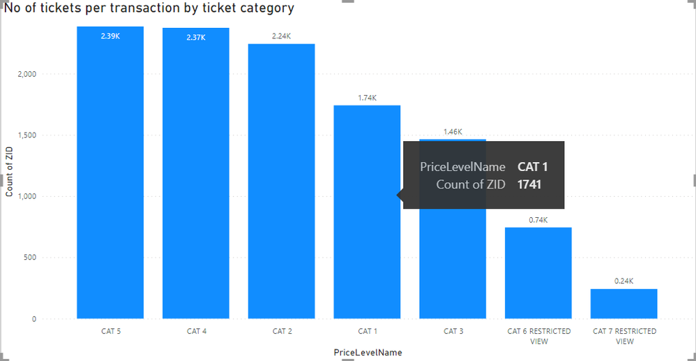
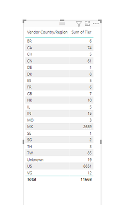
I am having an issue that the visualisation on Power BI is different from the data that I exported. I have searched for this problem but to no avail. Does anyone knows the reason why and how do I rectify this issue?
Solved! Go to Solution.
- Mark as New
- Bookmark
- Subscribe
- Mute
- Subscribe to RSS Feed
- Permalink
- Report Inappropriate Content
Hi @Anonymous ,
Do you export the data from Service or desktop?
If you export from desktop,you could only export summarized data,that's why you see the differences.
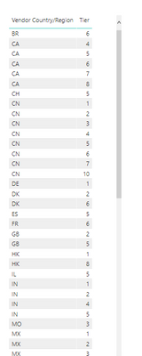
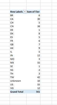
Make an example as below:
If you export below visual to csv file:
You would see:
But actually the data is as below:
All depends on whether you have exported the underlying data.
Check the reference below:
https://docs.microsoft.com/en-us/power-bi/visuals/power-bi-visualization-export-data
Best Regards,
Kelly
Did I answer your question? Mark my post as a solution!
- Mark as New
- Bookmark
- Subscribe
- Mute
- Subscribe to RSS Feed
- Permalink
- Report Inappropriate Content
I am understanding the export function, but my visualization is less than what is exported. Why is that the case?
- Mark as New
- Bookmark
- Subscribe
- Mute
- Subscribe to RSS Feed
- Permalink
- Report Inappropriate Content
Hi @Anonymous ,
Do you export the data from Service or desktop?
If you export from desktop,you could only export summarized data,that's why you see the differences.
Make an example as below:
If you export below visual to csv file:
You would see:
But actually the data is as below:
All depends on whether you have exported the underlying data.
Check the reference below:
https://docs.microsoft.com/en-us/power-bi/visuals/power-bi-visualization-export-data
Best Regards,
Kelly
Did I answer your question? Mark my post as a solution!
Helpful resources

Fabric Data Days
Advance your Data & AI career with 50 days of live learning, contests, hands-on challenges, study groups & certifications and more!

Power BI Monthly Update - October 2025
Check out the October 2025 Power BI update to learn about new features.


