Get Fabric certified for FREE!
Don't miss your chance to take the Fabric Data Engineer (DP-600) exam for FREE! Find out how by watching the DP-600 session on-demand now through April 28th.
Learn more- Power BI forums
- Get Help with Power BI
- Desktop
- Service
- Report Server
- Power Query
- Mobile Apps
- Developer
- DAX Commands and Tips
- Custom Visuals Development Discussion
- Health and Life Sciences
- Power BI Spanish forums
- Translated Spanish Desktop
- Training and Consulting
- Instructor Led Training
- Dashboard in a Day for Women, by Women
- Galleries
- Data Stories Gallery
- Themes Gallery
- Contests Gallery
- QuickViz Gallery
- Quick Measures Gallery
- Visual Calculations Gallery
- Notebook Gallery
- Translytical Task Flow Gallery
- TMDL Gallery
- R Script Showcase
- Webinars and Video Gallery
- Ideas
- Custom Visuals Ideas (read-only)
- Issues
- Issues
- Events
- Upcoming Events
Join the FabCon + SQLCon recap series. Up next: Power BI, Real-Time Intelligence, IQ and AI, and Data Factory take center stage. All sessions are available on-demand after the live show. Register now
- Power BI forums
- Forums
- Get Help with Power BI
- Power Query
- Re: Data label
- Subscribe to RSS Feed
- Mark Topic as New
- Mark Topic as Read
- Float this Topic for Current User
- Bookmark
- Subscribe
- Printer Friendly Page
- Mark as New
- Bookmark
- Subscribe
- Mute
- Subscribe to RSS Feed
- Permalink
- Report Inappropriate Content
Data label
Hi
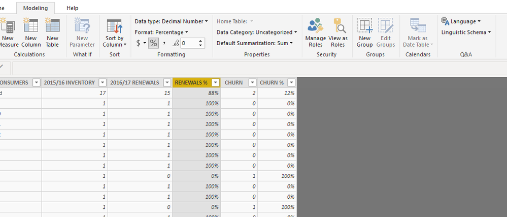
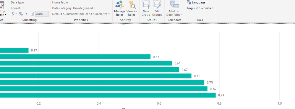
When I build a cluster graph with data I used before for similar visualisation, the data labels appear as decimal numbers and not percentage - which is how the data is presented in the grid. Checke modeling for format options and verything appears correct. Tried refreshing the data, removing and re-importing as well.
Solved! Go to Solution.
- Mark as New
- Bookmark
- Subscribe
- Mute
- Subscribe to RSS Feed
- Permalink
- Report Inappropriate Content
Hi @Anonymous ,
You could click the % for the data like below.
Then you could show the % data label in chart.
If you still need help, please share your desired output and your data sample so that we could help further on it.
Best Regards,
Cherry
If this post helps, then please consider Accept it as the solution to help the other members find it more quickly.
- Mark as New
- Bookmark
- Subscribe
- Mute
- Subscribe to RSS Feed
- Permalink
- Report Inappropriate Content
Hi @Anonymous ,
Have you solved your problem?
If you have solved, please always accept the replies making sense as solution to your question so that people who may have the same question can get the solution directly.
If you still need help, please feel free to ask.
Best Regards,
Cherry
If this post helps, then please consider Accept it as the solution to help the other members find it more quickly.
- Mark as New
- Bookmark
- Subscribe
- Mute
- Subscribe to RSS Feed
- Permalink
- Report Inappropriate Content
Hi @Anonymous ,
You could click the % for the data like below.
Then you could show the % data label in chart.
If you still need help, please share your desired output and your data sample so that we could help further on it.
Best Regards,
Cherry
If this post helps, then please consider Accept it as the solution to help the other members find it more quickly.
- Mark as New
- Bookmark
- Subscribe
- Mute
- Subscribe to RSS Feed
- Permalink
- Report Inappropriate Content
Hi
Thanks for getting back. I had done this earlier.
Attcahed are screenshots of the data grid and visualisation.
Thanks
Nidhi
- Mark as New
- Bookmark
- Subscribe
- Mute
- Subscribe to RSS Feed
- Permalink
- Report Inappropriate Content
Hi @Anonymous ,
That's really strange.
Could you show the percent format in table visaul or other visuals?
What version of power bi desktop do you use? Please check if you have install the latest version of power bi desktop 2.71.5523.821.
If you still need help, could you please share the dummy pbix file which can reproduce the scenario, so that we can help further investigate on it? You can upload it to OneDrive and post the link here. Do mask sensitive data before uploading.
Best Regards,
Cherry
If this post helps, then please consider Accept it as the solution to help the other members find it more quickly.
- Mark as New
- Bookmark
- Subscribe
- Mute
- Subscribe to RSS Feed
- Permalink
- Report Inappropriate Content
Hi
I am afraid I haven't found an opportunity to simulate the data. WIll have some more play wround to see if I can figure it out on my own again. and keep you posted.
Thanks
Nidhi
- Mark as New
- Bookmark
- Subscribe
- Mute
- Subscribe to RSS Feed
- Permalink
- Report Inappropriate Content
Hi @Anonymous ,
Have you solved your problem?
If you have solved, please always accept the replies making sense as solution to your question so that people who may have the same question can get the solution directly.
If you still need help, please feel free to ask.
Best Regards,
Cherry
If this post helps, then please consider Accept it as the solution to help the other members find it more quickly.
- Mark as New
- Bookmark
- Subscribe
- Mute
- Subscribe to RSS Feed
- Permalink
- Report Inappropriate Content
Hi
I had our agency that trained us pn PBI look at it and they found out an error with the files not being refreshed on thier own from Excel. After resolving a couple of errors it was only a matter of clicking on the percentage icon to convert the data into percentage.
Last I tried to reply to you, this page wouldn't load, hence the delay.
Many thanks for checking up.
Regards
Nidhi
Helpful resources

Power BI Monthly Update - April 2026
Check out the April 2026 Power BI update to learn about new features.

New to Fabric Survey
If you have recently started exploring Fabric, we'd love to hear how it's going. Your feedback can help with product improvements.

Power BI DataViz World Championships - June 2026
A new Power BI DataViz World Championship is coming this June! Don't miss out on submitting your entry.

| User | Count |
|---|---|
| 3 | |
| 2 | |
| 2 | |
| 2 | |
| 2 |
| User | Count |
|---|---|
| 5 | |
| 4 | |
| 4 | |
| 4 | |
| 4 |


