FabCon is coming to Atlanta
Join us at FabCon Atlanta from March 16 - 20, 2026, for the ultimate Fabric, Power BI, AI and SQL community-led event. Save $200 with code FABCOMM.
Register now!- Power BI forums
- Get Help with Power BI
- Desktop
- Service
- Report Server
- Power Query
- Mobile Apps
- Developer
- DAX Commands and Tips
- Custom Visuals Development Discussion
- Health and Life Sciences
- Power BI Spanish forums
- Translated Spanish Desktop
- Training and Consulting
- Instructor Led Training
- Dashboard in a Day for Women, by Women
- Galleries
- Data Stories Gallery
- Themes Gallery
- Contests Gallery
- QuickViz Gallery
- Quick Measures Gallery
- Visual Calculations Gallery
- Notebook Gallery
- Translytical Task Flow Gallery
- TMDL Gallery
- R Script Showcase
- Webinars and Video Gallery
- Ideas
- Custom Visuals Ideas (read-only)
- Issues
- Issues
- Events
- Upcoming Events
Vote for your favorite vizzies from the Power BI Dataviz World Championship submissions. Vote now!
- Power BI forums
- Forums
- Get Help with Power BI
- Power Query
- Auto Created Relationship when referencing an SQL ...
- Subscribe to RSS Feed
- Mark Topic as New
- Mark Topic as Read
- Float this Topic for Current User
- Bookmark
- Subscribe
- Printer Friendly Page
- Mark as New
- Bookmark
- Subscribe
- Mute
- Subscribe to RSS Feed
- Permalink
- Report Inappropriate Content
Auto Created Relationship when referencing an SQL database?
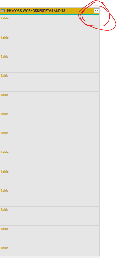
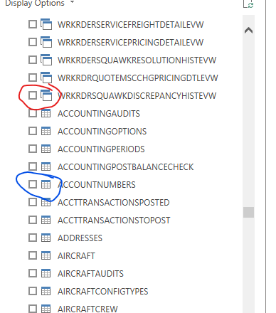
I have a few questions on this image and they may not be worded correctly so bear with me. I am accessing my SQL database for the first time and after a few days noticed this new icon. My first question is what is this icon referencing. I think it is pulling in the auto relationship feature of Power BI to automatically create relationships it believes can be beneficial for this data set, which is great. When I tried another data set to see if there was a similar auto relationship generation it was non-existent. What's the difference between the two circled icons in this Navigation window. I'd really like to transform the data where my columns are datasets and I can pick and choose which to include, for performance reasons. I feel like this is a pipe dream. Any help would be appreciated.
- Mark as New
- Bookmark
- Subscribe
- Mute
- Subscribe to RSS Feed
- Permalink
- Report Inappropriate Content
These icons have nothing to do with the relationships. The top icons indicate views, the bottom ones tables - on your SQL server. From a Power BI perspective it doesn't really matter, as they are treated the same in data source terms.
Helpful resources

Power BI Dataviz World Championships
Vote for your favorite vizzies from the Power BI World Championship submissions!

Join our Community Sticker Challenge 2026
If you love stickers, then you will definitely want to check out our Community Sticker Challenge!

Power BI Monthly Update - January 2026
Check out the January 2026 Power BI update to learn about new features.

| User | Count |
|---|---|
| 8 | |
| 6 | |
| 4 | |
| 3 | |
| 3 |
| User | Count |
|---|---|
| 16 | |
| 12 | |
| 9 | |
| 7 | |
| 6 |


