A new Data Days event is coming soon!
This time we’re going bigger than ever. Fabric, Power BI, SQL, AI and more. We're covering it all. You won't want to miss it.
Learn more- Power BI forums
- Get Help with Power BI
- Desktop
- Service
- Report Server
- Power Query
- Mobile Apps
- Developer
- DAX Commands and Tips
- Custom Visuals Development Discussion
- Health and Life Sciences
- Power BI Spanish forums
- Translated Spanish Desktop
- Training and Consulting
- Instructor Led Training
- Dashboard in a Day for Women, by Women
- Galleries
- Data Stories Gallery
- Themes Gallery
- Contests Gallery
- QuickViz Gallery
- Quick Measures Gallery
- Visual Calculations Gallery
- Notebook Gallery
- Translytical Task Flow Gallery
- TMDL Gallery
- R Script Showcase
- Webinars and Video Gallery
- Ideas
- Custom Visuals Ideas (read-only)
- Issues
- Issues
- Events
- Upcoming Events
Did you hear? There's a new SQL AI Developer certification (DP-800). Start preparing now and be one of the first to get certified. Register now
- Power BI forums
- Forums
- Get Help with Power BI
- Developer
- Script to add column based on historical data
- Subscribe to RSS Feed
- Mark Topic as New
- Mark Topic as Read
- Float this Topic for Current User
- Bookmark
- Subscribe
- Printer Friendly Page
- Mark as New
- Bookmark
- Subscribe
- Mute
- Subscribe to RSS Feed
- Permalink
- Report Inappropriate Content
Script to add column based on historical data
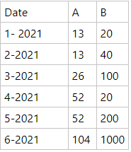
I've been trying to add automatic column with py script, but without a success. So the idea is to lets say i have a table like below:

And the idea is to create a additional column which tells us a current situation of A or B value over time, so basically something like this: ( let's say that 7-th month data is updated)

Did anyone took similar approach to something like above? Looking for a suggestions & approach ideas or some solutions to problem above. A & B columns could also be like A (as value) and B as value category.
Thanks in advance!!
- Mark as New
- Bookmark
- Subscribe
- Mute
- Subscribe to RSS Feed
- Permalink
- Report Inappropriate Content
See if dynamic commentary in Power BI can meet your needs:
https://zebrabi.com/dynamic-commentary-power-bi/
https://blog.enterprisedna.co/adding-commentary-to-your-reports-in-a-dynamic-way/
- Mark as New
- Bookmark
- Subscribe
- Mute
- Subscribe to RSS Feed
- Permalink
- Report Inappropriate Content
You could do something like this with a measure incorporating a bunch of if/then logic specifying what you want to say in any conceivable situation but that seems pretty painful to write and not nearly as useful as showing a visual instead.
- Mark as New
- Bookmark
- Subscribe
- Mute
- Subscribe to RSS Feed
- Permalink
- Report Inappropriate Content
Obviously, but in my case there is a need to have tooltip/comments in addition to graph. My idea was to loop through dates and output value progression over time but as mentioned above - ended up without success.
Nested ifs are painful - i agree, but i consider it as last resort.
Thanks for your reply!
Helpful resources

Power BI Monthly Update - April 2026
Check out the April 2026 Power BI update to learn about new features.

Data Days 2026 coming soon!
Sign up to receive a private message when registration opens and key events begin.

New to Fabric Survey
If you have recently started exploring Fabric, we'd love to hear how it's going. Your feedback can help with product improvements.

