This is best Fabric, Power BI, SQL and AI community event. How do we know? The last event sold out! Save €200 with code FABCMTY200.
Register nowThe Fabric community is now in read-only for platform upgrade. Learn more
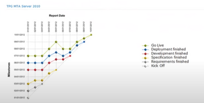
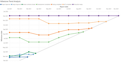
I was wondering if there is currently a way to create a vizual for a Milestone Trend Analysis? It's necessary to have dates on both the X and Y axis, which I don't see how to do. Thanks to anyone who has a suggestion for this.
Hi Naekwon19,
A bit late reaction, but we (Nova Silva and our customers) also have been looking for a MTA chart in Power BI. Since we could not find it we decided to develop it ourselves. You can find it here in the AppSource: https://appsource.microsoft.com/en-us/product/power-bi-visuals/novasilvagroupbv1626174611009.milesto...
Does this work for you?
@Anonymous
If everything else fails there's always the option to do this via SVG, or on https://charts.powerbi.tips
Join us in Barcelona for FabCon and SQLCon, the Fabric, Power BI, SQL, and AI community event. Save €200 with code FABCMTY200.
| User | Count |
|---|---|
| 2 | |
| 1 | |
| 1 | |
| 1 | |
| 1 |
| User | Count |
|---|---|
| 1 | |
| 1 | |
| 1 | |
| 1 | |
| 1 |