A new Data Days event is coming soon!
This time we’re going bigger than ever. Fabric, Power BI, SQL, AI and more. We're covering it all. You won't want to miss it.
Learn more- Power BI forums
- Get Help with Power BI
- Desktop
- Service
- Report Server
- Power Query
- Mobile Apps
- Developer
- DAX Commands and Tips
- Custom Visuals Development Discussion
- Health and Life Sciences
- Power BI Spanish forums
- Translated Spanish Desktop
- Training and Consulting
- Instructor Led Training
- Dashboard in a Day for Women, by Women
- Galleries
- Data Stories Gallery
- Themes Gallery
- Contests Gallery
- QuickViz Gallery
- Quick Measures Gallery
- Visual Calculations Gallery
- Notebook Gallery
- Translytical Task Flow Gallery
- TMDL Gallery
- R Script Showcase
- Webinars and Video Gallery
- Ideas
- Custom Visuals Ideas (read-only)
- Issues
- Issues
- Events
- Upcoming Events
Did you hear? There's a new SQL AI Developer certification (DP-800). Start preparing now and be one of the first to get certified. Register now
- Power BI forums
- Forums
- Get Help with Power BI
- Developer
- How do I use vertical orientation
- Subscribe to RSS Feed
- Mark Topic as New
- Mark Topic as Read
- Float this Topic for Current User
- Bookmark
- Subscribe
- Printer Friendly Page
- Mark as New
- Bookmark
- Subscribe
- Mute
- Subscribe to RSS Feed
- Permalink
- Report Inappropriate Content
How do I use vertical orientation
How do I use vertical orientation
Solved! Go to Solution.
- Mark as New
- Bookmark
- Subscribe
- Mute
- Subscribe to RSS Feed
- Permalink
- Report Inappropriate Content
Hi,
I don't have access to source code which was used to create your barchart visual.
Now I may be wrong... though I can assume this type of barchart may have been built using d3.js
coding approach. Actually a lot of visuals found Custom Visual Gallery were basically built using
a d3.js coding approach including the main barChart tutorial found on Github.
So I'd say that pretty often label orientation can be dealt with transform rotate attribute.
As an example the following code with x-axis label
 svg.append("g")
                .attr("class", "x axis")
                .attr("transform", "translate(0," + height + ")")
                .call(xAxis)
                .selectAll("text")
                .style("text-anchor", "end")
                .attr("dx", "-.8em")
                .attr("dy", "-.55em")
                .attr("transform", "rotate(-90)" ); //<---- 90 angle rotation
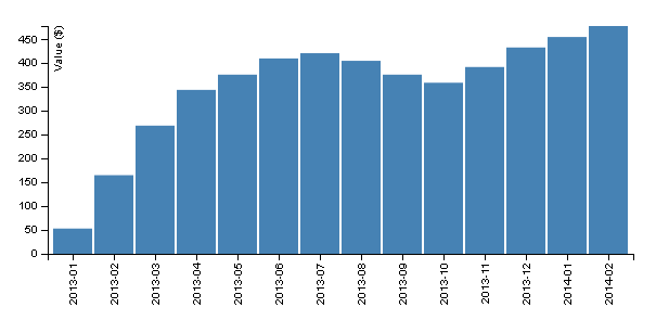
would produce something similar to this
while the same code with only minor rotate parameter modification:
svg.append("g")
                .attr("class", "x axis")
                .attr("transform", "translate(0," + height + ")")
                .call(xAxis)
                .selectAll("text")
                .style("text-anchor", "end")
                .attr("dx", "-.8em")
                .attr("dy", "-.55em")
                .attr("transform", "rotate(-45)" ); //<-- 45 angle rotation
would render something similar to this:
Note that this is pretty basic d3.js stuff... if you can send a copy of the source code you're using
then I maybe I could take a closer look at it and come up with something more accurate...
Hope this helps
- Mark as New
- Bookmark
- Subscribe
- Mute
- Subscribe to RSS Feed
- Permalink
- Report Inappropriate Content
Hi,
I was searching for the same subject and found your suggestion.
I am using Power Bi default visual (Clustered Column Chart) and willing to accomplish rotating the X axis.
Where do I apply the code you shared?
- Mark as New
- Bookmark
- Subscribe
- Mute
- Subscribe to RSS Feed
- Permalink
- Report Inappropriate Content
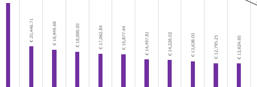
mine shows like this-
- Mark as New
- Bookmark
- Subscribe
- Mute
- Subscribe to RSS Feed
- Permalink
- Report Inappropriate Content
Hi @amitloh,
Formatting features for things such as data labels are still very much in their infancy in Power BI. If you think it would be a good feature addition please add it as an idea on the PowerBI Ideas page. There is another post with a reponse from Matt Ellington (MVP and super contributor) that gives a similar repsonse here as wel..
Helpful resources

Power BI Monthly Update - April 2026
Check out the April 2026 Power BI update to learn about new features.

Data Days 2026 coming soon!
Sign up to receive a private message when registration opens and key events begin.

New to Fabric Survey
If you have recently started exploring Fabric, we'd love to hear how it's going. Your feedback can help with product improvements.

| User | Count |
|---|---|
| 4 | |
| 2 | |
| 1 | |
| 1 | |
| 1 |


