A new Data Days event is coming soon!
This time we’re going bigger than ever. Fabric, Power BI, SQL, AI and more. We're covering it all. You won't want to miss it.
Learn more- Power BI forums
- Get Help with Power BI
- Desktop
- Service
- Report Server
- Power Query
- Mobile Apps
- Developer
- DAX Commands and Tips
- Custom Visuals Development Discussion
- Health and Life Sciences
- Power BI Spanish forums
- Translated Spanish Desktop
- Training and Consulting
- Instructor Led Training
- Dashboard in a Day for Women, by Women
- Galleries
- Data Stories Gallery
- Themes Gallery
- Contests Gallery
- QuickViz Gallery
- Quick Measures Gallery
- Visual Calculations Gallery
- Notebook Gallery
- Translytical Task Flow Gallery
- TMDL Gallery
- R Script Showcase
- Webinars and Video Gallery
- Ideas
- Custom Visuals Ideas (read-only)
- Issues
- Issues
- Events
- Upcoming Events
Level up your Power BI skills this month - build one visual each week and tell better stories with data! Get started
- Power BI forums
- Forums
- Get Help with Power BI
- Developer
- Re: Change Color Legends in Map with Custom Icon
- Subscribe to RSS Feed
- Mark Topic as New
- Mark Topic as Read
- Float this Topic for Current User
- Bookmark
- Subscribe
- Printer Friendly Page
- Mark as New
- Bookmark
- Subscribe
- Mute
- Subscribe to RSS Feed
- Permalink
- Report Inappropriate Content
Change Color Legends in Map with Custom Icon
Hi, Can we change legends in Map Visualization (that uses color) with custom icon? For example: I have Map Visualization that show count of network device (router, switch, hub) in certain areas. Normally, each network device will be differentiated by color. I need to change the color legend with icon (router with router icon, etc). Thank you.
- Mark as New
- Bookmark
- Subscribe
- Mute
- Subscribe to RSS Feed
- Permalink
- Report Inappropriate Content
Hi @andychiar,
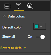
If you want to change the legends color, you can simply to modify at “Format Table” -> “Data colors”.
If you want to use custom icon as the legends, currently map visual doesn’t support this feature, you can vote this idea at below link:
Regards,
Xiaoxin Sheng
- Mark as New
- Bookmark
- Subscribe
- Mute
- Subscribe to RSS Feed
- Permalink
- Report Inappropriate Content
Hi Xiaoxin,
Thank you for your explanation.
I will vote the idea.
Andy
- Mark as New
- Bookmark
- Subscribe
- Mute
- Subscribe to RSS Feed
- Permalink
- Report Inappropriate Content
Hi
Appreciate it's years since your post - but thought I'd flag that the Icon Map now in the store should let you achieve this. Check out https://www.youtube.com/channel/UCFbxn6ALX9C4nQXD0QcJmug for examples.
James
- Mark as New
- Bookmark
- Subscribe
- Mute
- Subscribe to RSS Feed
- Permalink
- Report Inappropriate Content
Do you work on your own Custom Visual? So you can change the background-image from the node.
Nice Regards
Mcburn
- Mark as New
- Bookmark
- Subscribe
- Mute
- Subscribe to RSS Feed
- Permalink
- Report Inappropriate Content
Hi Mcburn,
No, I'm working on map visualization provided by Power BI.
I want to change data color with custom icon.
Andy
- Mark as New
- Bookmark
- Subscribe
- Mute
- Subscribe to RSS Feed
- Permalink
- Report Inappropriate Content
Okay so maybe a question for the Desktop Forum.
But @v-chuncz-msft or @Eric_Zhang had more Experience in that.
Nice Regards
Mcburn
- Mark as New
- Bookmark
- Subscribe
- Mute
- Subscribe to RSS Feed
- Permalink
- Report Inappropriate Content
Oh, I'm sorry for the wrong Forum.
Should I post a new topic in the Desktop Forum?
Andy
- Mark as New
- Bookmark
- Subscribe
- Mute
- Subscribe to RSS Feed
- Permalink
- Report Inappropriate Content
Iam not really sure but i think you get more help on the Desktop Forum.
But i linked you Sam and Eric. I think they know what to do :).
Sry i can not help you on your Problem. But i hope some other can do this.
Nice Regards
Mcburn
Helpful resources

Power BI Monthly Update - April 2026
Check out the April 2026 Power BI update to learn about new features.

Data Days 2026 coming soon!
Sign up to receive a private message when registration opens and key events begin.

New to Fabric Survey
If you have recently started exploring Fabric, we'd love to hear how it's going. Your feedback can help with product improvements.

| User | Count |
|---|---|
| 4 | |
| 2 | |
| 1 | |
| 1 | |
| 1 |
| User | Count |
|---|---|
| 10 | |
| 8 | |
| 3 | |
| 3 | |
| 2 |

