Fabric Data Days starts November 4th!
Advance your Data & AI career with 50 days of live learning, dataviz contests, hands-on challenges, study groups & certifications and more!
Get registered- Power BI forums
- Get Help with Power BI
- Desktop
- Service
- Report Server
- Power Query
- Mobile Apps
- Developer
- DAX Commands and Tips
- Custom Visuals Development Discussion
- Health and Life Sciences
- Power BI Spanish forums
- Translated Spanish Desktop
- Training and Consulting
- Instructor Led Training
- Dashboard in a Day for Women, by Women
- Galleries
- Data Stories Gallery
- Themes Gallery
- Contests Gallery
- QuickViz Gallery
- Quick Measures Gallery
- Visual Calculations Gallery
- Notebook Gallery
- Translytical Task Flow Gallery
- TMDL Gallery
- R Script Showcase
- Webinars and Video Gallery
- Ideas
- Custom Visuals Ideas (read-only)
- Issues
- Issues
- Events
- Upcoming Events
Get Fabric Certified for FREE during Fabric Data Days. Don't miss your chance! Request now
- Power BI forums
- Forums
- Get Help with Power BI
- Desktop
- Re: x-axis values repeats
- Subscribe to RSS Feed
- Mark Topic as New
- Mark Topic as Read
- Float this Topic for Current User
- Bookmark
- Subscribe
- Printer Friendly Page
- Mark as New
- Bookmark
- Subscribe
- Mute
- Subscribe to RSS Feed
- Permalink
- Report Inappropriate Content
x-axis values repeats
Hello,
I have a chart in which one of the x-axis values repeats with no data on it... I can't fix it and I don't understand why.
The context:
I have a table in which each line is a different product and has its expiration date. Using this column, I created a calculated column where I categorize each product as "already expired", "recently expired", "will expire in a week", "will expire in 2 to 3 weeks"... etc, as shown below:
Product Status = SWITCH(TRUE();
'Table'[Expiration Date] = BLANK(); BLANK();
AND(DATEDIFF('Table'[Expiration Date];TODAY();DAY) < 7; DATEDIFF('Table'[Expiration Date];TODAY();DAY) >=0) ; "Expired in less than a week";
DATEDIFF('Table'[Expiration Date];TODAY();DAY) >= 7; "Expired over a week";
DATEDIFF('Table'[Expiration Date];TODAY();DAY) >= -14; "will expire in 1 to 2 weeks";
DATEDIFF('Table'[Expiration Date];TODAY();DAY) >= -21; "will expire in 2 to 3 weeks";
DATEDIFF('Table'[Expiration Date];TODAY();DAY) >= -28; "will expire in 3 to 4 weeks";
DATEDIFF('Table'[Expiration Date];TODAY();DAY) >= -60; "will expire in 1 to 2 months";
DATEDIFF('Table'[Expiration Date];TODAY();DAY) >= -90; "will expire in 2 to 3 months";
"will expire in more than 3 months")
Also, I made a measure where I sum up the tons of products and then I put it in the chart using the calculated column as my x-axis, given me the following:
https://imgur.com/a/bKpHP2t
(I dont know why, but I couldn't add the images here so I created a URL... I hope it works)
additional information: If I put the calculated column in a table and use it to filter the data, it won't select the doubled column in the chart... So I can't filter the "second" one...
Can anyway explain to me what is happening?
Thank you,
Solved! Go to Solution.
- Mark as New
- Bookmark
- Subscribe
- Mute
- Subscribe to RSS Feed
- Permalink
- Report Inappropriate Content
Hello Daniel,
I solved the problem myself.... finally!
I was creating a sample of the data to send to you and I recreated the formulas on a new PBI file. Doing this, I noticed that there was a gap in the calculated column (products that would expire in less than a week were not being taken into account and somehow it was making the x-axis repeat a value)... when I filled the gap, the repeated x-axis disappeared. I didn't really understood why this gap led to the problem... but it is solved.
- Mark as New
- Bookmark
- Subscribe
- Mute
- Subscribe to RSS Feed
- Permalink
- Report Inappropriate Content
Hi @Anonymous,
Due to I could not reproduce your problem, could you please offer some sample data to have a test if possible?
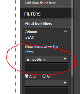
And could you have tried to add a filter for your visual with "is not blank" to have a try:
Regards,
Daniel He
If this post helps, then please consider Accept it as the solution to help the other members find it more quickly.
- Mark as New
- Bookmark
- Subscribe
- Mute
- Subscribe to RSS Feed
- Permalink
- Report Inappropriate Content
Hello Daniel,
I solved the problem myself.... finally!
I was creating a sample of the data to send to you and I recreated the formulas on a new PBI file. Doing this, I noticed that there was a gap in the calculated column (products that would expire in less than a week were not being taken into account and somehow it was making the x-axis repeat a value)... when I filled the gap, the repeated x-axis disappeared. I didn't really understood why this gap led to the problem... but it is solved.
- Mark as New
- Bookmark
- Subscribe
- Mute
- Subscribe to RSS Feed
- Permalink
- Report Inappropriate Content
Hi @Anonymous,
It's pleasant that your problem could be solved, could you please mark one reply as answered to close the topic?
Regards,
Daniel He
If this post helps, then please consider Accept it as the solution to help the other members find it more quickly.
Helpful resources

Power BI Monthly Update - November 2025
Check out the November 2025 Power BI update to learn about new features.

Fabric Data Days
Advance your Data & AI career with 50 days of live learning, contests, hands-on challenges, study groups & certifications and more!

| User | Count |
|---|---|
| 98 | |
| 72 | |
| 50 | |
| 49 | |
| 42 |

