A new Data Days event is coming soon!
This time we’re going bigger than ever. Fabric, Power BI, SQL, AI and more. We're covering it all. You won't want to miss it.
Learn more- Power BI forums
- Get Help with Power BI
- Desktop
- Service
- Report Server
- Power Query
- Mobile Apps
- Developer
- DAX Commands and Tips
- Custom Visuals Development Discussion
- Health and Life Sciences
- Power BI Spanish forums
- Translated Spanish Desktop
- Training and Consulting
- Instructor Led Training
- Dashboard in a Day for Women, by Women
- Galleries
- Data Stories Gallery
- Themes Gallery
- Contests Gallery
- QuickViz Gallery
- Quick Measures Gallery
- Visual Calculations Gallery
- Notebook Gallery
- Translytical Task Flow Gallery
- TMDL Gallery
- R Script Showcase
- Webinars and Video Gallery
- Ideas
- Custom Visuals Ideas (read-only)
- Issues
- Issues
- Events
- Upcoming Events
Did you hear? There's a new SQL AI Developer certification (DP-800). Start preparing now and be one of the first to get certified. Register now
- Power BI forums
- Forums
- Get Help with Power BI
- Desktop
- Re: undefined
- Subscribe to RSS Feed
- Mark Topic as New
- Mark Topic as Read
- Float this Topic for Current User
- Bookmark
- Subscribe
- Printer Friendly Page
- Mark as New
- Bookmark
- Subscribe
- Mute
- Subscribe to RSS Feed
- Permalink
- Report Inappropriate Content
undefined
I have two spreadsheets
2018 data
2019 data
When I create a clustered column chart to compare YOY by month, I run into a few issues.
Fields are populated as follows:
Axis
2018 Date of Incident (ordered by date hierarchy)
2019 Date of Incident (ordered by date hierarchy)
Value
2018 Surname of Injured Person
2019 Surname of Injured Person
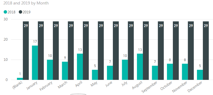
When I do that, it shows the below.
2018 data is correct however 2019 is showing as 29 for all months. 29 is the number of rows, it's not actually counting the amount of 2019 incidents per month.
I'm stuck, please help! 🙂
- Mark as New
- Bookmark
- Subscribe
- Mute
- Subscribe to RSS Feed
- Permalink
- Report Inappropriate Content
You're going to need to combine the two sets of data somehow - either merge the queries, or create some sort of linking table listing the months. Right now I'm guessing they are separated and you just have a list of months on the 2018 table, Power BI's not going to know which of those months the 2019 data applies to so it does it for all of them
- Mark as New
- Bookmark
- Subscribe
- Mute
- Subscribe to RSS Feed
- Permalink
- Report Inappropriate Content
Do you know how to create a linking table listing the months?
Helpful resources

Power BI Monthly Update - April 2026
Check out the April 2026 Power BI update to learn about new features.

New to Fabric Survey
If you have recently started exploring Fabric, we'd love to hear how it's going. Your feedback can help with product improvements.

Power BI DataViz World Championships - June 2026
A new Power BI DataViz World Championship is coming this June! Don't miss out on submitting your entry.

| User | Count |
|---|---|
| 38 | |
| 38 | |
| 31 | |
| 22 | |
| 15 |
| User | Count |
|---|---|
| 74 | |
| 61 | |
| 31 | |
| 31 | |
| 23 |

