- Subscribe to RSS Feed
- Mark Topic as New
- Mark Topic as Read
- Float this Topic for Current User
- Bookmark
- Subscribe
- Printer Friendly Page
- Mark as New
- Bookmark
- Subscribe
- Mute
- Subscribe to RSS Feed
- Permalink
- Report Inappropriate Content

show all months on graph even with no data
Hi all!
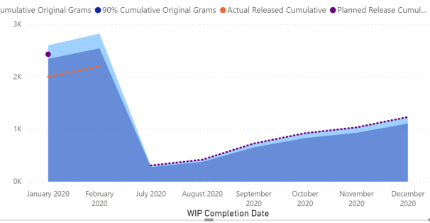
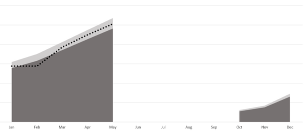
I am trying to recreate an excel graph in PBI and am having some issues...
Is it possible to have this graph in PBI:
look like this grpah in Excel:
like how it has the blank space were there is no data rather than just skipping to the next data-filled month?
I tried changing the x axis to continuous and manually seting the start and end date but that didnt work, and I also tried to add a date table and put 0 as the value for the non-data-filled months but that didnt work either.
If anyone has any ideas please let me know 🙂 thanks!!
Solved! Go to Solution.
- Mark as New
- Bookmark
- Subscribe
- Mute
- Subscribe to RSS Feed
- Permalink
- Report Inappropriate Content

Hi @sy898661 ,
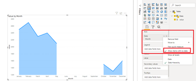
You can try to put month hierarchy in the x-axis field and enable 'Show items with no data' option to achieve this:
Best Regards,
Yingjie Li
If this post helps then please consider Accept it as the solution to help the other members find it more quickly.
- Mark as New
- Bookmark
- Subscribe
- Mute
- Subscribe to RSS Feed
- Permalink
- Report Inappropriate Content

Hi @sy898661 ,
You can try to put month hierarchy in the x-axis field and enable 'Show items with no data' option to achieve this:
Best Regards,
Yingjie Li
If this post helps then please consider Accept it as the solution to help the other members find it more quickly.
- Mark as New
- Bookmark
- Subscribe
- Mute
- Subscribe to RSS Feed
- Permalink
- Report Inappropriate Content

You saved my life. Thanks a lot!
- Mark as New
- Bookmark
- Subscribe
- Mute
- Subscribe to RSS Feed
- Permalink
- Report Inappropriate Content

I tried this but, when I take calculated column
Calculated Column : Format(Date, "MMM")
then for this It does not show any data for Blank months.
- Mark as New
- Bookmark
- Subscribe
- Mute
- Subscribe to RSS Feed
- Permalink
- Report Inappropriate Content

Hi,
Sorry to dig this post up, but i have a similar issue and while your solution helped me display the months with 0 data inputs, it also disabled my set filter.
In my case I have data from the last couple of years, but only want to show the latest 12 months. Now I get everything before that AND all upcoming months of this year as well.
Is there a way to filter those again?
Thank you!
- Mark as New
- Bookmark
- Subscribe
- Mute
- Subscribe to RSS Feed
- Permalink
- Report Inappropriate Content

I also am experiencing this issue. I think it's a bug?
- Mark as New
- Bookmark
- Subscribe
- Mute
- Subscribe to RSS Feed
- Permalink
- Report Inappropriate Content

Hello @ksempai , thank you for reaching out to the Fabric Community Forum. Since the original post has been marked as "Solved" and is over four years old, we kindly ask that you create a new post Fabric Community Forums for your inquiries instead of replying to the existing one. Our community is here to assist you, and following this approach will help ensure that your question is viewed by more people and answered more promptly.
If your requirement is solved, please make THIS ANSWER a SOLUTION ✔️ and help other users find the solution quickly. Please hit the LIKE 👍 button if this comment helps you. Proud to be a Super User!
- Mark as New
- Bookmark
- Subscribe
- Mute
- Subscribe to RSS Feed
- Permalink
- Report Inappropriate Content

I have the same problem.
when I choose show items with no data, my 12 months filter doesn't work. Does anyone now how to fix it?
- Mark as New
- Bookmark
- Subscribe
- Mute
- Subscribe to RSS Feed
- Permalink
- Report Inappropriate Content

@v-yingjl I added in dummy data-lines where there was no data for the dates we needed spaces in and tried this and it worked!! thank you so much!!
- Mark as New
- Bookmark
- Subscribe
- Mute
- Subscribe to RSS Feed
- Permalink
- Report Inappropriate Content

Having to put a lot of zeros in the excel tables were so frustrating, now this saved my life, I am so relieved
- Mark as New
- Bookmark
- Subscribe
- Mute
- Subscribe to RSS Feed
- Permalink
- Report Inappropriate Content

@sy898661 , With the visible viusal, I doubt. But this how it can happen if you want a break in between.
1. Make the value for those months as blank, not 0. If(Max(Table[Month] in {"Apr20","May20"}, blank(),[measure])
2. Make the type as Categorical
If it does not resolve. Can you share sample data and sample output in table format? Or a sample pbix after removing sensitive data.
- Mark as New
- Bookmark
- Subscribe
- Mute
- Subscribe to RSS Feed
- Permalink
- Report Inappropriate Content

I don't see what's wrong with the Power BI picture. It is a representation of your data with a high level of truthiness.
- Mark as New
- Bookmark
- Subscribe
- Mute
- Subscribe to RSS Feed
- Permalink
- Report Inappropriate Content

@lbendlin The two areas are separated in the excel graph because they are two different campaigns that happen to fall in the same year. My boss is looking for separation. I know it technically portrays the same information but its not what I am looking to do....
Helpful resources
| Subject | Author | Posted | |
|---|---|---|---|
|
Anonymous
| 05-31-2023 12:50 AM | ||
| 02-28-2023 10:31 AM | |||
| 12-28-2023 05:16 PM | |||
| 10-20-2023 07:55 AM | |||
| 05-30-2024 01:25 PM |
| User | Count |
|---|---|
| 109 | |
| 90 | |
| 82 | |
| 55 | |
| 46 |


