FabCon is coming to Atlanta
Join us at FabCon Atlanta from March 16 - 20, 2026, for the ultimate Fabric, Power BI, AI and SQL community-led event. Save $200 with code FABCOMM.
Register now!- Power BI forums
- Get Help with Power BI
- Desktop
- Service
- Report Server
- Power Query
- Mobile Apps
- Developer
- DAX Commands and Tips
- Custom Visuals Development Discussion
- Health and Life Sciences
- Power BI Spanish forums
- Translated Spanish Desktop
- Training and Consulting
- Instructor Led Training
- Dashboard in a Day for Women, by Women
- Galleries
- Data Stories Gallery
- Themes Gallery
- Contests Gallery
- QuickViz Gallery
- Quick Measures Gallery
- Visual Calculations Gallery
- Notebook Gallery
- Translytical Task Flow Gallery
- TMDL Gallery
- R Script Showcase
- Webinars and Video Gallery
- Ideas
- Custom Visuals Ideas (read-only)
- Issues
- Issues
- Events
- Upcoming Events
View all the Fabric Data Days sessions on demand. View schedule
- Power BI forums
- Forums
- Get Help with Power BI
- Desktop
- scatter with straight line plot in power bi
- Subscribe to RSS Feed
- Mark Topic as New
- Mark Topic as Read
- Float this Topic for Current User
- Bookmark
- Subscribe
- Printer Friendly Page
- Mark as New
- Bookmark
- Subscribe
- Mute
- Subscribe to RSS Feed
- Permalink
- Report Inappropriate Content
scatter with straight line plot in power bi
Hi Dears,
I want to visual a well locatoin x,y in scatter plot with faults coordinates x,y as a lines in that same plot in power bi as what execl offer chart called combo scatter with straingt line plot.
Best regards
- Mark as New
- Bookmark
- Subscribe
- Mute
- Subscribe to RSS Feed
- Permalink
- Report Inappropriate Content
Thank you, but what I looking for is diffrent not a trend line but combo chart that can visual lines as layer and scatter points as another layer
- Mark as New
- Bookmark
- Subscribe
- Mute
- Subscribe to RSS Feed
- Permalink
- Report Inappropriate Content
Hello @AAbufarwa,
- Select the scatter chart and in the "Visualizations" pane, go to the "Analytics" section.
- Expand the "Trend lines" section and select "Add" to add a trend line to the scatter chart.
Let me know if you might need further assistance.
Did I answer your question? Mark my post as a solution, this will help others!
If my response(s) assisted you in any way, don't forget to drop me a "Kudos" 🙂
Kind Regards,
Sahir Maharaj
Data Scientist | Data Engineer | Data Analyst | AI Engineer
P.S. Want me to build your Power BI solution? (Yes, its FREE!)
➤ Lets connect on LinkedIn: Join my network of 15K+ professionals
➤ Join my free newsletter: Data Driven: From 0 to 100
➤ Website: https://sahirmaharaj.com
➤ About: https://sahirmaharaj.com/about.html
➤ Email: sahir@sahirmaharaj.com
➤ Want me to build your Power BI solution? Lets chat about how I can assist!
➤ Join my Medium community of 30K readers! Sharing my knowledge about data science and artificial intelligence
➤ Explore my latest project (350K+ views): Wordlit.net
➤ 100+ FREE Power BI Themes: Download Now
LinkedIn Top Voice in Artificial Intelligence, Data Science and Machine Learning
- Mark as New
- Bookmark
- Subscribe
- Mute
- Subscribe to RSS Feed
- Permalink
- Report Inappropriate Content
Since on object interaction the option for a Trend line has disappeared. Not only from the new Reference Line options but also from the old (with on object preview turned off) Analysis sub-pane
Pity - I hope I don't need to write DAX if I can find a way to draw a line on top
Excel has it!!
- Mark as New
- Bookmark
- Subscribe
- Mute
- Subscribe to RSS Feed
- Permalink
- Report Inappropriate Content
Hello @Sahir_Maharaj , I have checked your solution because I have the same question as @AAbufarwa .
However your solution is not accurate because you proposed a "Trend line" that is very different as our request.
I'll try to explain in my words and with examples the question:
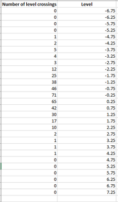
1. I have the following dataset in Excel:
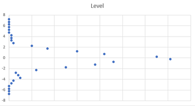
2. There is the scatter plot for the dataset (in excel):
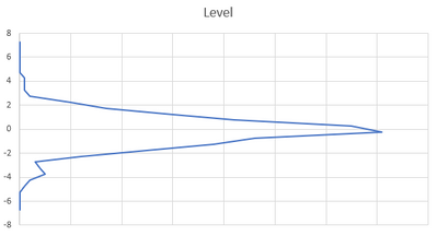
3. I have the option to change the visual by a "scatter plot with straight lines" (in excel)
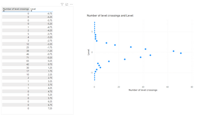
4. In Power BI, with the same dataset I created a scatter plot:
6. But there are no options to "join" all the points with a straight line in Power BI scatter plot.
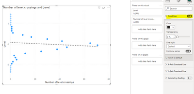
7. Your solution of "Trend Line" looks like this:
8. @AAbufarwa and me need to "join" the points of the scatter plot with a straight line as Excel does.
Do you have any idea on how to achieve this?
Thanks and regards,
Yineth Castiblanco Rojas
Helpful resources

Power BI Monthly Update - November 2025
Check out the November 2025 Power BI update to learn about new features.

Fabric Data Days
Advance your Data & AI career with 50 days of live learning, contests, hands-on challenges, study groups & certifications and more!


