Get Fabric certified for FREE!
Don't miss your chance to take the Fabric Data Engineer (DP-700) exam on us!
Learn more- Power BI forums
- Get Help with Power BI
- Desktop
- Service
- Report Server
- Power Query
- Mobile Apps
- Developer
- DAX Commands and Tips
- Custom Visuals Development Discussion
- Health and Life Sciences
- Power BI Spanish forums
- Translated Spanish Desktop
- Training and Consulting
- Instructor Led Training
- Dashboard in a Day for Women, by Women
- Galleries
- Data Stories Gallery
- Themes Gallery
- Contests Gallery
- QuickViz Gallery
- Quick Measures Gallery
- Visual Calculations Gallery
- Notebook Gallery
- Translytical Task Flow Gallery
- TMDL Gallery
- R Script Showcase
- Webinars and Video Gallery
- Ideas
- Custom Visuals Ideas (read-only)
- Issues
- Issues
- Events
- Upcoming Events
The FabCon + SQLCon recap series starts April 14th at 8am Pacific. If you’re tracking where AI is going inside Fabric, this first session is a can't miss. Register now
- Power BI forums
- Forums
- Get Help with Power BI
- Desktop
- scatter plot and quadrant chart
- Subscribe to RSS Feed
- Mark Topic as New
- Mark Topic as Read
- Float this Topic for Current User
- Bookmark
- Subscribe
- Printer Friendly Page
- Mark as New
- Bookmark
- Subscribe
- Mute
- Subscribe to RSS Feed
- Permalink
- Report Inappropriate Content
scatter plot and quadrant chart
Hi All,
I have the below requirement:
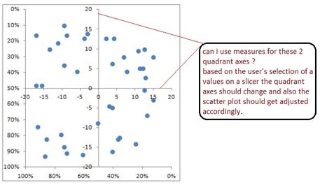
The end user wants to use a combination of a scatter plot and a quadrant chart, where the end user wants to specify the values of the quadrant axes(may be by slicer values) and the scatter plot(data points) should get adjusted based on the end user's values.
Not sure if this is possible with the Scatter chart/custom Quadrant chart...
Any inputs are appreciated...
Thanks !!
Solved! Go to Solution.
- Mark as New
- Bookmark
- Subscribe
- Mute
- Subscribe to RSS Feed
- Permalink
- Report Inappropriate Content
@sd782,
In Power BI Desktop, the Scatter Chart doesn't include quadrants. An idea about showing quadrants in Scatter Chart has been submitted in this link, you can vote it up.
In your scenario, the closest visual that you can create is Quadrant Chart custom visual, you are able to drag measures to X Axis and Y Axis of the custom visual.
Regards,
Lydia
- Mark as New
- Bookmark
- Subscribe
- Mute
- Subscribe to RSS Feed
- Permalink
- Report Inappropriate Content
Hey -
I like the idea of quadrant chart which helps convey a strong message. However, the lines on X axis and Y axis that define these quadrants are not always fixed. It would change if user changes filter selections - for example, from filter country US to UK. Is this flexibility possible?
- Mark as New
- Bookmark
- Subscribe
- Mute
- Subscribe to RSS Feed
- Permalink
- Report Inappropriate Content
voted !!
thank you @Anonymous !!
Helpful resources

New to Fabric Survey
If you have recently started exploring Fabric, we'd love to hear how it's going. Your feedback can help with product improvements.

Power BI DataViz World Championships - June 2026
A new Power BI DataViz World Championship is coming this June! Don't miss out on submitting your entry.

Join our Fabric User Panel
Share feedback directly with Fabric product managers, participate in targeted research studies and influence the Fabric roadmap.

| User | Count |
|---|---|
| 53 | |
| 40 | |
| 38 | |
| 19 | |
| 18 |
| User | Count |
|---|---|
| 70 | |
| 69 | |
| 34 | |
| 33 | |
| 30 |

