A new Data Days event is coming soon!
This time we’re going bigger than ever. Fabric, Power BI, SQL, AI and more. We're covering it all. You won't want to miss it.
Learn more- Power BI forums
- Get Help with Power BI
- Desktop
- Service
- Report Server
- Power Query
- Mobile Apps
- Developer
- DAX Commands and Tips
- Custom Visuals Development Discussion
- Health and Life Sciences
- Power BI Spanish forums
- Translated Spanish Desktop
- Training and Consulting
- Instructor Led Training
- Dashboard in a Day for Women, by Women
- Galleries
- Data Stories Gallery
- Themes Gallery
- Contests Gallery
- QuickViz Gallery
- Quick Measures Gallery
- Visual Calculations Gallery
- Notebook Gallery
- Translytical Task Flow Gallery
- TMDL Gallery
- R Script Showcase
- Webinars and Video Gallery
- Ideas
- Custom Visuals Ideas (read-only)
- Issues
- Issues
- Events
- Upcoming Events
Level up your Power BI skills this month - build one visual each week and tell better stories with data! Get started
- Power BI forums
- Forums
- Get Help with Power BI
- Desktop
- Re: pch and col function not working in R using Po...
- Subscribe to RSS Feed
- Mark Topic as New
- Mark Topic as Read
- Float this Topic for Current User
- Bookmark
- Subscribe
- Printer Friendly Page
- Mark as New
- Bookmark
- Subscribe
- Mute
- Subscribe to RSS Feed
- Permalink
- Report Inappropriate Content
pch and col function not working in R using Power BI
Hi All,
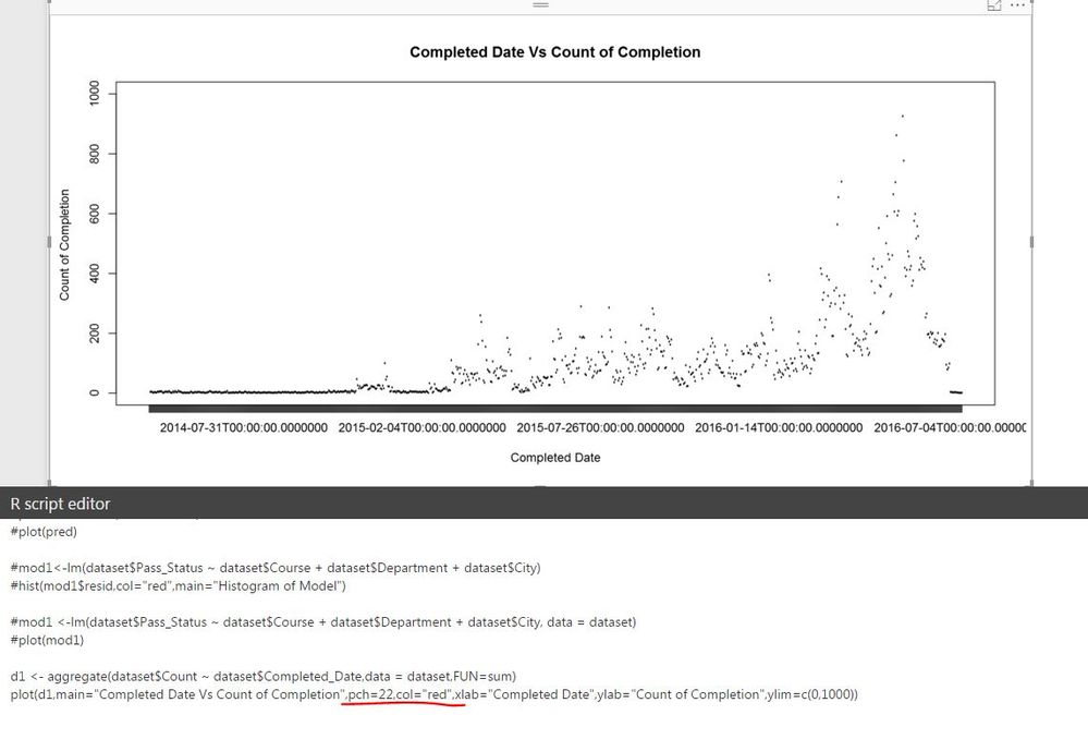
Below is the plot function I am using to plot 2 columns where one is date range and other one is Numeric.
I am getting the plot as desired but now I want to know 2 more things : -
1) Can anyone help me with why pch and col functions are not working in this plot. (highlighted below in red)
2) Can I get rid of the hh:mm:ss from the date range on my plot in X axis.
Thanks,
Abhishek
Solved! Go to Solution.
- Mark as New
- Bookmark
- Subscribe
- Mute
- Subscribe to RSS Feed
- Permalink
- Report Inappropriate Content
Hi abhishekpati86,
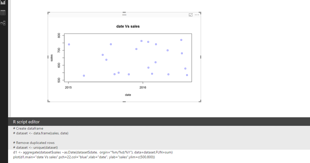
The chart is only able to show the year range under R when using the as.date (date format) function in R.
d1 <- aggregate(dataset$sales ~as.Date(dataset$date, orgin="%m/%d/%Y"), data=dataset,FUN=sum)
plot(d1,main="date Vs sales",pch=22,col="blue",xlab="date", ylab="sales",ylim=c(500,800))
The below is the as.date function reference:
https://stat.ethz.ch/R-manual/R-devel/library/base/html/as.Date.html
See the result:
Check and see if this would be helpful. I will also take a further look into the X range part, and if any helpful things, I will post back.
Regards
- Mark as New
- Bookmark
- Subscribe
- Mute
- Subscribe to RSS Feed
- Permalink
- Report Inappropriate Content
- Mark as New
- Bookmark
- Subscribe
- Mute
- Subscribe to RSS Feed
- Permalink
- Report Inappropriate Content
The list below covers what I know about R in Power BI
That concludes the list 🙂
* Matt is an 8 times Microsoft MVP (Power BI) and author of the Power BI Book Supercharge Power BI.
I will not give you bad advice, even if you unknowingly ask for it.
- Mark as New
- Bookmark
- Subscribe
- Mute
- Subscribe to RSS Feed
- Permalink
- Report Inappropriate Content
That was a cheeky response. I would appreciate if you can point out anyone who can help 🙂
- Mark as New
- Bookmark
- Subscribe
- Mute
- Subscribe to RSS Feed
- Permalink
- Report Inappropriate Content
Can you post your full R script so I can see what modules you are using and any chance you can post some sample data? Also, what R runtime are you using?
Follow on LinkedIn
@ me in replies or I'll lose your thread!!!
Instead of a Kudo, please vote for this idea
Become an expert!: Enterprise DNA
External Tools: MSHGQM
YouTube Channel!: Microsoft Hates Greg
Latest book!: DAX For Humans
DAX is easy, CALCULATE makes DAX hard...
- Mark as New
- Bookmark
- Subscribe
- Mute
- Subscribe to RSS Feed
- Permalink
- Report Inappropriate Content
Hey,
Below is the rcode I am using.
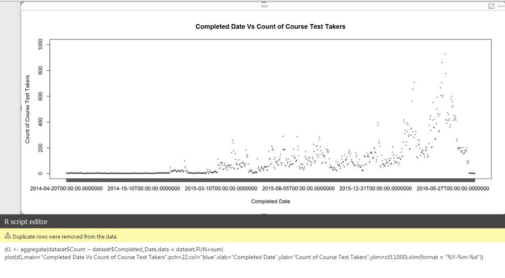
d1 <- aggregate(dataset$Count ~ dataset$Completed_Date,data = dataset,FUN=sum)
plot(d1,main="Completed Date Vs Count of Course Test Takers",pch=22,col="blue",xlab="Completed Date",ylab="Count of Course Test Takers",ylim=c(0,1000))
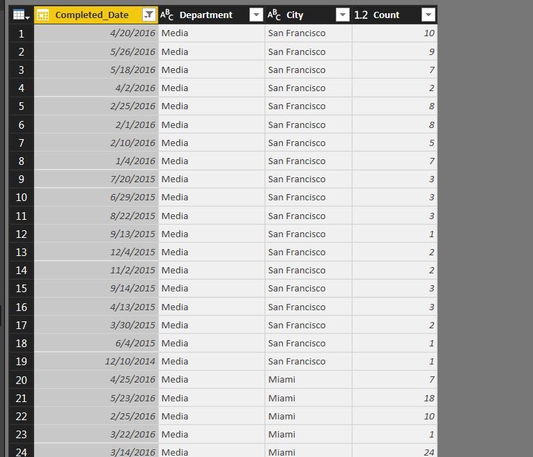
I have loaded a bunch of packages on R (version 3.3.1) and here goes the sample data.
- Mark as New
- Bookmark
- Subscribe
- Mute
- Subscribe to RSS Feed
- Permalink
- Report Inappropriate Content
OK, just as another quick question, in your R IDE outside of Power BI Desktop does it work correctly?
Follow on LinkedIn
@ me in replies or I'll lose your thread!!!
Instead of a Kudo, please vote for this idea
Become an expert!: Enterprise DNA
External Tools: MSHGQM
YouTube Channel!: Microsoft Hates Greg
Latest book!: DAX For Humans
DAX is easy, CALCULATE makes DAX hard...
- Mark as New
- Bookmark
- Subscribe
- Mute
- Subscribe to RSS Feed
- Permalink
- Report Inappropriate Content
Hi,
I haven't uploaded this particular dataset but normal pch and col commands works fine on other dataset in my R Desktop.
Thanks,
Abhishek
- Mark as New
- Bookmark
- Subscribe
- Mute
- Subscribe to RSS Feed
- Permalink
- Report Inappropriate Content
Hi All,
I was able to solve the last issue but now I am not able to format the X axis dates to mm-dd-yyyy format.
Currently my date field in x axis is showing in yyyy-mm-dd hh:mm:ssss.
Thanks,
Abhishek
- Mark as New
- Bookmark
- Subscribe
- Mute
- Subscribe to RSS Feed
- Permalink
- Report Inappropriate Content
Hi abhishekpati86,
The chart is only able to show the year range under R when using the as.date (date format) function in R.
d1 <- aggregate(dataset$sales ~as.Date(dataset$date, orgin="%m/%d/%Y"), data=dataset,FUN=sum)
plot(d1,main="date Vs sales",pch=22,col="blue",xlab="date", ylab="sales",ylim=c(500,800))
The below is the as.date function reference:
https://stat.ethz.ch/R-manual/R-devel/library/base/html/as.Date.html
See the result:
Check and see if this would be helpful. I will also take a further look into the X range part, and if any helpful things, I will post back.
Regards
- Mark as New
- Bookmark
- Subscribe
- Mute
- Subscribe to RSS Feed
- Permalink
- Report Inappropriate Content
@v-micsh-msft -- Thanks Michael, it did solve the issue. My pch and col functions that didn't work earlier have also started responding.
Cheers,
Abhi
Helpful resources

Power BI Monthly Update - April 2026
Check out the April 2026 Power BI update to learn about new features.

Data Days 2026 coming soon!
Sign up to receive a private message when registration opens and key events begin.

New to Fabric Survey
If you have recently started exploring Fabric, we'd love to hear how it's going. Your feedback can help with product improvements.

| User | Count |
|---|---|
| 37 | |
| 28 | |
| 28 | |
| 19 | |
| 18 |
| User | Count |
|---|---|
| 69 | |
| 38 | |
| 32 | |
| 28 | |
| 24 |


