- Power BI forums
- Get Help with Power BI
- Desktop
- Service
- Report Server
- Power Query
- Mobile Apps
- Developer
- DAX Commands and Tips
- Custom Visuals Development Discussion
- Health and Life Sciences
- Power BI Spanish forums
- Translated Spanish Desktop
- Training and Consulting
- Instructor Led Training
- Dashboard in a Day for Women, by Women
- Galleries
- Data Stories Gallery
- Themes Gallery
- Contests Gallery
- QuickViz Gallery
- Quick Measures Gallery
- Visual Calculations Gallery
- Notebook Gallery
- Translytical Task Flow Gallery
- TMDL Gallery
- R Script Showcase
- Webinars and Video Gallery
- Ideas
- Custom Visuals Ideas (read-only)
- Issues
- Issues
- Events
- Upcoming Events
Join the FabCon + SQLCon recap series. Up next: Power BI, Real-Time Intelligence, IQ and AI, and Data Factory take center stage. All sessions are available on-demand after the live show. Register now
- Power BI forums
- Forums
- Get Help with Power BI
- Desktop
- Re: particular filter visualization
- Subscribe to RSS Feed
- Mark Topic as New
- Mark Topic as Read
- Float this Topic for Current User
- Bookmark
- Subscribe
- Printer Friendly Page
- Mark as New
- Bookmark
- Subscribe
- Mute
- Subscribe to RSS Feed
- Permalink
- Report Inappropriate Content
particular filter visualization
Hi,
is it possible to create a filter in this format or something similar? Any ideas?
Thank you
Solved! Go to Solution.
- Mark as New
- Bookmark
- Subscribe
- Mute
- Subscribe to RSS Feed
- Permalink
- Report Inappropriate Content
Hi @Giada_Togliatti ,
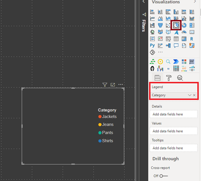
You can use Legend on a visual as a filter.
Legends by default are created the same way as in your screenshot.
As a workaround, create an empty chart with just value in legend section and use it as a filter.
Something like shown below: (I used a PIE CHART visual)
Thanks,
Pragati
- Mark as New
- Bookmark
- Subscribe
- Mute
- Subscribe to RSS Feed
- Permalink
- Report Inappropriate Content
@Giada_Togliatti , In slicer, you can try, orientation - Horizontal , That will give button impact and then you can color items to color buttons
see if that can help
https://docs.microsoft.com/en-us/power-bi/power-bi-slicer-filter-responsive
Helpful resources

Power BI Monthly Update - April 2026
Check out the April 2026 Power BI update to learn about new features.

New to Fabric Survey
If you have recently started exploring Fabric, we'd love to hear how it's going. Your feedback can help with product improvements.

Power BI DataViz World Championships - June 2026
A new Power BI DataViz World Championship is coming this June! Don't miss out on submitting your entry.

| User | Count |
|---|---|
| 42 | |
| 37 | |
| 35 | |
| 22 | |
| 15 |
| User | Count |
|---|---|
| 67 | |
| 58 | |
| 29 | |
| 27 | |
| 25 |


