FabCon is coming to Atlanta
Join us at FabCon Atlanta from March 16 - 20, 2026, for the ultimate Fabric, Power BI, AI and SQL community-led event. Save $200 with code FABCOMM.
Register now!- Power BI forums
- Get Help with Power BI
- Desktop
- Service
- Report Server
- Power Query
- Mobile Apps
- Developer
- DAX Commands and Tips
- Custom Visuals Development Discussion
- Health and Life Sciences
- Power BI Spanish forums
- Translated Spanish Desktop
- Training and Consulting
- Instructor Led Training
- Dashboard in a Day for Women, by Women
- Galleries
- Data Stories Gallery
- Themes Gallery
- Contests Gallery
- QuickViz Gallery
- Quick Measures Gallery
- Visual Calculations Gallery
- Notebook Gallery
- Translytical Task Flow Gallery
- TMDL Gallery
- R Script Showcase
- Webinars and Video Gallery
- Ideas
- Custom Visuals Ideas (read-only)
- Issues
- Issues
- Events
- Upcoming Events
The Power BI Data Visualization World Championships is back! Get ahead of the game and start preparing now! Learn more
- Power BI forums
- Forums
- Get Help with Power BI
- Desktop
- Re: need help understanding Sankey Chart tooltip
- Subscribe to RSS Feed
- Mark Topic as New
- Mark Topic as Read
- Float this Topic for Current User
- Bookmark
- Subscribe
- Printer Friendly Page
- Mark as New
- Bookmark
- Subscribe
- Mute
- Subscribe to RSS Feed
- Permalink
- Report Inappropriate Content
need help understanding Sankey Chart tooltip
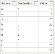
I do not understand what the measure value in the tooltip of the Sankey Chart visual represents. As such, I created a very simple data model to demonstrate. Here is my data:
Here is my visual:
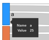
I understand that the height of each bar segment represents the size / weight of the measure for source or destination. And, I understand that the link widths represent the size / weight of the measure as well. However, what does the value in the measure in the tooltip represent? For example, how does Power BI arrive at the value '25' for my "a" value, as shown below?
- Mark as New
- Bookmark
- Subscribe
- Mute
- Subscribe to RSS Feed
- Permalink
- Report Inappropriate Content
Hi @Anonymous ,
As you mentioned, value represents the weight of each path to help us distinguish the path from each source to destination clearly. If we don't put it into the weight field, all of the path will have the same weight.
Here are some blogs and articles about snakey chart that can also help you to understand this visual in details, please refer:
- Visual Awesomeness Unlocked – Sankey diagram
- Power BI Blog: Sankey Chart
- Analyze entity data flow in Power BI Desktop using Sankey charts
- power-bi-custom-visuals-sankey-with-labels
Best Regards,
Yingjie Li
If this post helps then please consider Accept it as the solution to help the other members find it more quickly.
- Mark as New
- Bookmark
- Subscribe
- Mute
- Subscribe to RSS Feed
- Permalink
- Report Inappropriate Content
I was not aware that the set of source values doesn't usually match the set of destination values in Sankey charts. However, in my work, those two sets will be identical, and, even though I can distinguish them with suffixes as you described, my customers don't want them distinguishable. In other words, my paths will always be circular So, I need to understand how Power BI is calculating these values for circular paths. My measure is simply the sum of Value. For the non-circular scenario (i.e., when I distinguish my Source and Destination values with suffixes as you described), the values that I expect to see in the tooltip when hovering over the bar segments on both sides of the chart (i.e., the sum of Value) match what Power BI displays. However, for the circular scenario, the expected values do not match what Power BI displays (for all except one). Below is a comparison of my expected value computations against what Power BI displays:
Again, how is Power BI arriving at the values that it's displaying for this scenario?
- Mark as New
- Bookmark
- Subscribe
- Mute
- Subscribe to RSS Feed
- Permalink
- Report Inappropriate Content
Note that Power BI's implementation of a Sankey is pretty weak. For a more complete (and much scarier) solution you want to use
- Mark as New
- Bookmark
- Subscribe
- Mute
- Subscribe to RSS Feed
- Permalink
- Report Inappropriate Content
that's the destination weight for a.
Normally you are not supposed to have source and destination values match. Unless you want to see the circular routes too.
to be on the safe side change the source a to as and the destination a to ad or similar.
Helpful resources

Power BI Monthly Update - November 2025
Check out the November 2025 Power BI update to learn about new features.

Fabric Data Days
Advance your Data & AI career with 50 days of live learning, contests, hands-on challenges, study groups & certifications and more!

| User | Count |
|---|---|
| 58 | |
| 45 | |
| 40 | |
| 21 | |
| 18 |


