FabCon is coming to Atlanta
Join us at FabCon Atlanta from March 16 - 20, 2026, for the ultimate Fabric, Power BI, AI and SQL community-led event. Save $200 with code FABCOMM.
Register now!- Power BI forums
- Get Help with Power BI
- Desktop
- Service
- Report Server
- Power Query
- Mobile Apps
- Developer
- DAX Commands and Tips
- Custom Visuals Development Discussion
- Health and Life Sciences
- Power BI Spanish forums
- Translated Spanish Desktop
- Training and Consulting
- Instructor Led Training
- Dashboard in a Day for Women, by Women
- Galleries
- Data Stories Gallery
- Themes Gallery
- Contests Gallery
- QuickViz Gallery
- Quick Measures Gallery
- Visual Calculations Gallery
- Notebook Gallery
- Translytical Task Flow Gallery
- TMDL Gallery
- R Script Showcase
- Webinars and Video Gallery
- Ideas
- Custom Visuals Ideas (read-only)
- Issues
- Issues
- Events
- Upcoming Events
Vote for your favorite vizzies from the Power BI Dataviz World Championship submissions. Vote now!
- Power BI forums
- Forums
- Get Help with Power BI
- Desktop
- data in two tables
- Subscribe to RSS Feed
- Mark Topic as New
- Mark Topic as Read
- Float this Topic for Current User
- Bookmark
- Subscribe
- Printer Friendly Page
- Mark as New
- Bookmark
- Subscribe
- Mute
- Subscribe to RSS Feed
- Permalink
- Report Inappropriate Content
data in two tables
Hi
I have two tables containing new sales and service disconnections
table 1)
date, sales man, sales amount in euro
table 2)
date, sales man, disconnection amount euro
I want to get a graph that shows net amounts (total monthly sales - total monthly disconnections) per month per salesman
BR
Solved! Go to Solution.
- Mark as New
- Bookmark
- Subscribe
- Mute
- Subscribe to RSS Feed
- Permalink
- Report Inappropriate Content
Hi @Anonymous,
You should add the month columns in your two tables, and UNION all the rows to one table, calculate the net amounts based on the new table. I try to reproduce your scenario and get expected results as follows.
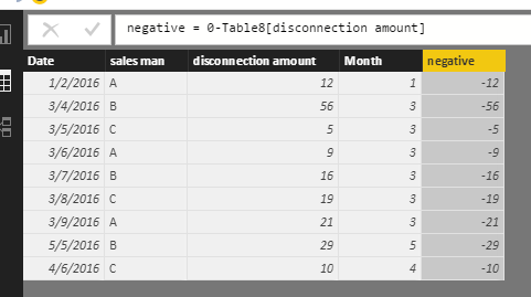
First, add month calculated columns in the two table, mark all the disconnection amount negative using the formulas.
month = MONTH(Table7[Date])
month = MONTH(Table8[Date])
negative = 0-Table8[disconnection amount]
Second, union all the rows into one table using the following formula and get the new table shown in screenshot.
New = UNION(Table7,SELECTCOLUMNS(Table8,"Date",Table8[Date],"salesMan",Table8[sales man],"salesAmount",Table8[negative],"month",Table8[Month]))
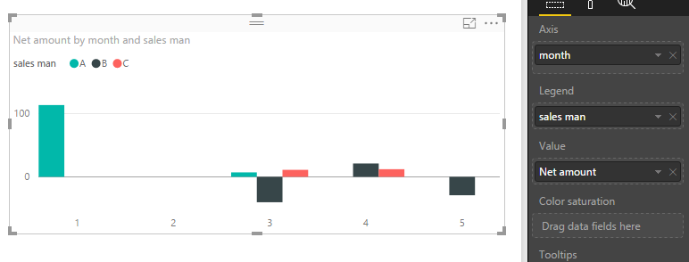
Finally, create a measure used to calculate the net amount per month per salesman, and create a clustered chart. In the following screenshot, in each month, you will see different customer’s net amount. The data below the axis show the net amount is negative.
Net amount = CALCULATE(SUM(New[sales amount]),ALLEXCEPT(New,New[month],New[sales man]))
Best Regards,
Angelia
- Mark as New
- Bookmark
- Subscribe
- Mute
- Subscribe to RSS Feed
- Permalink
- Report Inappropriate Content
Angelia
super. thanks for that.
Helpful resources

Power BI Dataviz World Championships
Vote for your favorite vizzies from the Power BI World Championship submissions!

Join our Community Sticker Challenge 2026
If you love stickers, then you will definitely want to check out our Community Sticker Challenge!

Power BI Monthly Update - January 2026
Check out the January 2026 Power BI update to learn about new features.

| User | Count |
|---|---|
| 63 | |
| 51 | |
| 41 | |
| 23 | |
| 18 |
| User | Count |
|---|---|
| 130 | |
| 111 | |
| 48 | |
| 30 | |
| 28 |


