FabCon is coming to Atlanta
Join us at FabCon Atlanta from March 16 - 20, 2026, for the ultimate Fabric, Power BI, AI and SQL community-led event. Save $200 with code FABCOMM.
Register now!- Power BI forums
- Get Help with Power BI
- Desktop
- Service
- Report Server
- Power Query
- Mobile Apps
- Developer
- DAX Commands and Tips
- Custom Visuals Development Discussion
- Health and Life Sciences
- Power BI Spanish forums
- Translated Spanish Desktop
- Training and Consulting
- Instructor Led Training
- Dashboard in a Day for Women, by Women
- Galleries
- Data Stories Gallery
- Themes Gallery
- Contests Gallery
- QuickViz Gallery
- Quick Measures Gallery
- Visual Calculations Gallery
- Notebook Gallery
- Translytical Task Flow Gallery
- TMDL Gallery
- R Script Showcase
- Webinars and Video Gallery
- Ideas
- Custom Visuals Ideas (read-only)
- Issues
- Issues
- Events
- Upcoming Events
The Power BI Data Visualization World Championships is back! Get ahead of the game and start preparing now! Learn more
- Power BI forums
- Forums
- Get Help with Power BI
- Desktop
- Re: create Jobs Duration Time Series Graph
- Subscribe to RSS Feed
- Mark Topic as New
- Mark Topic as Read
- Float this Topic for Current User
- Bookmark
- Subscribe
- Printer Friendly Page
- Mark as New
- Bookmark
- Subscribe
- Mute
- Subscribe to RSS Feed
- Permalink
- Report Inappropriate Content
create Jobs Duration Time Series Graph
Hi!
I have dataset that looks like this:
| Job Name | Start | End | Duration (days) |
| JOB24 | 12.07.2018 03:00:53 | 12.07.2018 03:30:53 | 0,020833333 |
| JOB23 | 12.07.2018 02:37:36 | 12.07.2018 02:38:09 | 0,000381944 |
| JOB22 | 12.07.2018 02:37:36 | 12.07.2018 02:38:04 | 0,000324074 |
| JOB21 | 12.07.2018 02:37:13 | 12.07.2018 02:37:14 | 1,15741E-05 |
..........
Start and End have DateTime type. Duration is simply End minus Start.
Some Jobs overlap in time.
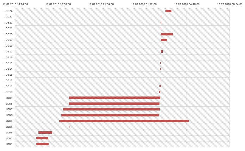
I am trying to visualize Jobs Flow using Stacked Bar Chart. Ideally (reproduced in Excel) it should look like this:
Please help to create similar Graph in Power BI Desktop.
In Excel I set 'Start' and 'Duration' to Legend and then 'No fill' Start. In Power BI Desktop only one variable possible to add to the Legend.
Solved! Go to Solution.
- Mark as New
- Bookmark
- Subscribe
- Mute
- Subscribe to RSS Feed
- Permalink
- Report Inappropriate Content
Hi k0ater,
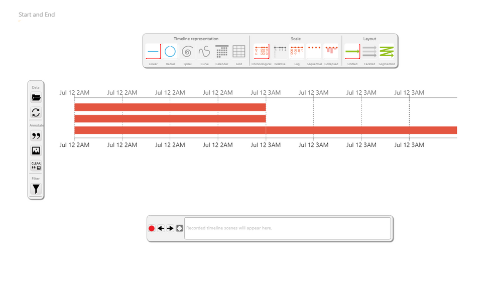
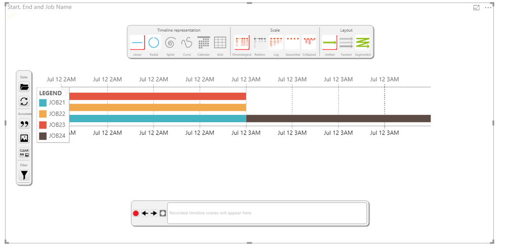
Add this custom visual to your report:
You just have to put the start date and the end date.
The visual is very powerful, so I let the configuration of the visual to you.
But you should be able to see somenthing like this:
or this:
If my answer is what you where looking for, please mark it as accepted. Like this, others can benefit from my answer too.
Regards
- Mark as New
- Bookmark
- Subscribe
- Mute
- Subscribe to RSS Feed
- Permalink
- Report Inappropriate Content
Thanks! Thats exactly what I need
Helpful resources

Power BI Dataviz World Championships
The Power BI Data Visualization World Championships is back! Get ahead of the game and start preparing now!

| User | Count |
|---|---|
| 39 | |
| 37 | |
| 33 | |
| 33 | |
| 29 |
| User | Count |
|---|---|
| 132 | |
| 90 | |
| 78 | |
| 66 | |
| 65 |


