FabCon is coming to Atlanta
Join us at FabCon Atlanta from March 16 - 20, 2026, for the ultimate Fabric, Power BI, AI and SQL community-led event. Save $200 with code FABCOMM.
Register now!- Power BI forums
- Get Help with Power BI
- Desktop
- Service
- Report Server
- Power Query
- Mobile Apps
- Developer
- DAX Commands and Tips
- Custom Visuals Development Discussion
- Health and Life Sciences
- Power BI Spanish forums
- Translated Spanish Desktop
- Training and Consulting
- Instructor Led Training
- Dashboard in a Day for Women, by Women
- Galleries
- Data Stories Gallery
- Themes Gallery
- Contests Gallery
- Quick Measures Gallery
- Notebook Gallery
- Translytical Task Flow Gallery
- TMDL Gallery
- R Script Showcase
- Webinars and Video Gallery
- Ideas
- Custom Visuals Ideas (read-only)
- Issues
- Issues
- Events
- Upcoming Events
To celebrate FabCon Vienna, we are offering 50% off select exams. Ends October 3rd. Request your discount now.
- Power BI forums
- Forums
- Get Help with Power BI
- Desktop
- Re: convert simple Excel chart into Power BI
- Subscribe to RSS Feed
- Mark Topic as New
- Mark Topic as Read
- Float this Topic for Current User
- Bookmark
- Subscribe
- Printer Friendly Page
- Mark as New
- Bookmark
- Subscribe
- Mute
- Subscribe to RSS Feed
- Permalink
- Report Inappropriate Content
convert simple Excel chart into Power BI
Hi,
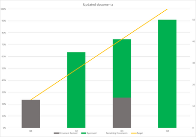
I'm trying to recreate an Excel Table in Power Bi - never thought it would seem so complex to create something so simple - maybe its just because I am a novice. Anyway, trying to get Three different stages for documents monitored over four quarters of the year - with trendline for target. Simple right? Not for me - here is the chart in Excel and the data - please tell me what I am doing wrong - I get the chart created etc but maybe my data points in the imported Excel are wrong? no idea. Thank you in advance!
| Q1 | Q2 | Q3 | Q4 | |
| Document Revised | 13 | 0 | 14 | 0 |
| Approved | 0 | 35 | 27 | 50 |
| Remaining Documents | 42 | 20 | 14 | 5 |
| Target | 13 | 27 | 41 | 55 |
- Mark as New
- Bookmark
- Subscribe
- Mute
- Subscribe to RSS Feed
- Permalink
- Report Inappropriate Content
@Rosie64, Yes, it is doable.
You may need a measure for Target,
Target = CALCULATE(
     SUM('Table'[Value]),
     'Table'[Type] = "Target"
)
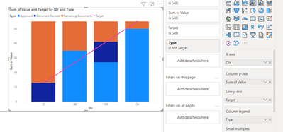
Add the category to the column legend property and exclude Target at the visual level filter, add value column to column y-axis and the target measure to Line y-axis
Helpful resources
| User | Count |
|---|---|
| 98 | |
| 76 | |
| 74 | |
| 49 | |
| 26 |


