Become a Certified Power BI Data Analyst!
Join us for an expert-led overview of the tools and concepts you'll need to pass exam PL-300. The first session starts on June 11th. See you there!
Get registered- Power BI forums
- Get Help with Power BI
- Desktop
- Service
- Report Server
- Power Query
- Mobile Apps
- Developer
- DAX Commands and Tips
- Custom Visuals Development Discussion
- Health and Life Sciences
- Power BI Spanish forums
- Translated Spanish Desktop
- Training and Consulting
- Instructor Led Training
- Dashboard in a Day for Women, by Women
- Galleries
- Webinars and Video Gallery
- Data Stories Gallery
- Themes Gallery
- Contests Gallery
- Quick Measures Gallery
- Notebook Gallery
- Translytical Task Flow Gallery
- R Script Showcase
- Ideas
- Custom Visuals Ideas (read-only)
- Issues
- Issues
- Events
- Upcoming Events
Power BI is turning 10! Let’s celebrate together with dataviz contests, interactive sessions, and giveaways. Register now.
- Power BI forums
- Forums
- Get Help with Power BI
- Desktop
- combining data of two tables into one graph
- Subscribe to RSS Feed
- Mark Topic as New
- Mark Topic as Read
- Float this Topic for Current User
- Bookmark
- Subscribe
- Printer Friendly Page
- Mark as New
- Bookmark
- Subscribe
- Mute
- Subscribe to RSS Feed
- Permalink
- Report Inappropriate Content
combining data of two tables into one graph
Hi I like to combine two tables of data into one bar chart.
this this the first data table:
| Forecast data | Amount | Expecteddate | DateofForecast | Product | |||
| 80 | 1-6-2016 | 27-4-2016 | Red | ||||
| 90 | 1-6-2016 | 4-5-2016 | Red | ||||
| 95 | 1-6-2016 | 11-5-2016 | Red | ||||
| 98 | 1-6-2016 | 18-5-2016 | Red | ||||
| 100 | 1-6-2016 | 25-5-2016 | Red | ||||
| 90 | 5-6-2016 | 1-5-2016 | Green | ||||
| 95 | 5-6-2016 | 8-5-2016 | Green | ||||
| 100 | 5-6-2016 | 15-5-2016 | Green | ||||
| 108 | 5-6-2016 | 22-5-2016 | Green | ||||
| 110 | 5-6-2016 | 29-5-2016 | Green |
This is the second datatable.
| Amount | Expecteddate | DateofForecast | Product | ||||
| actuals data | 101 | 1-6-2016 | 1-6-2016 | Red | |||
| 112 | 5-6-2016 | 5-6-2016 | Green |
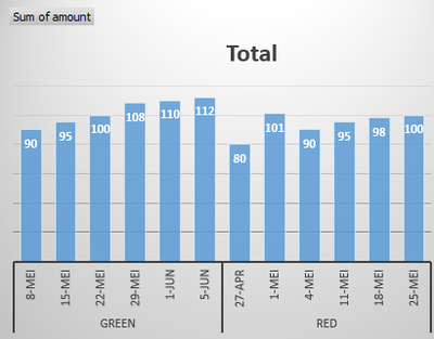
The bar chart could look like this
The bars should be clustered by expecteddate and product
The last bar of the product (= actuals) may be different color.
I like to have this analysis over a month period for example.
Any ideaS how to do this?
JohnD2
Solved! Go to Solution.
- Mark as New
- Bookmark
- Subscribe
- Mute
- Subscribe to RSS Feed
- Permalink
- Report Inappropriate Content
Hi sridevi,
In your scenario, you should combine the two tables into a single one first.
uniontable = UNION(ADDCOLUMNS(Actual,"Actuals","actual forecast"),ADDCOLUMNS(Forcecast,"Actuals","Forcecast forecast"))
To distinguish the bar color between actual value and forcecast value, you can add anextra legend in the chart.
If you have any question, please feel free to ask.
Best regards,
Yuliana Gu
If this post helps, then please consider Accept it as the solution to help the other members find it more quickly.
- Mark as New
- Bookmark
- Subscribe
- Mute
- Subscribe to RSS Feed
- Permalink
- Report Inappropriate Content
Hi John,
Please see attached file here for your solution.
You have to append your Actuals Table onto the Forecast Table and You can load this query into the PowerBI and Create Bar Chart visual with data labels on to visualize your output.
Thanks & Regards,
Bhavesh
Bhavesh
Love the Self Service BI.
Please use the 'Mark as answer' link to mark a post that answers your question. If you find a reply helpful, please remember to give Kudos.
Helpful resources
| User | Count |
|---|---|
| 84 | |
| 78 | |
| 70 | |
| 49 | |
| 41 |
| User | Count |
|---|---|
| 111 | |
| 56 | |
| 50 | |
| 42 | |
| 40 |


