FabCon is coming to Atlanta
Join us at FabCon Atlanta from March 16 - 20, 2026, for the ultimate Fabric, Power BI, AI and SQL community-led event. Save $200 with code FABCOMM.
Register now!- Power BI forums
- Get Help with Power BI
- Desktop
- Service
- Report Server
- Power Query
- Mobile Apps
- Developer
- DAX Commands and Tips
- Custom Visuals Development Discussion
- Health and Life Sciences
- Power BI Spanish forums
- Translated Spanish Desktop
- Training and Consulting
- Instructor Led Training
- Dashboard in a Day for Women, by Women
- Galleries
- Data Stories Gallery
- Themes Gallery
- Contests Gallery
- Quick Measures Gallery
- Notebook Gallery
- Translytical Task Flow Gallery
- TMDL Gallery
- R Script Showcase
- Webinars and Video Gallery
- Ideas
- Custom Visuals Ideas (read-only)
- Issues
- Issues
- Events
- Upcoming Events
Calling all Data Engineers! Fabric Data Engineer (Exam DP-700) live sessions are back! Starting October 16th. Sign up.
- Power BI forums
- Forums
- Get Help with Power BI
- Desktop
- chart with start and end date
- Subscribe to RSS Feed
- Mark Topic as New
- Mark Topic as Read
- Float this Topic for Current User
- Bookmark
- Subscribe
- Printer Friendly Page
- Mark as New
- Bookmark
- Subscribe
- Mute
- Subscribe to RSS Feed
- Permalink
- Report Inappropriate Content
chart with start and end date
I would like to create a line chart based on data that only has a start and end date.
Here is a sample of the data
Type Start Date End Date
| IW | 12/01/2017 | 12/31/2017 |
| IW | 12/01/2017 | 12/31/2017 |
| JL | 12/01/2017 | 12/31/2017 |
| JL | 12/01/2017 | 12/14/2017 |
| EC | 12/15/2017 | 12/31/2017 |
| IW | 12/01/2017 | 12/24/2017 |
Ideally it would group based on Type and then create a line chart with the Y Axis as Type and the X-Axis would be the Start Date to the End Date range. Then for each day in between start and end it would have the Count of Type.
Solved! Go to Solution.
- Mark as New
- Bookmark
- Subscribe
- Mute
- Subscribe to RSS Feed
- Permalink
- Report Inappropriate Content
Hi @jeffr,
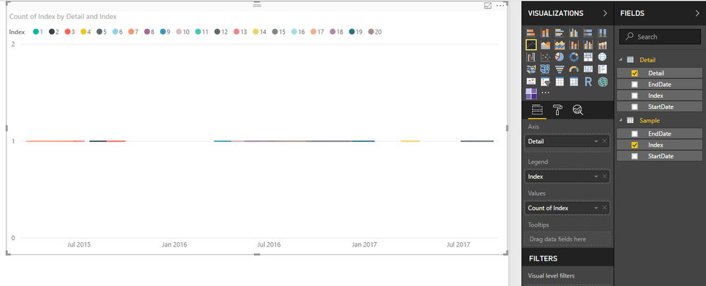
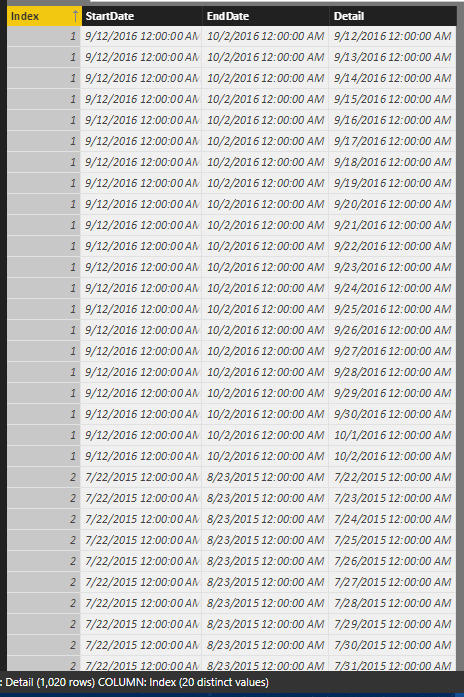
You can try to use below formula to generate the detail date table, then build relationship between original table and new table. After these steps, you can use new date form new table as the axis and drag id to value field with summary mode count.
Original table:
Sample:
Detail =
VAR temp =
    SELECTCOLUMNS (
        'Sample',
        "Index", [Index],
        "StartDate", [StartDate],
        "EndDate", [EndDate]
    )
VAR vCalendar =
    CALENDAR ( MINX ( temp, [StartDate] ), MAXX ( temp, [EndDate] ) )
RETURN
    SELECTCOLUMNS (
        FILTER (
            CROSSJOIN ( temp, vCalendar ),
            [StartDate] <= [Date]
                && [EndDate] >= [Date]
        ),
        "Index", [Index],
        "StartDate", [StartDate],
        "EndDate", [EndDate],
        "Detail", [Date]
    )
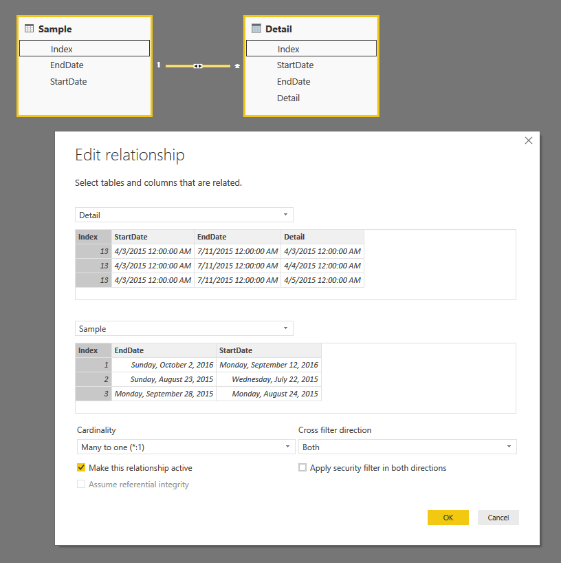
Create line chart with above columns:
Regards,
Xiaoxin Sheng
- Mark as New
- Bookmark
- Subscribe
- Mute
- Subscribe to RSS Feed
- Permalink
- Report Inappropriate Content
Hi,
You have reposted this question. I had shared my solution in your previous post. Here is the download link to my solution.
Hope this helps.
Regards,
Ashish Mathur
http://www.ashishmathur.com
https://www.linkedin.com/in/excelenthusiasts/
- Mark as New
- Bookmark
- Subscribe
- Mute
- Subscribe to RSS Feed
- Permalink
- Report Inappropriate Content
Hi @jeffr,
You can try to use below formula to generate the detail date table, then build relationship between original table and new table. After these steps, you can use new date form new table as the axis and drag id to value field with summary mode count.
Original table:
Sample:
Detail =
VAR temp =
    SELECTCOLUMNS (
        'Sample',
        "Index", [Index],
        "StartDate", [StartDate],
        "EndDate", [EndDate]
    )
VAR vCalendar =
    CALENDAR ( MINX ( temp, [StartDate] ), MAXX ( temp, [EndDate] ) )
RETURN
    SELECTCOLUMNS (
        FILTER (
            CROSSJOIN ( temp, vCalendar ),
            [StartDate] <= [Date]
                && [EndDate] >= [Date]
        ),
        "Index", [Index],
        "StartDate", [StartDate],
        "EndDate", [EndDate],
        "Detail", [Date]
    )


Create line chart with above columns:
Regards,
Xiaoxin Sheng
- Mark as New
- Bookmark
- Subscribe
- Mute
- Subscribe to RSS Feed
- Permalink
- Report Inappropriate Content
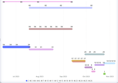
Thanks @Anonymous. This method works but the only issue I have is the data label in the Y axis duplicates excatly 4 times, not sure why, though the numbers are correct (screenshot attached). Any lead how to resolve this? Thanks!
- Mark as New
- Bookmark
- Subscribe
- Mute
- Subscribe to RSS Feed
- Permalink
- Report Inappropriate Content
hey,
if you goal is to show the time period please refer to following posts:
"Event-in-Progress"
https://community.powerbi.com/t5/Desktop/Count-of-Active-Contracts-by-Start-en-End-date/td-p/94104

