Join the #PBI10 DataViz contest
Power BI is turning 10, and we’re marking the occasion with a special community challenge. Use your creativity to tell a story, uncover trends, or highlight something unexpected.
Get started- Power BI forums
- Get Help with Power BI
- Desktop
- Service
- Report Server
- Power Query
- Mobile Apps
- Developer
- DAX Commands and Tips
- Custom Visuals Development Discussion
- Health and Life Sciences
- Power BI Spanish forums
- Translated Spanish Desktop
- Training and Consulting
- Instructor Led Training
- Dashboard in a Day for Women, by Women
- Galleries
- Webinars and Video Gallery
- Data Stories Gallery
- Themes Gallery
- Contests Gallery
- Quick Measures Gallery
- Notebook Gallery
- Translytical Task Flow Gallery
- R Script Showcase
- Ideas
- Custom Visuals Ideas (read-only)
- Issues
- Issues
- Events
- Upcoming Events
Join us for an expert-led overview of the tools and concepts you'll need to become a Certified Power BI Data Analyst and pass exam PL-300. Register now.
- Power BI forums
- Forums
- Get Help with Power BI
- Desktop
- Re: bar chart suggestion to show zero values
- Subscribe to RSS Feed
- Mark Topic as New
- Mark Topic as Read
- Float this Topic for Current User
- Bookmark
- Subscribe
- Printer Friendly Page
- Mark as New
- Bookmark
- Subscribe
- Mute
- Subscribe to RSS Feed
- Permalink
- Report Inappropriate Content
bar chart suggestion to show zero values
Hi,
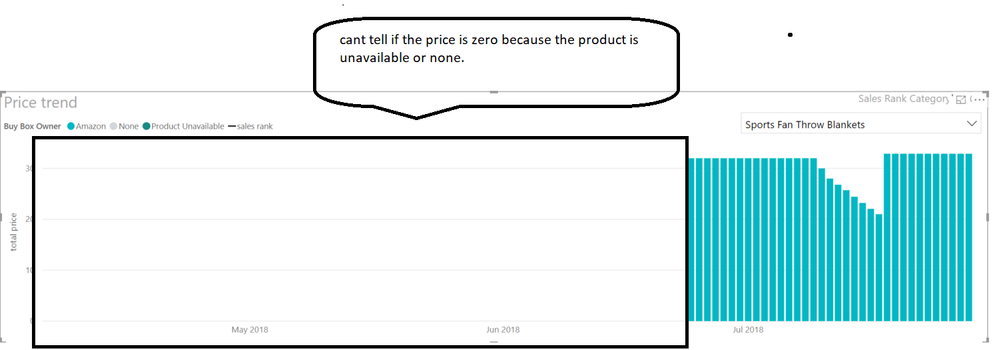
I am trying to display category wise price trend over time, I have two distinct categories for which price can be zero: one when the product is unavailable, second when the product is none (don't bother about the logic behind it). Right now i don't have a way to distinguish between these two categories in the column chart, what do you guys suggest I do?
Thank
Solved! Go to Solution.
- Mark as New
- Bookmark
- Subscribe
- Mute
- Subscribe to RSS Feed
- Permalink
- Report Inappropriate Content
Hi @Anonymous,
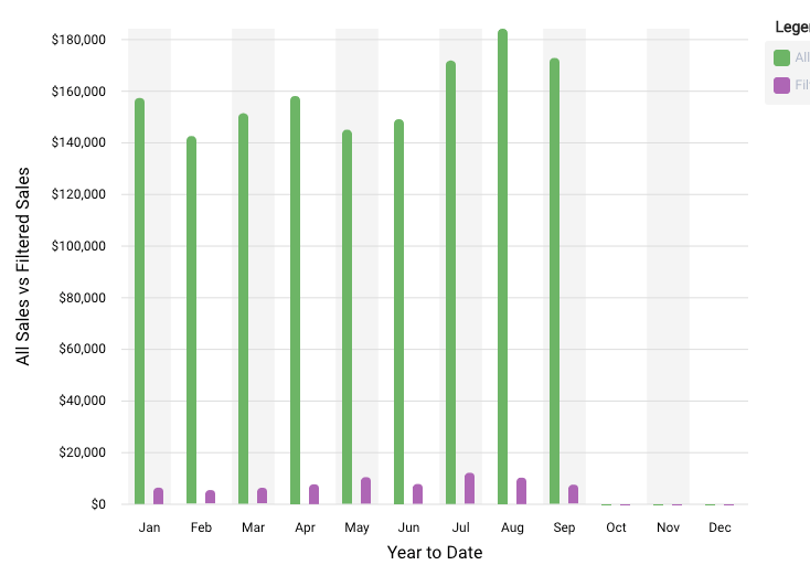
The circled values in Oct, Nov and Dec is zero, right? I'm afraid the chart visual in Power BI cannot display zero value like this.
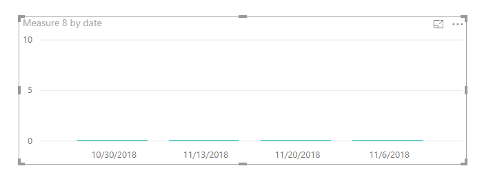
As a workaround, you can show 0.000001 which approximately equals to 0 in a chart. For example, if your original measure is like: Measure =SUM ( Table[Value] )
Please modify it to:
Measure =IF ( SUM ( Table[Value] ) = BLANK (), 0.00001, SUM ( Table[Value] ) )
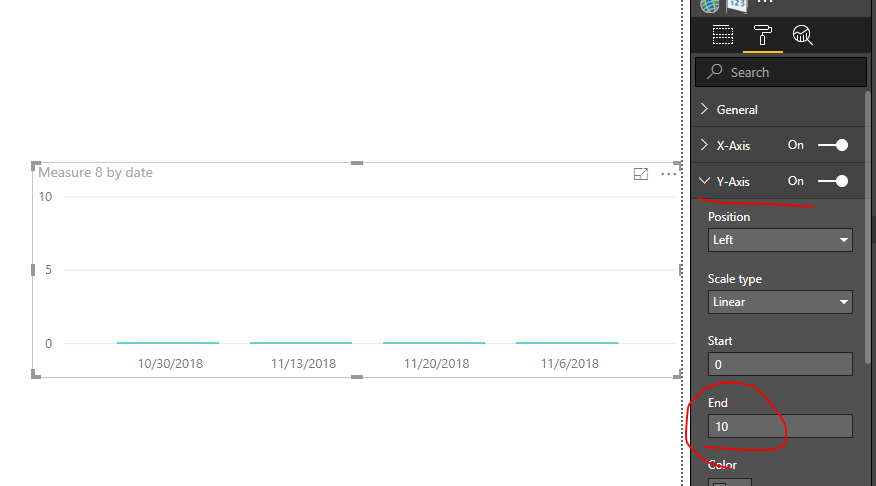
Remember to specify the End value of Y-axis.
Best regards,
Yuliana Gu
If this post helps, then please consider Accept it as the solution to help the other members find it more quickly.
- Mark as New
- Bookmark
- Subscribe
- Mute
- Subscribe to RSS Feed
- Permalink
- Report Inappropriate Content
Hi @Anonymous,
How to you want to show zero values in a chart? Can you show us an example?
Regards,
Yuliana Gu
If this post helps, then please consider Accept it as the solution to help the other members find it more quickly.
- Mark as New
- Bookmark
- Subscribe
- Mute
- Subscribe to RSS Feed
- Permalink
- Report Inappropriate Content
something like this:
- Mark as New
- Bookmark
- Subscribe
- Mute
- Subscribe to RSS Feed
- Permalink
- Report Inappropriate Content
Hi @Anonymous,
The circled values in Oct, Nov and Dec is zero, right? I'm afraid the chart visual in Power BI cannot display zero value like this.
As a workaround, you can show 0.000001 which approximately equals to 0 in a chart. For example, if your original measure is like: Measure =SUM ( Table[Value] )
Please modify it to:
Measure =IF ( SUM ( Table[Value] ) = BLANK (), 0.00001, SUM ( Table[Value] ) )
Remember to specify the End value of Y-axis.
Best regards,
Yuliana Gu
If this post helps, then please consider Accept it as the solution to help the other members find it more quickly.
- Mark as New
- Bookmark
- Subscribe
- Mute
- Subscribe to RSS Feed
- Permalink
- Report Inappropriate Content
Thank you for that work-around on this! Was also wondering how could I show data with zero values because I want a complete 12-month x-axis reference.
If in case no one has shared this yet, the formula would also work if you entered the value "0" instead of "0.0001". I noticed that if you did this, then the data label would show "0" instead of "1.0-E".
Helpful resources

Join our Fabric User Panel
This is your chance to engage directly with the engineering team behind Fabric and Power BI. Share your experiences and shape the future.

Power BI Monthly Update - June 2025
Check out the June 2025 Power BI update to learn about new features.

| User | Count |
|---|---|
| 79 | |
| 73 | |
| 58 | |
| 36 | |
| 32 |
| User | Count |
|---|---|
| 90 | |
| 60 | |
| 60 | |
| 49 | |
| 45 |


