FabCon is coming to Atlanta
Join us at FabCon Atlanta from March 16 - 20, 2026, for the ultimate Fabric, Power BI, AI and SQL community-led event. Save $200 with code FABCOMM.
Register now!- Power BI forums
- Get Help with Power BI
- Desktop
- Service
- Report Server
- Power Query
- Mobile Apps
- Developer
- DAX Commands and Tips
- Custom Visuals Development Discussion
- Health and Life Sciences
- Power BI Spanish forums
- Translated Spanish Desktop
- Training and Consulting
- Instructor Led Training
- Dashboard in a Day for Women, by Women
- Galleries
- Data Stories Gallery
- Themes Gallery
- Contests Gallery
- QuickViz Gallery
- Quick Measures Gallery
- Visual Calculations Gallery
- Notebook Gallery
- Translytical Task Flow Gallery
- TMDL Gallery
- R Script Showcase
- Webinars and Video Gallery
- Ideas
- Custom Visuals Ideas (read-only)
- Issues
- Issues
- Events
- Upcoming Events
View all the Fabric Data Days sessions on demand. View schedule
- Power BI forums
- Forums
- Get Help with Power BI
- Desktop
- azure map bubble color as per conditional
- Subscribe to RSS Feed
- Mark Topic as New
- Mark Topic as Read
- Float this Topic for Current User
- Bookmark
- Subscribe
- Printer Friendly Page
- Mark as New
- Bookmark
- Subscribe
- Mute
- Subscribe to RSS Feed
- Permalink
- Report Inappropriate Content
azure map bubble color as per conditional
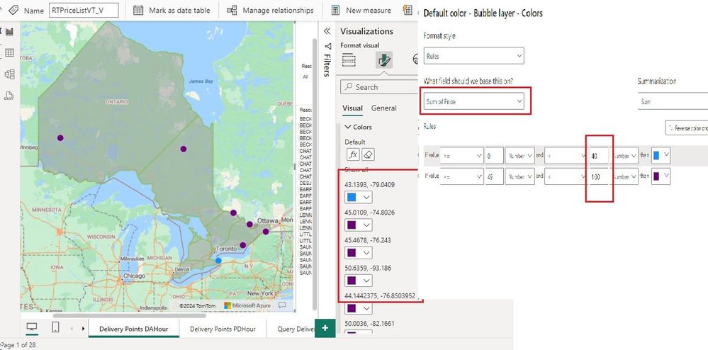
I am using Azure Map vsiual in this the bubbles are displayed by the latitude and longitude cordinates, here now I want to show the bubbles color as per the price values contains, when I am trying to do the range is taking defaulty on basis of latitude and longitudes instead of price values. Here I am attaching the images FYI.
- Mark as New
- Bookmark
- Subscribe
- Mute
- Subscribe to RSS Feed
- Permalink
- Report Inappropriate Content
Hi, @aboge
Have you solved your problem? If so, can you share your solution here and mark the correct answer as a standard answer to help other members find it faster? Thank you very much for your kind cooperation!
Best Regards
Yongkang Hua
- Mark as New
- Bookmark
- Subscribe
- Mute
- Subscribe to RSS Feed
- Permalink
- Report Inappropriate Content
To customize the bubble colors in the Azure Map visual in Power BI based on price values, you can follow these steps:
1. **Create a Measure for Price Range**:
First, create a measure in your dataset that assigns a range to each price value. You can use DAX to define this measure based on your price data. For example, if you want to create three price ranges (low, medium, high), you can define the measure like this:
```DAX
Price Range =
SWITCH(
TRUE(),
[Price] <= 50, "Low",
AND([Price] > 50, [Price] <= 100), "Medium",
[Price] > 100, "High"
)
```
Adjust the price ranges and thresholds according to your specific requirements.
2. **Add Price Range Measure to Legend**:
In your Azure Map visual, add the `Price Range` measure to the Legend field. This will categorize the bubbles based on their price ranges.
3. **Customize Bubble Colors**:
Once the legend is added, you can customize the bubble colors based on the price ranges. Follow these steps:
- Click on the Format pane for the Azure Map visual.
- Go to the Legend section.
- Under Legend Items, you should see the categories for your price ranges (e.g., Low, Medium, High).
- Click on each category to customize its color.
- Choose a color for each price range category that you defined in the Price Range measure.
By following these steps, you'll be able to customize the bubble colors in the Azure Map visual based on the price values in your dataset. The bubbles will be colored according to the price ranges you defined, allowing you to visually differentiate between different price levels.
Did I answer your question? Mark my post as a solution! Appreciate your Kudos !!
Helpful resources

Power BI Monthly Update - November 2025
Check out the November 2025 Power BI update to learn about new features.

Fabric Data Days
Advance your Data & AI career with 50 days of live learning, contests, hands-on challenges, study groups & certifications and more!


