- Power BI forums
- Updates
- News & Announcements
- Get Help with Power BI
- Desktop
- Service
- Report Server
- Power Query
- Mobile Apps
- Developer
- DAX Commands and Tips
- Custom Visuals Development Discussion
- Health and Life Sciences
- Power BI Spanish forums
- Translated Spanish Desktop
- Power Platform Integration - Better Together!
- Power Platform Integrations (Read-only)
- Power Platform and Dynamics 365 Integrations (Read-only)
- Training and Consulting
- Instructor Led Training
- Dashboard in a Day for Women, by Women
- Galleries
- Community Connections & How-To Videos
- COVID-19 Data Stories Gallery
- Themes Gallery
- Data Stories Gallery
- R Script Showcase
- Webinars and Video Gallery
- Quick Measures Gallery
- 2021 MSBizAppsSummit Gallery
- 2020 MSBizAppsSummit Gallery
- 2019 MSBizAppsSummit Gallery
- Events
- Ideas
- Custom Visuals Ideas
- Issues
- Issues
- Events
- Upcoming Events
- Community Blog
- Power BI Community Blog
- Custom Visuals Community Blog
- Community Support
- Community Accounts & Registration
- Using the Community
- Community Feedback
Register now to learn Fabric in free live sessions led by the best Microsoft experts. From Apr 16 to May 9, in English and Spanish.
- Power BI forums
- Forums
- Get Help with Power BI
- Desktop
- Re: $ and % in the one column
- Subscribe to RSS Feed
- Mark Topic as New
- Mark Topic as Read
- Float this Topic for Current User
- Bookmark
- Subscribe
- Printer Friendly Page
- Mark as New
- Bookmark
- Subscribe
- Mute
- Subscribe to RSS Feed
- Permalink
- Report Inappropriate Content
$ and % in the one column
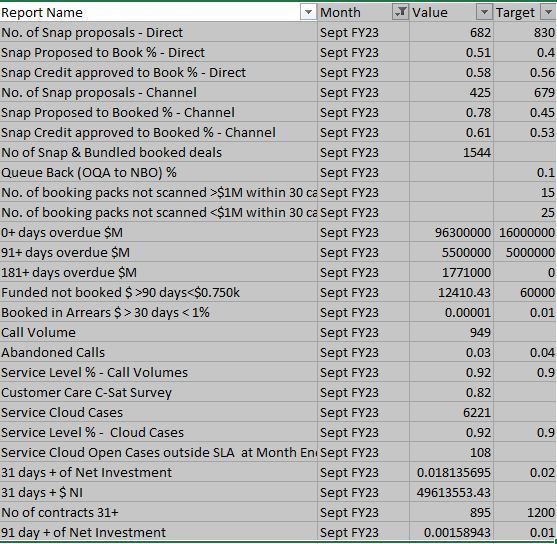
I have a results of team performance, some are expressed in $ others are in %, I combined them all into one table with results for each month, but had to make the data type number - now on the visuals I can't see $ or % just the number.
For the data model should I split these sets of data into one for $ and one for % or is there a way to leave them in one data set?
And make the visual look at some sort of type to determine if its $ or % or whole number it should be showing
Thanks
Solved! Go to Solution.
- Mark as New
- Bookmark
- Subscribe
- Mute
- Subscribe to RSS Feed
- Permalink
- Report Inappropriate Content
Hi,
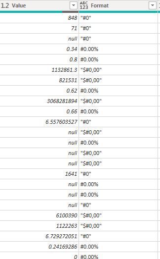
create a conditional column called format using if( contains( table, reportname, "%") =true, "#0.00%", "$#0,00")
Or if there are report names that dont have % in their name, you have to then create an index column and assign these formatting options by index.
once done, in your value measure just go Format(value/value calculation, selectedvalue(formatcolumn))
hope that works for you!
DID I ANSWER YOUR QUESTION? PLEASE MARK MY POST AS A SOLUTION! APPRECIATE YOUR KUDO/LIKE!
PROUD TO BE A SUPER USER!
Best Stories, Interesting Cases: PowerBI Storytime Newsletter
Linkedin Profile: Linkedin
YouTube Channel: PowerBI Storytime
- Mark as New
- Bookmark
- Subscribe
- Mute
- Subscribe to RSS Feed
- Permalink
- Report Inappropriate Content
Hi, thanks, I'm new to all this
I've done the first part, but I'm new to all this and don't get how to have the format of the data in the values column updated by the values I now have in the format column. Is it a format change to the value column or is it a new measure (in either case would appreciate some more guidance)
- Mark as New
- Bookmark
- Subscribe
- Mute
- Subscribe to RSS Feed
- Permalink
- Report Inappropriate Content
Now create a Measure
Formatted Values=
Make sure that your format column is text, right now it is abc, 123
DID I ANSWER YOUR QUESTION? PLEASE MARK MY POST AS A SOLUTION! APPRECIATE YOUR KUDO/LIKE!
PROUD TO BE A SUPER USER!
Best Stories, Interesting Cases: PowerBI Storytime Newsletter
Linkedin Profile: Linkedin
YouTube Channel: PowerBI Storytime
- Mark as New
- Bookmark
- Subscribe
- Mute
- Subscribe to RSS Feed
- Permalink
- Report Inappropriate Content
Hi Olgad
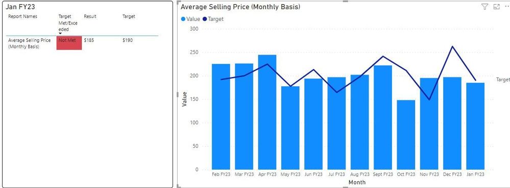
That worked, I'd like to try to push it one step further, I can now see the nicely formatted measure in a table visual, but I cannot use that visual in a bar chart (is it not possible?), I can't drag the measure into the visual
So at the minute I have a table beside the visual showing the $, %, number for the current month, but the visual beside is for 12 months, and I have to use the original 'value column'. Which means its formatted as a number for all, is there a way to use the measure instead and have the legends switch between $, % , Number?
And thanks again for your help so far
- Mark as New
- Bookmark
- Subscribe
- Mute
- Subscribe to RSS Feed
- Permalink
- Report Inappropriate Content
Hi, doesnt work this way, but there are different workarounds.
My suggested one:
Categorize your format options and assign an index %-1 #-0
Then create two exact same measures Sum(Value) but change the formatting under Measure tools. one % another # if zou are gonna differentiate between # with 0 decimal or 1 decimal, then you will create extra measures, ok. Now lets go with 2 options.
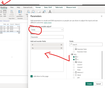
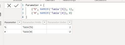
Then create a parameter,
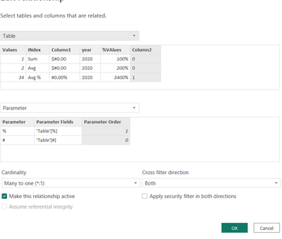
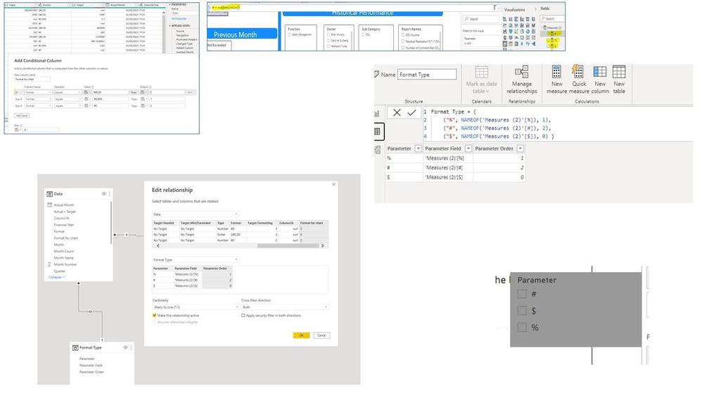
now create one to many relationship between parameter Order and your table Index value of the format. Now you can add the parameter slicer and the report names slicer, first zou will be picking
Now you can pick either the format sign and it will filter the report names you can vie a report name or you can pick the report name and it will filter you the sign which you would need to click.
SECOND ALTERNATIVE: add index to your report names, how many are there?
Then you create the measures for all of your Report names. Lets say you have 10 report names you assign Index to them from 1 till 10, then 10 measures like Average Selling Price=Calculate(Sum(Values), Index=1) Then individually you format the measure in the emasure tools based on what you need % or currency.
After you create a Field parameter. adding those 10 measures and voila you have a slicer to pick from which masure you wanna see and your formatting is good.
DID I ANSWER YOUR QUESTION? PLEASE MARK MY POST AS A SOLUTION! APPRECIATE YOUR KUDO/LIKE!
PROUD TO BE A SUPER USER!
Best Stories, Interesting Cases: PowerBI Storytime Newsletter
Linkedin Profile: Linkedin
YouTube Channel: PowerBI Storytime
- Mark as New
- Bookmark
- Subscribe
- Mute
- Subscribe to RSS Feed
- Permalink
- Report Inappropriate Content
Hi Olgad
I've been out for a few weeks and only getting back to this now, I totally understand if you can't help anymore. I don't think suggestion 2 will work as I have 140 reports, but in truth I'm lost trying to implement your first suggestion at the first step, when you say 'Categorize your format options and assign an index %-1 #-0' I'm not sure what you mean.
Again any help greatly appreciated
- Mark as New
- Bookmark
- Subscribe
- Mute
- Subscribe to RSS Feed
- Permalink
- Report Inappropriate Content
I will take one more look at that tomorrow because in the meantime i created so many advanced versions with field parameters, i am sure i can suggest a more efficient solution.
DID I ANSWER YOUR QUESTION? PLEASE MARK MY POST AS A SOLUTION! APPRECIATE YOUR KUDO/LIKE!
PROUD TO BE A SUPER USER!
Best Stories, Interesting Cases: PowerBI Storytime Newsletter
Linkedin Profile: Linkedin
YouTube Channel: PowerBI Storytime
- Mark as New
- Bookmark
- Subscribe
- Mute
- Subscribe to RSS Feed
- Permalink
- Report Inappropriate Content
Hi
I managed to follow all the instructions which are very clear, I have the
- conditional column
- the measures
- the parameters (with the linking setup)
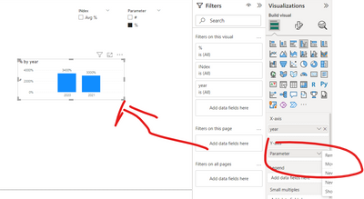
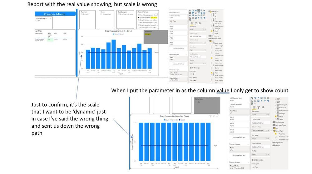
- have the slicer, if I select the report with a % the new slicer shows a %
However if I try to use the parameter on the chart I'm not seeing the values. I've attached some screen shots. I'm using a combie chart (ie. Bar and Line, not sure if that would make a difference)
Again really appreciate the help
- Mark as New
- Bookmark
- Subscribe
- Mute
- Subscribe to RSS Feed
- Permalink
- Report Inappropriate Content
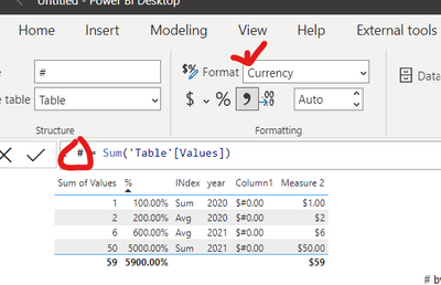
@Stephen3466 It took me a while to understand what I wrote🤣
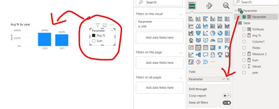
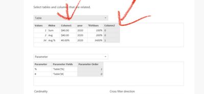
look at this table it has comumn 2 which i created with 0 and 1 value to distinguish between % and # values. Simply put create a conditional column for those. You can use column 1 for that to say if (column 1="#0.00%", 1, 0)
Then you will hook it up with the field parameter
DID I ANSWER YOUR QUESTION? PLEASE MARK MY POST AS A SOLUTION! APPRECIATE YOUR KUDO/LIKE!
PROUD TO BE A SUPER USER!
Best Stories, Interesting Cases: PowerBI Storytime Newsletter
Linkedin Profile: Linkedin
YouTube Channel: PowerBI Storytime
- Mark as New
- Bookmark
- Subscribe
- Mute
- Subscribe to RSS Feed
- Permalink
- Report Inappropriate Content
Now I'm getting an error when I try to create the measure
Again any help appreciated
- Mark as New
- Bookmark
- Subscribe
- Mute
- Subscribe to RSS Feed
- Permalink
- Report Inappropriate Content
One more ) before the comma and )) in the end not three
so [value]))
[format]))
DID I ANSWER YOUR QUESTION? PLEASE MARK MY POST AS A SOLUTION! APPRECIATE YOUR KUDO/LIKE!
PROUD TO BE A SUPER USER!
Best Stories, Interesting Cases: PowerBI Storytime Newsletter
Linkedin Profile: Linkedin
YouTube Channel: PowerBI Storytime
- Mark as New
- Bookmark
- Subscribe
- Mute
- Subscribe to RSS Feed
- Permalink
- Report Inappropriate Content
Hello,
Depending on the complexity of your raw data, the most straightforward solution is to either move the % values into additional columns within the same table or separate the data into two tables; one for $ and one for %.
This is due to PowerBI, DAX, and PowerQuery all working off of columns rather than Excel working off cells, meaning you can only select one "Data Type" per column.
I'm sure there's more complex solutions that include DAX measures and/or calculated columns, but hopefully this simple solution will work for you.
- Mark as New
- Bookmark
- Subscribe
- Mute
- Subscribe to RSS Feed
- Permalink
- Report Inappropriate Content
Hi,
create a conditional column called format using if( contains( table, reportname, "%") =true, "#0.00%", "$#0,00")
Or if there are report names that dont have % in their name, you have to then create an index column and assign these formatting options by index.
once done, in your value measure just go Format(value/value calculation, selectedvalue(formatcolumn))
hope that works for you!
DID I ANSWER YOUR QUESTION? PLEASE MARK MY POST AS A SOLUTION! APPRECIATE YOUR KUDO/LIKE!
PROUD TO BE A SUPER USER!
Best Stories, Interesting Cases: PowerBI Storytime Newsletter
Linkedin Profile: Linkedin
YouTube Channel: PowerBI Storytime
- Mark as New
- Bookmark
- Subscribe
- Mute
- Subscribe to RSS Feed
- Permalink
- Report Inappropriate Content
Hi, thanks, I'm new to all this
I've done the first part, but I'm new to all this and don't get how to have the format of the data in the values column updated by the values I now have in the format column. Is it a format change to the value column or is it a new measure (in either case would appreciate some more guidance)
Helpful resources

Microsoft Fabric Learn Together
Covering the world! 9:00-10:30 AM Sydney, 4:00-5:30 PM CET (Paris/Berlin), 7:00-8:30 PM Mexico City

Power BI Monthly Update - April 2024
Check out the April 2024 Power BI update to learn about new features.

| User | Count |
|---|---|
| 108 | |
| 105 | |
| 87 | |
| 74 | |
| 66 |
| User | Count |
|---|---|
| 124 | |
| 112 | |
| 96 | |
| 80 | |
| 72 |
