FabCon is coming to Atlanta
Join us at FabCon Atlanta from March 16 - 20, 2026, for the ultimate Fabric, Power BI, AI and SQL community-led event. Save $200 with code FABCOMM.
Register now!- Power BI forums
- Get Help with Power BI
- Desktop
- Service
- Report Server
- Power Query
- Mobile Apps
- Developer
- DAX Commands and Tips
- Custom Visuals Development Discussion
- Health and Life Sciences
- Power BI Spanish forums
- Translated Spanish Desktop
- Training and Consulting
- Instructor Led Training
- Dashboard in a Day for Women, by Women
- Galleries
- Data Stories Gallery
- Themes Gallery
- Contests Gallery
- QuickViz Gallery
- Quick Measures Gallery
- Visual Calculations Gallery
- Notebook Gallery
- Translytical Task Flow Gallery
- TMDL Gallery
- R Script Showcase
- Webinars and Video Gallery
- Ideas
- Custom Visuals Ideas (read-only)
- Issues
- Issues
- Events
- Upcoming Events
The Power BI Data Visualization World Championships is back! Get ahead of the game and start preparing now! Learn more
- Power BI forums
- Forums
- Get Help with Power BI
- Desktop
- X-axis labelling time intervals Line & Cluster...
- Subscribe to RSS Feed
- Mark Topic as New
- Mark Topic as Read
- Float this Topic for Current User
- Bookmark
- Subscribe
- Printer Friendly Page
- Mark as New
- Bookmark
- Subscribe
- Mute
- Subscribe to RSS Feed
- Permalink
- Report Inappropriate Content
X-axis labelling time intervals Line & Clustered Column Chart
@Amit, @Greg , @tamerj1 , @lbendlin
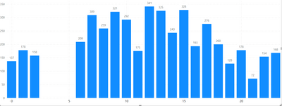
I have made a Line & Clustered Column Chart where my X-axis labels are timeclocks starting from 0, 1, 2, all the way to 23. However, when I add the Line & Clustered column chart, I can only see the labelling in the intervals of 0, 5, 10, 15 and 20 with in-between values missing. I tried to add the in between values by going under Format Your Visual and checking at Visual and General category. I found no way to edit the X-axis, I can change the color for the conditional formatting for each of the value 0, 1,2,3,4,5,6, etc..all the way to 23 but cannot add the in-between values in the X-axis. Can you please suggest how to fix this X-axis labelling issues?
Solved! Go to Solution.
- Mark as New
- Bookmark
- Subscribe
- Mute
- Subscribe to RSS Feed
- Permalink
- Report Inappropriate Content
Make the visual wider, or change the x axis type to categorical (NOTE: that will eliminate the gap).
- Mark as New
- Bookmark
- Subscribe
- Mute
- Subscribe to RSS Feed
- Permalink
- Report Inappropriate Content
What do you mean by having another column with numeric hour values? Are you saying 1:00 pm should be represented as 13:00 PM and 5:00 pm be written as 17:00 PM and then sorting them or breaking the original Hour Column into Hour AM and Hour PM and including only the relevant values there and putting the newly created columns into X-axis having 2 X-axis and sorting them ?
- Mark as New
- Bookmark
- Subscribe
- Mute
- Subscribe to RSS Feed
- Permalink
- Report Inappropriate Content
- Mark as New
- Bookmark
- Subscribe
- Mute
- Subscribe to RSS Feed
- Permalink
- Report Inappropriate Content
Thank you! This helps! Yes, after that I need to filter for the X-axis and sort the X-axis in ascending order.
- Mark as New
- Bookmark
- Subscribe
- Mute
- Subscribe to RSS Feed
- Permalink
- Report Inappropriate Content
Make the visual wider, or change the x axis type to categorical (NOTE: that will eliminate the gap).
- Mark as New
- Bookmark
- Subscribe
- Mute
- Subscribe to RSS Feed
- Permalink
- Report Inappropriate Content
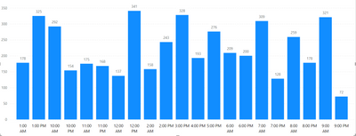
But if the X-axis is changed into AM and PM format using the DAX IF code, how do we sort the X-axis in a chronologial order from 12:00 am, 1:00 am, 2:00 am......11:00 pm? When we sort the X-axis in ascending order PowerBI reads like this:
Looks like PowerBI reads only the number in ascending order ignoring the AM & PM. Do you know how to fix this issue?
- Mark as New
- Bookmark
- Subscribe
- Mute
- Subscribe to RSS Feed
- Permalink
- Report Inappropriate Content
Have another column with the numeric hour values. Sort your x axis column by that numeric column.
Helpful resources

Power BI Dataviz World Championships
The Power BI Data Visualization World Championships is back! Get ahead of the game and start preparing now!

| User | Count |
|---|---|
| 39 | |
| 38 | |
| 38 | |
| 28 | |
| 27 |
| User | Count |
|---|---|
| 124 | |
| 88 | |
| 73 | |
| 66 | |
| 65 |


