FabCon is coming to Atlanta
Join us at FabCon Atlanta from March 16 - 20, 2026, for the ultimate Fabric, Power BI, AI and SQL community-led event. Save $200 with code FABCOMM.
Register now!- Power BI forums
- Get Help with Power BI
- Desktop
- Service
- Report Server
- Power Query
- Mobile Apps
- Developer
- DAX Commands and Tips
- Custom Visuals Development Discussion
- Health and Life Sciences
- Power BI Spanish forums
- Translated Spanish Desktop
- Training and Consulting
- Instructor Led Training
- Dashboard in a Day for Women, by Women
- Galleries
- Data Stories Gallery
- Themes Gallery
- Contests Gallery
- Quick Measures Gallery
- Notebook Gallery
- Translytical Task Flow Gallery
- TMDL Gallery
- R Script Showcase
- Webinars and Video Gallery
- Ideas
- Custom Visuals Ideas (read-only)
- Issues
- Issues
- Events
- Upcoming Events
Calling all Data Engineers! Fabric Data Engineer (Exam DP-700) live sessions are back! Starting October 16th. Sign up.
- Power BI forums
- Forums
- Get Help with Power BI
- Desktop
- Re: X-axis categorical line chart without scrollba...
- Subscribe to RSS Feed
- Mark Topic as New
- Mark Topic as Read
- Float this Topic for Current User
- Bookmark
- Subscribe
- Printer Friendly Page
- Mark as New
- Bookmark
- Subscribe
- Mute
- Subscribe to RSS Feed
- Permalink
- Report Inappropriate Content
X-axis categorical line chart without scrollbar
Hello,
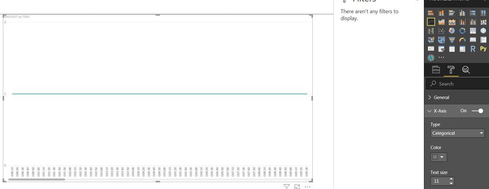
I have a dataset with a variable Interval in hh:mm:ss, which I use on the x-axis of a line chart. Interval data has the category Time and consists of intervals of approximately 30 seconds for 1 hour (00:00:00 until 01:00:00). If I use the X-Axis Type Continuous setting, the chart is plotted in 'one' view without scrollbar at the bottom of the chart. This setting shows the time from 12:00 AM - 1:00 AM. I need to have the time represented in hh:mm:ss on the x-axis of the chart. If I use the Categorical Type for the X-Axis I get the correct time representation, but I get a scrollbar at the bottom of the chart to scroll through time. This is not useful for our situation. Is there a way to display the data in 'one' view without the scrollbar? So that you see all data for the whole hour at one glance?
Thank you for the help.
- Mark as New
- Bookmark
- Subscribe
- Mute
- Subscribe to RSS Feed
- Permalink
- Report Inappropriate Content
@Anonymous
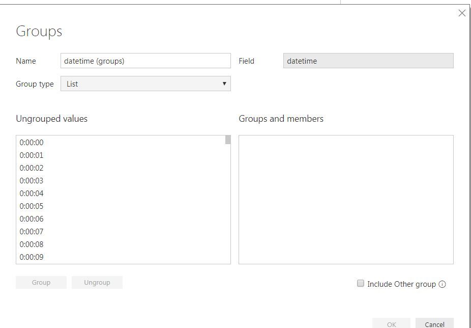
I think this is becuase too many values on X-axis. Maybe you can try group values to reduce the amount of values.
Did I answer your question? Mark my post as a solution!
Proud to be a Super User!
- Mark as New
- Bookmark
- Subscribe
- Mute
- Subscribe to RSS Feed
- Permalink
- Report Inappropriate Content
Hello ryan_mayu,
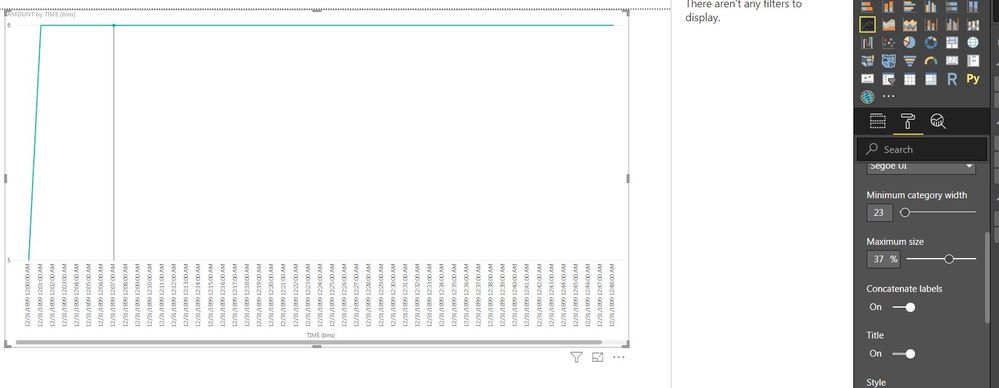
I think grouping the values worked, thank you! ![]()
The values on the X-axis are displayed diagonal, is there a way to display them vertical? Like in the second image of my original post. I have tried the X-axis Format options, without result.
- Mark as New
- Bookmark
- Subscribe
- Mute
- Subscribe to RSS Feed
- Permalink
- Report Inappropriate Content
@Anonymous
I changed the type to Categorical in x-aixs property. I am not sure if this can solve your problem. You can try this.
Did I answer your question? Mark my post as a solution!
Proud to be a Super User!
- Mark as New
- Bookmark
- Subscribe
- Mute
- Subscribe to RSS Feed
- Permalink
- Report Inappropriate Content
I already use type Categorical in the X-axis Format property. Before I used your solution to group the Interval (time) I got the values displayed vertically like in your image and like in my original post. After using your group solution the values are displayed diagonally. Is there a way to set them vertical?
- Mark as New
- Bookmark
- Subscribe
- Mute
- Subscribe to RSS Feed
- Permalink
- Report Inappropriate Content
@Anonymous
This is interesting. I never noticed about that.
You can increase the category width. However, if the value shows vertical, the scrollbar shows up... 😞
I guess the values shows vertical when the value is too long and scrollbar shows up as well.
Let's see if anyone else can help you on that....
Did I answer your question? Mark my post as a solution!
Proud to be a Super User!
- Mark as New
- Bookmark
- Subscribe
- Mute
- Subscribe to RSS Feed
- Permalink
- Report Inappropriate Content
Hi @Anonymous
As tested, I don't find any option to make the line chart look like what you like.
i work with a custom visual called "drill down column chart for time based data"
Hope this can be a available workaround for your scenario
Reference:
https://appsource.microsoft.com/en-us/product/power-bi-visuals/WA104380881?tab=Overview
Best regards
Maggie
- Mark as New
- Bookmark
- Subscribe
- Mute
- Subscribe to RSS Feed
- Permalink
- Report Inappropriate Content
Hi Maggie,
Thank you for your reply. Unfortunatly this is not the workaround we are looking for. The graphic needs to be a line chart like in my original post. But again, thank you for helping.
Regards,
Cas
Helpful resources

FabCon Global Hackathon
Join the Fabric FabCon Global Hackathon—running virtually through Nov 3. Open to all skill levels. $10,000 in prizes!

Power BI Monthly Update - September 2025
Check out the September 2025 Power BI update to learn about new features.


