Fabric Data Days starts November 4th!
Advance your Data & AI career with 50 days of live learning, dataviz contests, hands-on challenges, study groups & certifications and more!
Get registered- Power BI forums
- Get Help with Power BI
- Desktop
- Service
- Report Server
- Power Query
- Mobile Apps
- Developer
- DAX Commands and Tips
- Custom Visuals Development Discussion
- Health and Life Sciences
- Power BI Spanish forums
- Translated Spanish Desktop
- Training and Consulting
- Instructor Led Training
- Dashboard in a Day for Women, by Women
- Galleries
- Data Stories Gallery
- Themes Gallery
- Contests Gallery
- QuickViz Gallery
- Quick Measures Gallery
- Visual Calculations Gallery
- Notebook Gallery
- Translytical Task Flow Gallery
- TMDL Gallery
- R Script Showcase
- Webinars and Video Gallery
- Ideas
- Custom Visuals Ideas (read-only)
- Issues
- Issues
- Events
- Upcoming Events
Get Fabric Certified for FREE during Fabric Data Days. Don't miss your chance! Request now
- Power BI forums
- Forums
- Get Help with Power BI
- Desktop
- X-axis categorical line chart without scrollbar
- Subscribe to RSS Feed
- Mark Topic as New
- Mark Topic as Read
- Float this Topic for Current User
- Bookmark
- Subscribe
- Printer Friendly Page
- Mark as New
- Bookmark
- Subscribe
- Mute
- Subscribe to RSS Feed
- Permalink
- Report Inappropriate Content
X-axis categorical line chart without scrollbar
Hello,
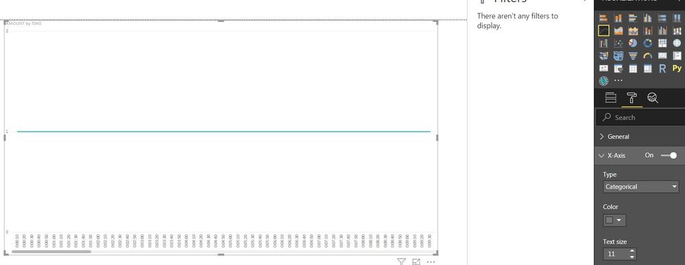
I have a dataset with a variable Interval in hh:mm:ss, which I use on the x-axis of a line chart. Interval data has the category Time and consists of intervals of approximately 30 seconds for 1 hour (00:00:00 until 01:00:00). If I use the X-Axis Type Continuous setting, the chart is plotted in 'one' view without scrollbar at the bottom of the chart. This setting shows the time from 12:00 AM - 1:00 AM. I need to have the time represented in hh:mm:ss on the x-axis of the chart. If I use the Categorical Type for the X-Axis I get the correct time representation, but I get a scrollbar at the bottom of the chart to scroll through time. This is not useful for our situation. Is there a way to display the data in 'one' view without the scrollbar? So that you see all data for the whole hour at one glance?
Thank you for the help.
- Mark as New
- Bookmark
- Subscribe
- Mute
- Subscribe to RSS Feed
- Permalink
- Report Inappropriate Content
@Anonymous
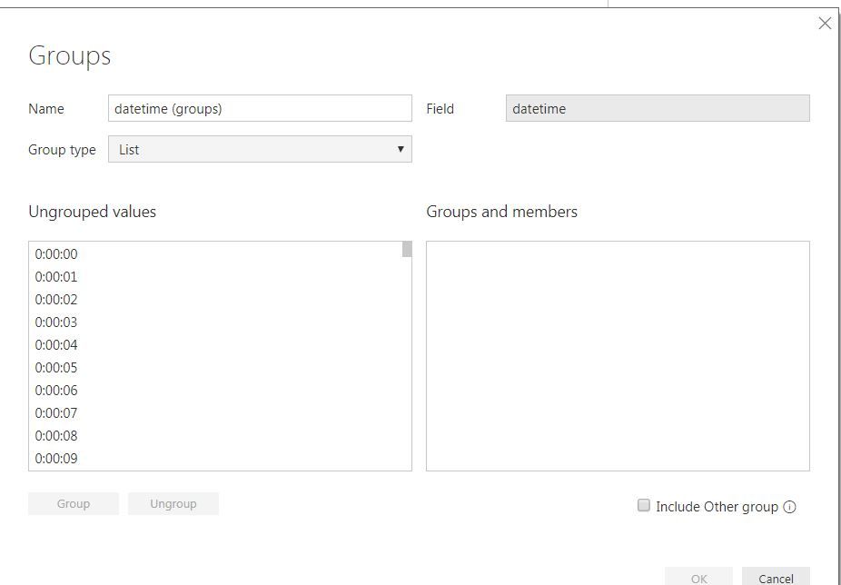
I think this is becuase too many values on X-axis. Maybe you can try group values to reduce the amount of values.
Did I answer your question? Mark my post as a solution!
Proud to be a Super User!
- Mark as New
- Bookmark
- Subscribe
- Mute
- Subscribe to RSS Feed
- Permalink
- Report Inappropriate Content
Hello ryan_mayu,
I think grouping the values worked, thank you! ![]()
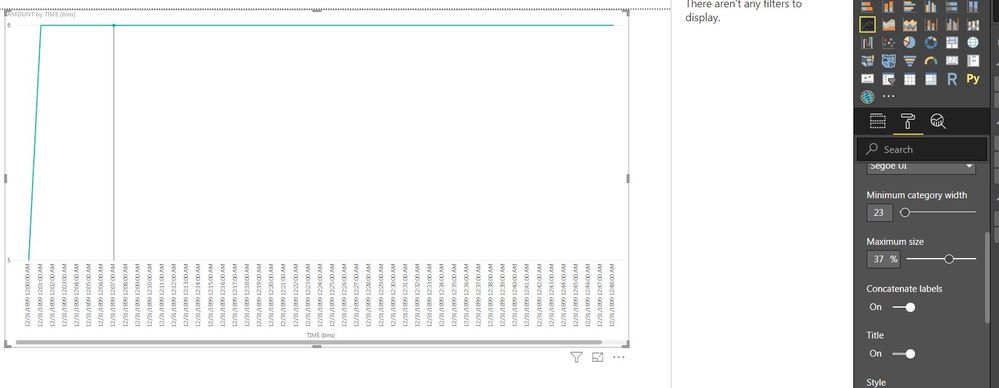
The values on the X-axis are displayed diagonal, is there a way to display them vertical? Like in the second image of my original post. I have tried the X-axis Format options, without result.
- Mark as New
- Bookmark
- Subscribe
- Mute
- Subscribe to RSS Feed
- Permalink
- Report Inappropriate Content
@Anonymous
I changed the type to Categorical in x-aixs property. I am not sure if this can solve your problem. You can try this.
Did I answer your question? Mark my post as a solution!
Proud to be a Super User!
- Mark as New
- Bookmark
- Subscribe
- Mute
- Subscribe to RSS Feed
- Permalink
- Report Inappropriate Content
I already use type Categorical in the X-axis Format property. Before I used your solution to group the Interval (time) I got the values displayed vertically like in your image and like in my original post. After using your group solution the values are displayed diagonally. Is there a way to set them vertical?
- Mark as New
- Bookmark
- Subscribe
- Mute
- Subscribe to RSS Feed
- Permalink
- Report Inappropriate Content
@Anonymous
This is interesting. I never noticed about that.
You can increase the category width. However, if the value shows vertical, the scrollbar shows up... 😞
I guess the values shows vertical when the value is too long and scrollbar shows up as well.
Let's see if anyone else can help you on that....
Did I answer your question? Mark my post as a solution!
Proud to be a Super User!
- Mark as New
- Bookmark
- Subscribe
- Mute
- Subscribe to RSS Feed
- Permalink
- Report Inappropriate Content
Hi @Anonymous
As tested, I don't find any option to make the line chart look like what you like.
i work with a custom visual called "drill down column chart for time based data"
Hope this can be a available workaround for your scenario
Reference:
https://appsource.microsoft.com/en-us/product/power-bi-visuals/WA104380881?tab=Overview
Best regards
Maggie
- Mark as New
- Bookmark
- Subscribe
- Mute
- Subscribe to RSS Feed
- Permalink
- Report Inappropriate Content
Hi Maggie,
Thank you for your reply. Unfortunatly this is not the workaround we are looking for. The graphic needs to be a line chart like in my original post. But again, thank you for helping.
Regards,
Cas
Helpful resources

Power BI Monthly Update - November 2025
Check out the November 2025 Power BI update to learn about new features.

Fabric Data Days
Advance your Data & AI career with 50 days of live learning, contests, hands-on challenges, study groups & certifications and more!

| User | Count |
|---|---|
| 97 | |
| 70 | |
| 50 | |
| 42 | |
| 40 |


