Join the #PBI10 DataViz contest
Power BI is turning 10, and we’re marking the occasion with a special community challenge. Use your creativity to tell a story, uncover trends, or highlight something unexpected.
Get started- Power BI forums
- Get Help with Power BI
- Desktop
- Service
- Report Server
- Power Query
- Mobile Apps
- Developer
- DAX Commands and Tips
- Custom Visuals Development Discussion
- Health and Life Sciences
- Power BI Spanish forums
- Translated Spanish Desktop
- Training and Consulting
- Instructor Led Training
- Dashboard in a Day for Women, by Women
- Galleries
- Webinars and Video Gallery
- Data Stories Gallery
- Themes Gallery
- Contests Gallery
- Quick Measures Gallery
- Notebook Gallery
- Translytical Task Flow Gallery
- R Script Showcase
- Ideas
- Custom Visuals Ideas (read-only)
- Issues
- Issues
- Events
- Upcoming Events
Join us for an expert-led overview of the tools and concepts you'll need to become a Certified Power BI Data Analyst and pass exam PL-300. Register now.
- Power BI forums
- Forums
- Get Help with Power BI
- Desktop
- Re: Where to get a African shape maps that work
- Subscribe to RSS Feed
- Mark Topic as New
- Mark Topic as Read
- Float this Topic for Current User
- Bookmark
- Subscribe
- Printer Friendly Page
- Mark as New
- Bookmark
- Subscribe
- Mute
- Subscribe to RSS Feed
- Permalink
- Report Inappropriate Content
Where to get a African shape maps that work
Dear Forum,
I am desperately trying to create a heat map for some agricultural surveys on sweetpotato virus disease in Uganda, Rwanda, Kenya and Tanzania. The first visualization I want is focused on Uganda. The standard map in Power BI does not have up to date districts and boundaries so I have turned to the Shape Map addin. I was able to convert a UG shape file to the topoJSON format but it does not seem to be working. I have made sure my result set is in the same order as the Legend which is Kitgum, Gulu and Lamwo (this is not in alphabetical order that seems odd to me). I would be very grateful for any help on this.
Best wishes
Jon
- Mark as New
- Bookmark
- Subscribe
- Mute
- Subscribe to RSS Feed
- Permalink
- Report Inappropriate Content
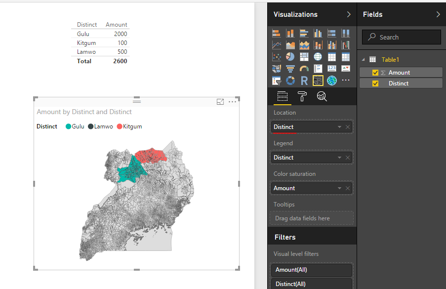
In this scenario, it looks like you only put distinct field into Legend. If you need to display the colored shape for those distincts, you need to put the ditinct field into Location. See my sample below:
Regards,
Simon Hou
Helpful resources

Join our Fabric User Panel
This is your chance to engage directly with the engineering team behind Fabric and Power BI. Share your experiences and shape the future.

Power BI Monthly Update - June 2025
Check out the June 2025 Power BI update to learn about new features.

| User | Count |
|---|---|
| 80 | |
| 79 | |
| 60 | |
| 36 | |
| 33 |
| User | Count |
|---|---|
| 91 | |
| 59 | |
| 59 | |
| 49 | |
| 42 |


