Get Fabric certified for FREE!
Don't miss your chance to take the Fabric Data Engineer (DP-700) exam on us!
Learn more- Power BI forums
- Get Help with Power BI
- Desktop
- Service
- Report Server
- Power Query
- Mobile Apps
- Developer
- DAX Commands and Tips
- Custom Visuals Development Discussion
- Health and Life Sciences
- Power BI Spanish forums
- Translated Spanish Desktop
- Training and Consulting
- Instructor Led Training
- Dashboard in a Day for Women, by Women
- Galleries
- Data Stories Gallery
- Themes Gallery
- Contests Gallery
- QuickViz Gallery
- Quick Measures Gallery
- Visual Calculations Gallery
- Notebook Gallery
- Translytical Task Flow Gallery
- TMDL Gallery
- R Script Showcase
- Webinars and Video Gallery
- Ideas
- Custom Visuals Ideas (read-only)
- Issues
- Issues
- Events
- Upcoming Events
Next up in the FabCon + SQLCon recap series: The roadmap for Microsoft SQL and Maximizing Developer experiences in Fabric. All sessions are available on-demand after the live show. Register now
- Power BI forums
- Forums
- Get Help with Power BI
- Desktop
- Waterfall Graph Application
- Subscribe to RSS Feed
- Mark Topic as New
- Mark Topic as Read
- Float this Topic for Current User
- Bookmark
- Subscribe
- Printer Friendly Page
- Mark as New
- Bookmark
- Subscribe
- Mute
- Subscribe to RSS Feed
- Permalink
- Report Inappropriate Content
Waterfall Graph Application
Hi all,
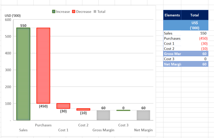
From the Tutorial, the waterfall graph can present the changes over time. But I did something else in excel as below as try to replicate it in Power BI but in vain.
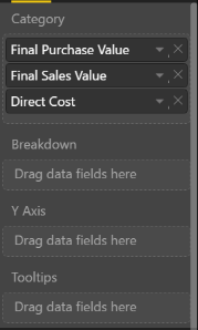
Below, i am showing the breakdown by elements. For those elements, they are different attributes (fields) in the database. Not sure how to put the fields into the visualisation panel (Category, Breakdown, Y Axis).
Solved! Go to Solution.
- Mark as New
- Bookmark
- Subscribe
- Mute
- Subscribe to RSS Feed
- Permalink
- Report Inappropriate Content
@JeffreyLau wrote:
Hi all,
From the Tutorial, the waterfall graph can present the changes over time. But I did something else in excel as below as try to replicate it in Power BI but in vain.
Below, i am showing the breakdown by elements. For those elements, they are different attributes (fields) in the database. Not sure how to put the fields into the visualisation panel (Category, Breakdown, Y Axis).
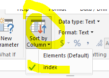
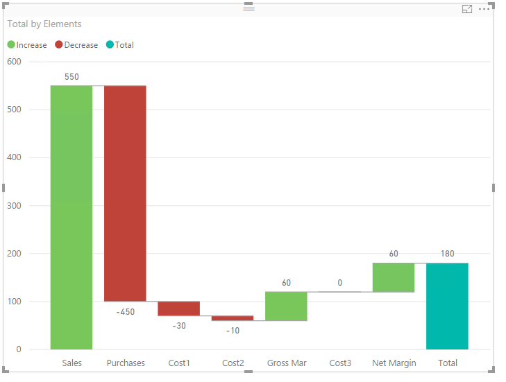
AFAIK, it is not able to create the very equivalent waterfall graph in Power BI. One similar graph as below can be created, however the elements have to be assigned an index to determine the present order in the graph. See more details in the attached pbix file.
Helpful resources

New to Fabric Survey
If you have recently started exploring Fabric, we'd love to hear how it's going. Your feedback can help with product improvements.

Power BI DataViz World Championships - June 2026
A new Power BI DataViz World Championship is coming this June! Don't miss out on submitting your entry.

Join our Fabric User Panel
Share feedback directly with Fabric product managers, participate in targeted research studies and influence the Fabric roadmap.

| User | Count |
|---|---|
| 48 | |
| 45 | |
| 41 | |
| 19 | |
| 17 |
| User | Count |
|---|---|
| 68 | |
| 68 | |
| 33 | |
| 32 | |
| 31 |


