FabCon is coming to Atlanta
Join us at FabCon Atlanta from March 16 - 20, 2026, for the ultimate Fabric, Power BI, AI and SQL community-led event. Save $200 with code FABCOMM.
Register now!- Power BI forums
- Get Help with Power BI
- Desktop
- Service
- Report Server
- Power Query
- Mobile Apps
- Developer
- DAX Commands and Tips
- Custom Visuals Development Discussion
- Health and Life Sciences
- Power BI Spanish forums
- Translated Spanish Desktop
- Training and Consulting
- Instructor Led Training
- Dashboard in a Day for Women, by Women
- Galleries
- Data Stories Gallery
- Themes Gallery
- Contests Gallery
- QuickViz Gallery
- Quick Measures Gallery
- Visual Calculations Gallery
- Notebook Gallery
- Translytical Task Flow Gallery
- TMDL Gallery
- R Script Showcase
- Webinars and Video Gallery
- Ideas
- Custom Visuals Ideas (read-only)
- Issues
- Issues
- Events
- Upcoming Events
The Power BI Data Visualization World Championships is back! Get ahead of the game and start preparing now! Learn more
- Power BI forums
- Forums
- Get Help with Power BI
- Desktop
- Re: Visualisation or pivot table by groups of data
- Subscribe to RSS Feed
- Mark Topic as New
- Mark Topic as Read
- Float this Topic for Current User
- Bookmark
- Subscribe
- Printer Friendly Page
- Mark as New
- Bookmark
- Subscribe
- Mute
- Subscribe to RSS Feed
- Permalink
- Report Inappropriate Content
Visualisation or pivot table by groups of data
Hi people!
I am new on the forum and think you guys are making amazing job helping us noobs.
Thanks in advance!
As the subject says, I have a data visualisation issue:
I would need a table in which I can see in turns: only the total results of a country / the total results of each zone slicing the country / the details of each entity.
It is the simplest action in Excel: grouping rows and developing the group at envy.
In powerby I don't have the trick!
Please help!
- Mark as New
- Bookmark
- Subscribe
- Mute
- Subscribe to RSS Feed
- Permalink
- Report Inappropriate Content
There are more than one options to achieve this in powerbi. I would suggest you to post sample data and expected outcome.
Bhavesh
Love the Self Service BI.
Please use the 'Mark as answer' link to mark a post that answers your question. If you find a reply helpful, please remember to give Kudos.
- Mark as New
- Bookmark
- Subscribe
- Mute
- Subscribe to RSS Feed
- Permalink
- Report Inappropriate Content
Thank you for this answer.
My complete table looks like below:
| Country | Region | Zone | Dealer | SalesVolume |
| France | 4 | 1 | 1001 | 1 |
| France | 4 | 2 | 1002 | 8 |
| France | 4 | 3 | 1003 | 14 |
| France | 1 | 4 | 1004 | 1 |
| France | 1 | 5 | 1005 | 5 |
| France | 1 | 6 | 1006 | 3 |
| France | 1 | 7 | 1007 | 19 |
| France | 2 | 8 | 1008 | 3 |
| France | 2 | 9 | 1009 | 1 |
My aim is to give the possibility to each region to filter as below, and toy with the information so that it can always have a look at the National Total, the Regional Total, etc. :
| Somme de SalesVolume | |
| Total Region 1 | 28 |
| 1004 | 1 |
| 1005 | 5 |
| 1006 | 3 |
| 1007 | 19 |
| Total Region 2 | 4 |
| Total Region 4 | 23 |
| Total France | 55 |
or develop
| Somme de SalesVolume | |
| Total Region 1 | 28 |
| 1004 | 1 |
| 1005 | 5 |
| 1006 | 3 |
| 1007 | 19 |
| Total Region 2 | 4 |
| 1008 | 3 |
| 1009 | 1 |
| Total Region 4 | 23 |
| 1001 | 1 |
| 1002 | 8 |
| 1003 | 14 |
| Total France | 55 |
I don't know if it is clear 🙂
Thanks!
- Mark as New
- Bookmark
- Subscribe
- Mute
- Subscribe to RSS Feed
- Permalink
- Report Inappropriate Content
No one?
- Mark as New
- Bookmark
- Subscribe
- Mute
- Subscribe to RSS Feed
- Permalink
- Report Inappropriate Content
Hi @Noob78,
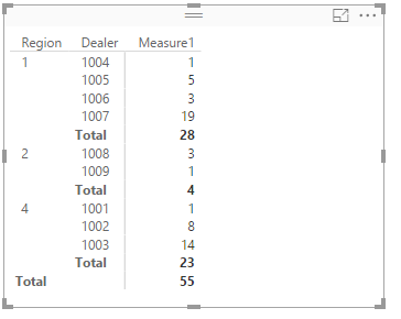
For one thing, please create a measure using the following formula. Then create a matrix in PowerBI desktop. Select the Region, Dealer as Row level, Measure1 as value level. You will get the result below.
Measure1 = SUM(Table4[SalesVolume])
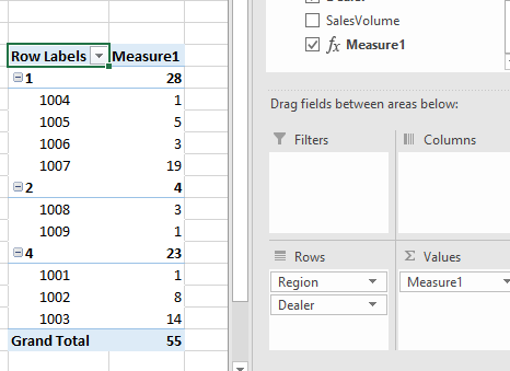
For another, if you create same measure, create a pivot table, select the Region and Dealer as Row level, the measure as Values, you will get the expected better result as follows.
Best Regards,
Angelia
- Mark as New
- Bookmark
- Subscribe
- Mute
- Subscribe to RSS Feed
- Permalink
- Report Inappropriate Content
Thank you! Shall try and let you know ![]()
I can easily obtain the first screenshot of PowerBi.
However, does the second screenshot not come from Excel? Indeed, I wish to have exactly this visualization, but in Power Bi (I mean, collapsible, etc.).
Correct me if I did not get something right 😕
- Mark as New
- Bookmark
- Subscribe
- Mute
- Subscribe to RSS Feed
- Permalink
- Report Inappropriate Content
Hi @Noob78.
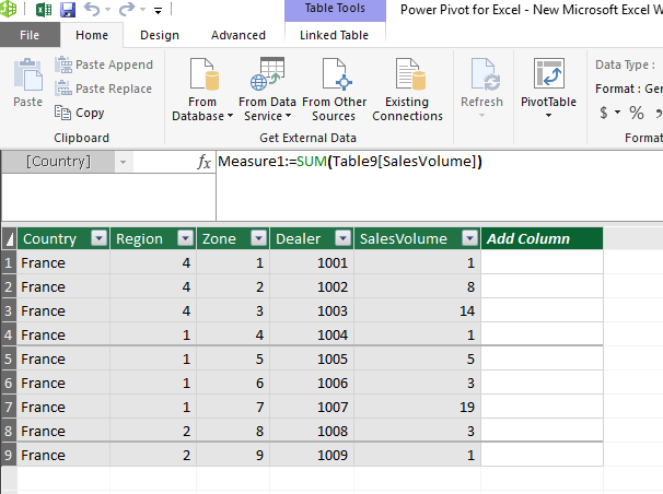
The secondshot is a pivot table. First import the data into power pivot model, create a measure as follows.
Then create a pivot table, when you select the Dealer after Region field in Rows level, the Dealer is subcategory automatically. For example, there several Dealer values for Region1. While in Power BI desktop, it display as the first screenshot. And we can’t set the custom subtotal.
Best Regards,
Angelia
- Mark as New
- Bookmark
- Subscribe
- Mute
- Subscribe to RSS Feed
- Permalink
- Report Inappropriate Content
The visual result is not exactly as I wished, however I note that there are no additional solution for the time being.
Thank you!
Regards
- Mark as New
- Bookmark
- Subscribe
- Mute
- Subscribe to RSS Feed
- Permalink
- Report Inappropriate Content
Hi @Noob78,
I reproduce your scenario on my local computer, I will post the update if I find new solution.
Best Regards,
Angelia
- Mark as New
- Bookmark
- Subscribe
- Mute
- Subscribe to RSS Feed
- Permalink
- Report Inappropriate Content
Helpful resources

Power BI Monthly Update - November 2025
Check out the November 2025 Power BI update to learn about new features.

Fabric Data Days
Advance your Data & AI career with 50 days of live learning, contests, hands-on challenges, study groups & certifications and more!

| User | Count |
|---|---|
| 58 | |
| 45 | |
| 42 | |
| 21 | |
| 18 |


