This is best Fabric, Power BI, SQL and AI community event. How do we know? The last event sold out! Save €200 with code FABCMTY200.
Register nowA new Data Days event is coming soon! This time we’re going bigger than ever. Fabric, Power BI, SQL, AI and more. Don't miss out.
Hello Everyone.
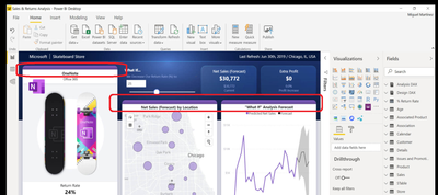
How to add color to the top-bar of a visual (as show in attached image). I know how to change the background color of the Title of a visual, but what I always see on Power BI website is a color on the top-border of visual (for example, the Mauve/Purple color in the attached image). How to do this?
Thank you.
Solved! Go to Solution.
Hi @abdulmannan1991
You can use a workaround like this :
1)Insert a rounded rectangle on the page from the Insert tab (click on Shapes, it will give you various shape options, select rounded rectangle from the drop down).
2)Place the rounded rectangle behind the visual(by clicking on the shape, going to the format tab and selecting "Send backward" till the shape goes behind the visual) and adjust the shape so that it has the same width as the visual. Then it looks like this.
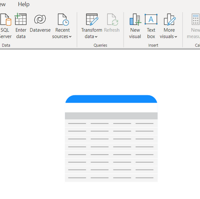
3) You can move the visual up or down depending on the height of the top bar you want
Hope this solves your doubt. Here is the attached .pbix file for reference.
Regards,
Aditya
Hi @abdulmannan1991
You can use a workaround like this :
1)Insert a rounded rectangle on the page from the Insert tab (click on Shapes, it will give you various shape options, select rounded rectangle from the drop down).
2)Place the rounded rectangle behind the visual(by clicking on the shape, going to the format tab and selecting "Send backward" till the shape goes behind the visual) and adjust the shape so that it has the same width as the visual. Then it looks like this.
3) You can move the visual up or down depending on the height of the top bar you want
Hope this solves your doubt. Here is the attached .pbix file for reference.
Regards,
Aditya
Thanks @Anonymous That trick worked!!
@abdulmannan1991
Actually, it is not part of the Visual, you need to create a background image (you can use Power Point) with the required shapes and align the visuals to mimic such appearance in power BI.
Refer to this video : https://www.youtube.com/watch?v=oDK6DZMHUyk
⭕ Subscribe and learn Power BI from these videos
⚪ Website ⚪ LinkedIn ⚪ PBI User Group
Check out the May 2026 Power BI update to learn about new features.
Sign up to receive a private message when registration opens and key events begin.
If you have recently started exploring Fabric, we'd love to hear how it's going. Your feedback can help with product improvements.
| User | Count |
|---|---|
| 32 | |
| 25 | |
| 24 | |
| 24 | |
| 14 |
| User | Count |
|---|---|
| 61 | |
| 47 | |
| 27 | |
| 24 | |
| 19 |