Get Fabric certified for FREE!
Don't miss your chance to take the Fabric Data Engineer (DP-600) exam for FREE! Find out how by attending the DP-600 session on April 23rd (pacific time), live or on-demand.
Learn more- Power BI forums
- Get Help with Power BI
- Desktop
- Service
- Report Server
- Power Query
- Mobile Apps
- Developer
- DAX Commands and Tips
- Custom Visuals Development Discussion
- Health and Life Sciences
- Power BI Spanish forums
- Translated Spanish Desktop
- Training and Consulting
- Instructor Led Training
- Dashboard in a Day for Women, by Women
- Galleries
- Data Stories Gallery
- Themes Gallery
- Contests Gallery
- QuickViz Gallery
- Quick Measures Gallery
- Visual Calculations Gallery
- Notebook Gallery
- Translytical Task Flow Gallery
- TMDL Gallery
- R Script Showcase
- Webinars and Video Gallery
- Ideas
- Custom Visuals Ideas (read-only)
- Issues
- Issues
- Events
- Upcoming Events
Next up in the FabCon + SQLCon recap series: The roadmap for Microsoft SQL and Maximizing Developer experiences in Fabric. All sessions are available on-demand after the live show. Register now
- Power BI forums
- Forums
- Get Help with Power BI
- Desktop
- Very Simple Question
- Subscribe to RSS Feed
- Mark Topic as New
- Mark Topic as Read
- Float this Topic for Current User
- Bookmark
- Subscribe
- Printer Friendly Page
- Mark as New
- Bookmark
- Subscribe
- Mute
- Subscribe to RSS Feed
- Permalink
- Report Inappropriate Content
Very Simple Question
Hi
I am a new user of Power BI. I have a very simple table tracking x number of devices, that have been upgraded (status = complete/scheduled), on a particular date and in a particular country.
I would like to use Power BI to improve my statis excel charts.
I would like to create a couple of charts:
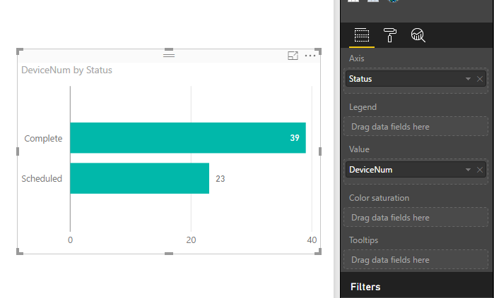
1. the number of devices completed vs scheduled - bar chart.
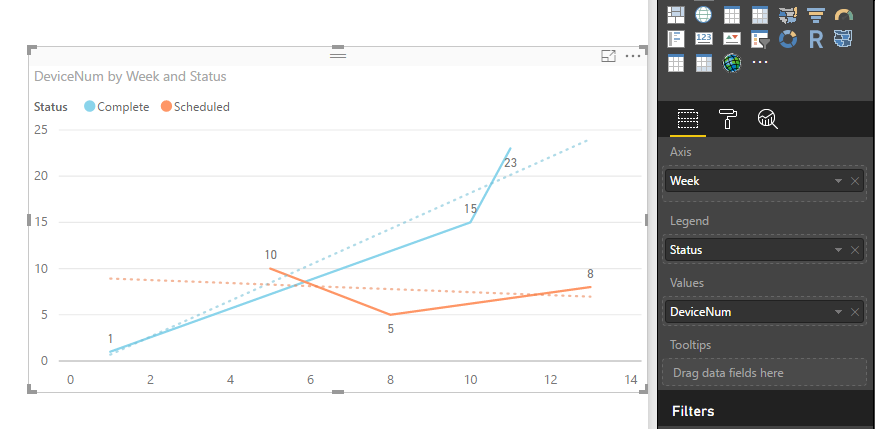
2. the number of devices completed and scheduled per a particular week, potentially with a trend line
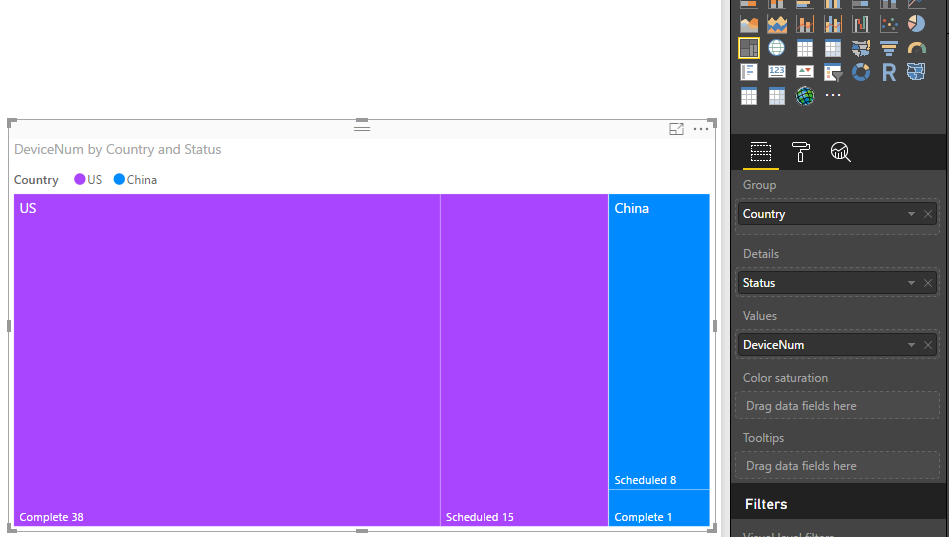
3. a treemap of the number of devices per a country (complete + scheduled
I would very much appreciate some assistance, without the need to code the solution.
Thank you
Chris
Solved! Go to Solution.
- Mark as New
- Bookmark
- Subscribe
- Mute
- Subscribe to RSS Feed
- Permalink
- Report Inappropriate Content
Hi @critchie,
Based on your description, I create some sample data to plot chats:
1. You can create a bar chart like below:
2. Create a calendar table, add a calculated column to return week values. Create a relationship between the calendar table and fact table. Add a trend line in a line chart. See: Analytics pane in Power BI Desktop.
3. Create a treemap like below. See: Treemaps in Power BI (Tutorial).
For detail steps, you can download attached .pbix file to have a look.
Best Regards,
Qiuyun Yu
If this post helps, then please consider Accept it as the solution to help the other members find it more quickly.
- Mark as New
- Bookmark
- Subscribe
- Mute
- Subscribe to RSS Feed
- Permalink
- Report Inappropriate Content
Hello Qiuyun (you have a very interesting name 😉 )
Thank you for your assistance!
This has massively helped me to improve my dashboard. Especially the calendar week table.
Kind regards
Chris
- Mark as New
- Bookmark
- Subscribe
- Mute
- Subscribe to RSS Feed
- Permalink
- Report Inappropriate Content
Hi @critchie,
You're welcome. ![]() Hope you can have fun with Power BI.
Hope you can have fun with Power BI.
Best Regards,
Qiuyun Yu
If this post helps, then please consider Accept it as the solution to help the other members find it more quickly.
- Mark as New
- Bookmark
- Subscribe
- Mute
- Subscribe to RSS Feed
- Permalink
- Report Inappropriate Content
i suggest going through the guided learning videos on the power Bi site, thats the best way to learn
https://powerbi.microsoft.com/en-us/guided-learning/
If I took the time to answer your question and I came up with a solution, please mark my post as a solution and /or give kudos freely for the effort 🙂 Thank you!
Proud to be a Super User!
Helpful resources

New to Fabric Survey
If you have recently started exploring Fabric, we'd love to hear how it's going. Your feedback can help with product improvements.

Power BI DataViz World Championships - June 2026
A new Power BI DataViz World Championship is coming this June! Don't miss out on submitting your entry.

| User | Count |
|---|---|
| 45 | |
| 43 | |
| 38 | |
| 19 | |
| 15 |
| User | Count |
|---|---|
| 67 | |
| 66 | |
| 31 | |
| 28 | |
| 24 |


