- Power BI forums
- Updates
- News & Announcements
- Get Help with Power BI
- Desktop
- Service
- Report Server
- Power Query
- Mobile Apps
- Developer
- DAX Commands and Tips
- Custom Visuals Development Discussion
- Health and Life Sciences
- Power BI Spanish forums
- Translated Spanish Desktop
- Power Platform Integration - Better Together!
- Power Platform Integrations (Read-only)
- Power Platform and Dynamics 365 Integrations (Read-only)
- Training and Consulting
- Instructor Led Training
- Dashboard in a Day for Women, by Women
- Galleries
- Community Connections & How-To Videos
- COVID-19 Data Stories Gallery
- Themes Gallery
- Data Stories Gallery
- R Script Showcase
- Webinars and Video Gallery
- Quick Measures Gallery
- 2021 MSBizAppsSummit Gallery
- 2020 MSBizAppsSummit Gallery
- 2019 MSBizAppsSummit Gallery
- Events
- Ideas
- Custom Visuals Ideas
- Issues
- Issues
- Events
- Upcoming Events
- Community Blog
- Power BI Community Blog
- Custom Visuals Community Blog
- Community Support
- Community Accounts & Registration
- Using the Community
- Community Feedback
Register now to learn Fabric in free live sessions led by the best Microsoft experts. From Apr 16 to May 9, in English and Spanish.
- Power BI forums
- Forums
- Get Help with Power BI
- Desktop
- Vertical gantt chart for production planning (y:Ti...
- Subscribe to RSS Feed
- Mark Topic as New
- Mark Topic as Read
- Float this Topic for Current User
- Bookmark
- Subscribe
- Printer Friendly Page
- Mark as New
- Bookmark
- Subscribe
- Mute
- Subscribe to RSS Feed
- Permalink
- Report Inappropriate Content
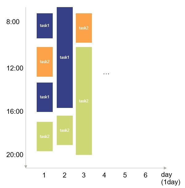
Vertical gantt chart for production planning (y:Time, x:Day)
I'm new to Power BI, and want to use it for visualize produciton task plan.
Is it possible to make a chart like, y-axis= Time during 1day, x-axis= day drung a month?
for showng all planned task for 1month by different time and duration.
Tried some custom visual but couldnt find good method.
Image of the output.
Solved! Go to Solution.
- Mark as New
- Bookmark
- Subscribe
- Mute
- Subscribe to RSS Feed
- Permalink
- Report Inappropriate Content
Hello bigpinkpig,
in the June/July Power BI Update blog Alan Baram explained briefly the Gantt Visual from Microsoft. -> https://powerbi.microsoft.com/en-us/blog/power-bi-developer-community-june-july-update/
You can download a sample report here.
If the answers was helpful please kudo & mark it as a solution ![]() Thank you!
Thank you!
BR,
Josef
- Mark as New
- Bookmark
- Subscribe
- Mute
- Subscribe to RSS Feed
- Permalink
- Report Inappropriate Content
Making the time axis fully in vertical axis can make the chart more readable and readable.
You can check it here: https://www.linkedin.com/pulse/vertical-gantt-chart-mochamad-aris-zamroni/
- Mark as New
- Bookmark
- Subscribe
- Mute
- Subscribe to RSS Feed
- Permalink
- Report Inappropriate Content
Hello bigpinkpig,
in the June/July Power BI Update blog Alan Baram explained briefly the Gantt Visual from Microsoft. -> https://powerbi.microsoft.com/en-us/blog/power-bi-developer-community-june-july-update/
You can download a sample report here.
If the answers was helpful please kudo & mark it as a solution ![]() Thank you!
Thank you!
BR,
Josef
Helpful resources

Microsoft Fabric Learn Together
Covering the world! 9:00-10:30 AM Sydney, 4:00-5:30 PM CET (Paris/Berlin), 7:00-8:30 PM Mexico City

Power BI Monthly Update - April 2024
Check out the April 2024 Power BI update to learn about new features.

| User | Count |
|---|---|
| 104 | |
| 95 | |
| 80 | |
| 67 | |
| 62 |
| User | Count |
|---|---|
| 146 | |
| 110 | |
| 107 | |
| 86 | |
| 63 |

