This is best Fabric, Power BI, SQL and AI community event. How do we know? The last event sold out! Save €200 with code FABCMTY200.
Register nowJuly 28 - August 9 | Final Round of the Power BI Dataviz World Championships. This is your chance. Learn more
Hi All,
I am trying to create a connected dynamic slicer/visuals for the below table
State | Company | Field | Values |
Wisconsin | MCD | C | 146 |
Florida | CVX | A | 175 |
Florida | CVX | C | 289 |
Idaho | CVX | C | 223 |
Idaho | XOM | B | 485 |
Wisconsin | MCD | B | 190 |
Wisconsin | MCD | A | 133 |
Idaho | MCD | A | 271 |
Idaho | KFC | C | 415 |
Florida | MCD | A | 275 |
Florida | KFC | D | 151 |
Florida | CVX | D | 197 |
Texas | KFC | D | 118 |
Wisconsin | KFC | D | 476 |
Wisconsin | MCD | D | 150 |
Texas | CVX | A | 250 |
Florida | XOM | D | 466 |
I have the following visuals
What I am looking for is when I select a field in pie chart (suppose- Florida) then I should simultaneously be able to select a company (say CVX). Based on my visual level selections the value in the slicer should also change. The slicer should only show me the fields available for CVX in Florida not all.
While creating the relationship I have set the cross filer direction to both but still isint helpful
Could you please help me on this.
Solved! Go to Solution.
Hi baronraghu
Do you want the two visuals show the information: in pie chart shows the state (suppose- Florida), in doughnut chart shows company from the selected state(CVX from Florida) ?
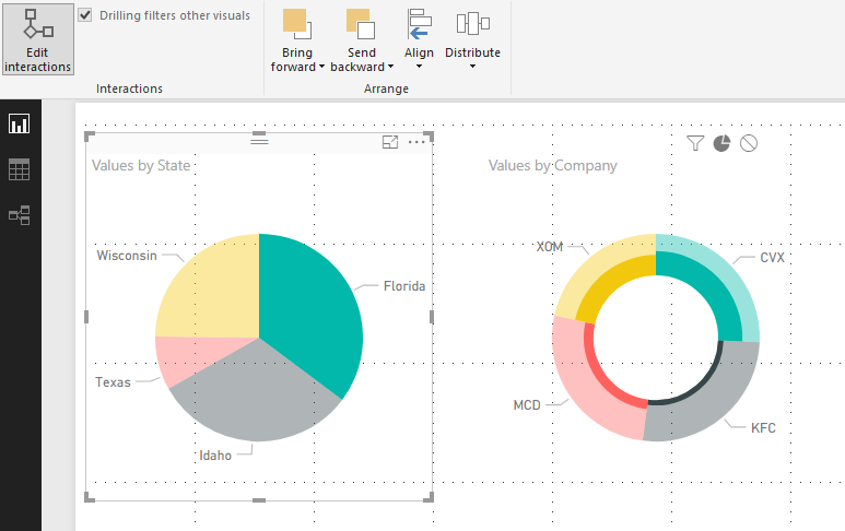
If so, you can Edit Interactions within the two visuals.
Detailed steps:
the first is to filter the companies of the selected state (all companies of Florida)
the second is to reflect the proportion of each company of the selected state ( the dark green in the picture below shows the proportion of company CVX in Florida)
the third shows no change in doughnut chart when selecting the state in pie chart.
Regards
Maggie
Hi baronraghu,
As you said, you want:
Is my understanding right?
If it is, what must be noted is slicer selection can’t be changed by other visuals’ selection. It is supported when you select value in a slicer, other visuals will make a change.
If you have any question, feel free to ask me.
Best regards
Maggie
Hi Maggie,
Yes your understanding is correct. Thanks for making it simple and easy to understand.
So is there any way where section of two different visuals are selected. Like i said earlier I select (Florida) in the pie chart and simultaneously i select CVX from company.
Regards
Raghu
Hi baronraghu
Do you want the two visuals show the information: in pie chart shows the state (suppose- Florida), in doughnut chart shows company from the selected state(CVX from Florida) ?
If so, you can Edit Interactions within the two visuals.
Detailed steps:
the first is to filter the companies of the selected state (all companies of Florida)
the second is to reflect the proportion of each company of the selected state ( the dark green in the picture below shows the proportion of company CVX in Florida)
the third shows no change in doughnut chart when selecting the state in pie chart.
Regards
Maggie
Join us in Barcelona for FabCon and SQLCon, the Fabric, Power BI, SQL, and AI community event. Save €200 with code FABCMTY200.
If you love stickers, then you will definitely want to check out our community sticker challenge, Barcelona edition!
Check out the July 2026 Power BI update to learn about new features.
| User | Count |
|---|---|
| 25 | |
| 23 | |
| 22 | |
| 17 | |
| 14 |
| User | Count |
|---|---|
| 25 | |
| 24 | |
| 20 | |
| 19 | |
| 19 |