FabCon is coming to Atlanta
Join us at FabCon Atlanta from March 16 - 20, 2026, for the ultimate Fabric, Power BI, AI and SQL community-led event. Save $200 with code FABCOMM.
Register now!- Power BI forums
- Get Help with Power BI
- Desktop
- Service
- Report Server
- Power Query
- Mobile Apps
- Developer
- DAX Commands and Tips
- Custom Visuals Development Discussion
- Health and Life Sciences
- Power BI Spanish forums
- Translated Spanish Desktop
- Training and Consulting
- Instructor Led Training
- Dashboard in a Day for Women, by Women
- Galleries
- Data Stories Gallery
- Themes Gallery
- Contests Gallery
- QuickViz Gallery
- Quick Measures Gallery
- Visual Calculations Gallery
- Notebook Gallery
- Translytical Task Flow Gallery
- TMDL Gallery
- R Script Showcase
- Webinars and Video Gallery
- Ideas
- Custom Visuals Ideas (read-only)
- Issues
- Issues
- Events
- Upcoming Events
The Power BI Data Visualization World Championships is back! Get ahead of the game and start preparing now! Learn more
- Power BI forums
- Forums
- Get Help with Power BI
- Desktop
- Re: Unusual behavior in visual
- Subscribe to RSS Feed
- Mark Topic as New
- Mark Topic as Read
- Float this Topic for Current User
- Bookmark
- Subscribe
- Printer Friendly Page
- Mark as New
- Bookmark
- Subscribe
- Mute
- Subscribe to RSS Feed
- Permalink
- Report Inappropriate Content
Unusual behavior in visual
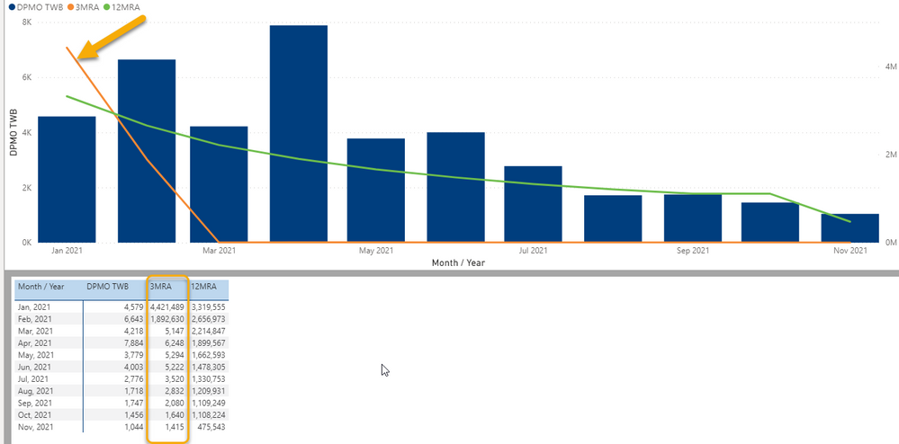
I have a bar / line chart visual that is not displaying the line values correctly. To be absolutely sure the screenshot below is from the Show as Table view. You can clearly see the 3MRA line does NOT match its values in the table!
I've deleted and recreated the chart and the measure, but no difference. I've never seen this kind of behavior before. Any ideas?
Solved! Go to Solution.
- Mark as New
- Bookmark
- Subscribe
- Mute
- Subscribe to RSS Feed
- Permalink
- Report Inappropriate Content
Hi @Anonymous
The minimum and maximum values for 3MRA are vastly different. The scale on the secondary Y axis isn't large enough to display them all properly. If you remove the two large values for 3MRA the line displays fine.
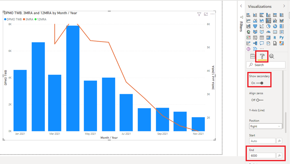
To illustrate, change the end value on the secondary Y axis to something small like 6000, and all your smaller values will now appear on the line. The really large ones will of cours ebe off the top of the chart, but this demonstates the issue.
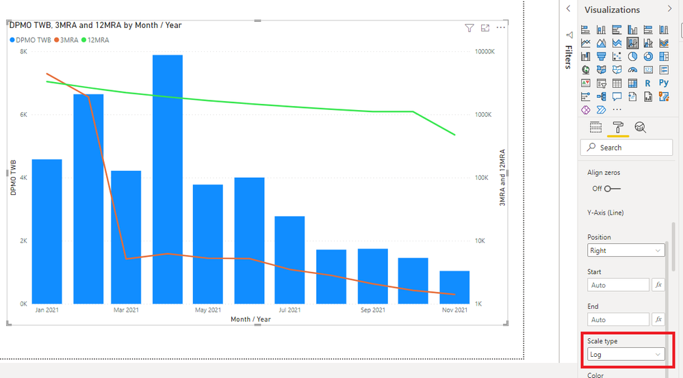
Change the secondary Y axis Scale Type to Log and you can see all the values for 3MRA
Regards
Phil
Did I answer your question? Then please mark my post as the solution.
If I helped you, click on the Thumbs Up to give Kudos.
Blog :: YouTube Channel :: Connect on Linkedin
Proud to be a Super User!
- Mark as New
- Bookmark
- Subscribe
- Mute
- Subscribe to RSS Feed
- Permalink
- Report Inappropriate Content
I agree, your 3RMA values are plotted on the secondary Y axis (millions) not the 1st Y axis (thousands) what you are seeing is the values relative to the axis and your 3RMA are displayed relative to the Millions, not Thousands
- Mark as New
- Bookmark
- Subscribe
- Mute
- Subscribe to RSS Feed
- Permalink
- Report Inappropriate Content
So everyone was absolutely correct on this (I am still a PBI newbie), but in following everyone's advice I noticed a peculiar and undesirable (for my setup, anyway) behavior. For combo bar/line charts like this it's impossible to "sync" the y axis between the columns and the lines, which makes for a lot of confusion. Whether the secondary y axis is turned on or off, that only seems to make the secondary y axis legend visible or not - the lines are still on a completely different scale. If I configure the "end" for the secondary axis to use the column values for scaling (instead of Auto) it brings it down a little, but it's still on a totally-different scale.
There should be an option to sync them completely. In my case, for example, one of the lines is a goal line, and it looks like the columns are consistently exceeding the goal when in fact they aren't. I've pored over all settings and I don't see any way to really make an absolute sync between the two y axis. Am I missing something?
EDIT: I updated my version of Desktop and see that now there is an option to zoom on the secondary y axis also. Using this I can manually "force" a scale match between the two. It works, but is rather inelegant and I have to redo it every time.
- Mark as New
- Bookmark
- Subscribe
- Mute
- Subscribe to RSS Feed
- Permalink
- Report Inappropriate Content
You are both of course absolutely correct. No idea how this escaped me (I blame the head cold).
Thank you!
- Mark as New
- Bookmark
- Subscribe
- Mute
- Subscribe to RSS Feed
- Permalink
- Report Inappropriate Content
Hi @Anonymous
The minimum and maximum values for 3MRA are vastly different. The scale on the secondary Y axis isn't large enough to display them all properly. If you remove the two large values for 3MRA the line displays fine.
To illustrate, change the end value on the secondary Y axis to something small like 6000, and all your smaller values will now appear on the line. The really large ones will of cours ebe off the top of the chart, but this demonstates the issue.
Change the secondary Y axis Scale Type to Log and you can see all the values for 3MRA
Regards
Phil
Did I answer your question? Then please mark my post as the solution.
If I helped you, click on the Thumbs Up to give Kudos.
Blog :: YouTube Channel :: Connect on Linkedin
Proud to be a Super User!
- Mark as New
- Bookmark
- Subscribe
- Mute
- Subscribe to RSS Feed
- Permalink
- Report Inappropriate Content
I agree, your 3RMA values are plotted on the secondary Y axis (millions) not the 1st Y axis (thousands) what you are seeing is the values relative to the axis and your 3RMA are displayed relative to the Millions, not Thousands
Helpful resources

Power BI Dataviz World Championships
The Power BI Data Visualization World Championships is back! Get ahead of the game and start preparing now!

| User | Count |
|---|---|
| 37 | |
| 33 | |
| 32 | |
| 31 | |
| 26 |
| User | Count |
|---|---|
| 134 | |
| 96 | |
| 78 | |
| 67 | |
| 65 |


