FabCon is coming to Atlanta
Join us at FabCon Atlanta from March 16 - 20, 2026, for the ultimate Fabric, Power BI, AI and SQL community-led event. Save $200 with code FABCOMM.
Register now!- Power BI forums
- Get Help with Power BI
- Desktop
- Service
- Report Server
- Power Query
- Mobile Apps
- Developer
- DAX Commands and Tips
- Custom Visuals Development Discussion
- Health and Life Sciences
- Power BI Spanish forums
- Translated Spanish Desktop
- Training and Consulting
- Instructor Led Training
- Dashboard in a Day for Women, by Women
- Galleries
- Data Stories Gallery
- Themes Gallery
- Contests Gallery
- QuickViz Gallery
- Quick Measures Gallery
- Visual Calculations Gallery
- Notebook Gallery
- Translytical Task Flow Gallery
- TMDL Gallery
- R Script Showcase
- Webinars and Video Gallery
- Ideas
- Custom Visuals Ideas (read-only)
- Issues
- Issues
- Events
- Upcoming Events
The Power BI Data Visualization World Championships is back! Get ahead of the game and start preparing now! Learn more
- Power BI forums
- Forums
- Get Help with Power BI
- Desktop
- Re: Two slicer on same column
- Subscribe to RSS Feed
- Mark Topic as New
- Mark Topic as Read
- Float this Topic for Current User
- Bookmark
- Subscribe
- Printer Friendly Page
- Mark as New
- Bookmark
- Subscribe
- Mute
- Subscribe to RSS Feed
- Permalink
- Report Inappropriate Content
Two slicer on same column
Before someone tells me that I can select two values in a slicer and that does the trick. I know that but that is not what i want here.
The idea is to have 1 v 1 comparison. So I need two slicer on the same column where the user can select 1 product from the first slicer and another product from the second slicer.
The problem which I am facing is that any graph created tries to filter both products and results in blank as Slicer 1 AND Slicer 2 is Null (which is obvious). I am thinking something like Slicer 1 OR Slicer 2 might do the trick but am open to any ideas you have.
Thanks
- Mark as New
- Bookmark
- Subscribe
- Mute
- Subscribe to RSS Feed
- Permalink
- Report Inappropriate Content
I need the same problem resolved - however i cannot use measures as i am dealing with circa 1-2 million points on a map visual (calculation time to do this with a measure is not appropriate).
I need one visual, filterable by two different slicers which operate on the same column.
Is this possible to do at the visual end? Or do you have to multiply tables and create a "Cube"/OLAP?
(i am already doing a sort of "cube", any further "cubing" is likely not viable.....
- Mark as New
- Bookmark
- Subscribe
- Mute
- Subscribe to RSS Feed
- Permalink
- Report Inappropriate Content
Create a measure that calculates based upon the MAX of your column and another that calculates based upon the MIN of your column. Use those measures in your visuals.
Really tough without sample data. Please see this post regarding How to Get Your Question Answered Quickly: https://community.powerbi.com/t5/Community-Blog/How-to-Get-Your-Question-Answered-Quickly/ba-p/38490
Follow on LinkedIn
@ me in replies or I'll lose your thread!!!
Instead of a Kudo, please vote for this idea
Become an expert!: Enterprise DNA
External Tools: MSHGQM
YouTube Channel!: Microsoft Hates Greg
Latest book!: DAX For Humans
DAX is easy, CALCULATE makes DAX hard...
- Mark as New
- Bookmark
- Subscribe
- Mute
- Subscribe to RSS Feed
- Permalink
- Report Inappropriate Content
@Anonymous,
I know how to help you. You need a feature called 'Edit interactions' - https://docs.microsoft.com/en-us/power-bi/service-reports-visual-interactions
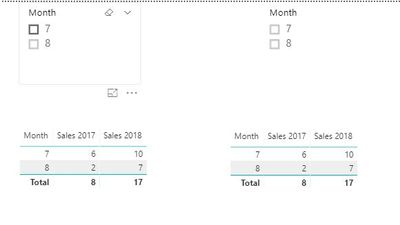
For instance, you have one two slicers and two tables like below:

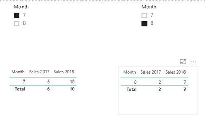
Then select the first slicer and go to Format -> 'Edit interactions' and disable filter on a second slicer and second table.
Then click on the first table and do completely the same.
After that click on the second slicer and disable filter on a first slicer and first table. Do completely the same for the second table.
As a result, you be able to filter both slicers separately like below:

Regards,
Ruslan
-------------------------------------------------------------------
Did I answer your question? Mark my post as a solution!
- Mark as New
- Bookmark
- Subscribe
- Mute
- Subscribe to RSS Feed
- Permalink
- Report Inappropriate Content
Hi Ruslan / @zoloturu ,
I was wondering if there is also a way to do this for multiple periods? Your method works brilliantly but when I want to filter for multiple periods it returns no results.
Thanks in advance,
- Mark as New
- Bookmark
- Subscribe
- Mute
- Subscribe to RSS Feed
- Permalink
- Report Inappropriate Content
Hey Ruslan
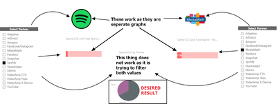
Thanks for the quick reply. Yes the edit interaction does that but the main goal is to have a 1 v 1 comparison, for eg a Pie chart for the two months (in your example).
Edit Interation works when there are two seperate graphs but not when there is one graph.
The result -> compare the two Partners and generate and 1 v 1 comparison.
I hope this helps
Thanks
- Mark as New
- Bookmark
- Subscribe
- Mute
- Subscribe to RSS Feed
- Permalink
- Report Inappropriate Content
Hi @Anonymous,
It can be done as well. See a screenshot and details how to achieve that below:

1. Create a calculated table using a formula:
MonthFilter1 = DISTINCT(VALUES(Table1[Month]))
where
- Table1 is your table name
- [Month] is your column of table Table1 to be used as a filter
- MonthFilter1 is your name for this calculated table, can be free text
Some examples of what is a calculated table and how to create it - https://www.youtube.com/watch?v=aKX1E3krl4I
2. Add a calculated measure to the table MonthFilter1:
MonthFilter1 Value = SELECTEDVALUE(MonthFilter1[Month])
Examples - https://www.youtube.com/watch?v=yn2bXVQJLx8
3. Create a second calculated table MonthFilter2 and measure MonthFilter2 Value in it (replace all 1 digit with 2 in formulas, except table Table1 name)
4. Create a calculated measure in Table1:
SalesMonth1 = SUMX(FILTER(Table1,Table1[Month]=MonthFilter1[MonthFilter1 Value]),Table1[Sales 2017])
Where
- SalesMonth1 is a name of your measure
- Table1 is a name of your main table
- MonthFilter1 is a name of a first calculated table
- [MonthFilter1 Value] is a name of a measure from a table MonthFilter1
- [Sales 2017] is a name of your numeric field which you want to compare for different filters
5. Create a similar measure SalesMonth2 in the same table Table1 (replace all 1 digit with 2 in formulas, except table Table1 name)
Regards,
Ruslan
-------------------------------------------------------------------
Did I answer your question? Mark my post as a solution!
- Mark as New
- Bookmark
- Subscribe
- Mute
- Subscribe to RSS Feed
- Permalink
- Report Inappropriate Content
can we do the same thing in scatter plot with more then one x-axis/y-axis?
- Mark as New
- Bookmark
- Subscribe
- Mute
- Subscribe to RSS Feed
- Permalink
- Report Inappropriate Content
Thanks for your answer!
Just wondering what if a slicer is able to select more than one value?
Can I write a dax function to collect the whole values selected from different slicers and pass the variable to the fact table measure to filter data?
Best Regards,
Matt
- Mark as New
- Bookmark
- Subscribe
- Mute
- Subscribe to RSS Feed
- Permalink
- Report Inappropriate Content
- Mark as New
- Bookmark
- Subscribe
- Mute
- Subscribe to RSS Feed
- Permalink
- Report Inappropriate Content
Been looking for an hour how to solve this. Helped a lot. Cheers and thanks!
- Mark as New
- Bookmark
- Subscribe
- Mute
- Subscribe to RSS Feed
- Permalink
- Report Inappropriate Content
- Mark as New
- Bookmark
- Subscribe
- Mute
- Subscribe to RSS Feed
- Permalink
- Report Inappropriate Content
Hi @zoloturu ,
I'm trying something similar with data ranges instead of month and I don't get any results in the output measure. What could I be doing wrong?
Here are my formulas:
First table: LHS DateRange = CALCULATETABLE(VALUES('BilledRevenue'[EFF_START_DATE]))
Second Table RHS DateRange = CALCULATETABLE(VALUES('BilledRevenue'[EFF_START_DATE]))
First Measure: LHS Value = SELECTEDVALUE('LHS DateRange'[EFF_START_DATE].[Date])
Second Measure RHS Value = SELECTEDVALUE('RHS DateRange'[EFF_START_DATE].[Date])
Output1 Measure: CustomLHS = sumx(FILTER('BilledRevenue','BilledRevenue'[EFF_START_DATE].[Date]='LHS DateRange'[LHS Value]),'BilledRevenue'[Revenue])
Output2 Measure: CustomRHS = sumx(FILTER('BilledRevenue','BilledRevenue'[EFF_START_DATE].[Date]='RHS DateRange'[RHS Value]),'BilledRevenue'[Revenue])
I have created two slicers on LHS DateRange and RHS DateRange tables. No matter if I select a single date or a range of dates or multiple dates from the date slicers, I don't get any values in the CustomLHS or CustomRHS measures.
Helpful resources

Power BI Monthly Update - November 2025
Check out the November 2025 Power BI update to learn about new features.

Fabric Data Days
Advance your Data & AI career with 50 days of live learning, contests, hands-on challenges, study groups & certifications and more!

| User | Count |
|---|---|
| 58 | |
| 45 | |
| 42 | |
| 21 | |
| 18 |
| User | Count |
|---|---|
| 172 | |
| 107 | |
| 92 | |
| 54 | |
| 46 |

