A new Data Days event is coming soon!
This time we’re going bigger than ever. Fabric, Power BI, SQL, AI and more. We're covering it all. You won't want to miss it.
Learn more- Power BI forums
- Get Help with Power BI
- Desktop
- Service
- Report Server
- Power Query
- Mobile Apps
- Developer
- DAX Commands and Tips
- Custom Visuals Development Discussion
- Health and Life Sciences
- Power BI Spanish forums
- Translated Spanish Desktop
- Training and Consulting
- Instructor Led Training
- Dashboard in a Day for Women, by Women
- Galleries
- Data Stories Gallery
- Themes Gallery
- Contests Gallery
- QuickViz Gallery
- Quick Measures Gallery
- Visual Calculations Gallery
- Notebook Gallery
- Translytical Task Flow Gallery
- TMDL Gallery
- R Script Showcase
- Webinars and Video Gallery
- Ideas
- Custom Visuals Ideas (read-only)
- Issues
- Issues
- Events
- Upcoming Events
Level up your Power BI skills this month - build one visual each week and tell better stories with data! Get started
- Power BI forums
- Forums
- Get Help with Power BI
- Desktop
- Re: Trend Chart (Line Chart) with Multiple Values
- Subscribe to RSS Feed
- Mark Topic as New
- Mark Topic as Read
- Float this Topic for Current User
- Bookmark
- Subscribe
- Printer Friendly Page
- Mark as New
- Bookmark
- Subscribe
- Mute
- Subscribe to RSS Feed
- Permalink
- Report Inappropriate Content
Trend Chart (Line Chart) with Multiple Values
Hi Team,
I am looking to implement a visual where I can choose the different values to display for a set of employees based on the Month.
I want to display the trends on a single graph but for multiple values. I can make the selection for a particular value on a single graph rather than multiple visuals.
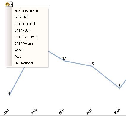
But in Power BI I can't do the same. In QlikView I can make cycling to choose the value for which I need to view the trend. Attaching the screenshot from QV.
Is it possible to do same in Power BI.
Thanks

Solved! Go to Solution.
- Mark as New
- Bookmark
- Subscribe
- Mute
- Subscribe to RSS Feed
- Permalink
- Report Inappropriate Content
@anmsharma you need a dynamic slicer for your measures
http://visualbi.com/blogs/powerbi/dynamic-measure-selection-power-bi/
If I took the time to answer your question and I came up with a solution, please mark my post as a solution and /or give kudos freely for the effort 🙂 Thank you!
Proud to be a Super User!
- Mark as New
- Bookmark
- Subscribe
- Mute
- Subscribe to RSS Feed
- Permalink
- Report Inappropriate Content
Hi @vanessafvg,
Thanks for the help.
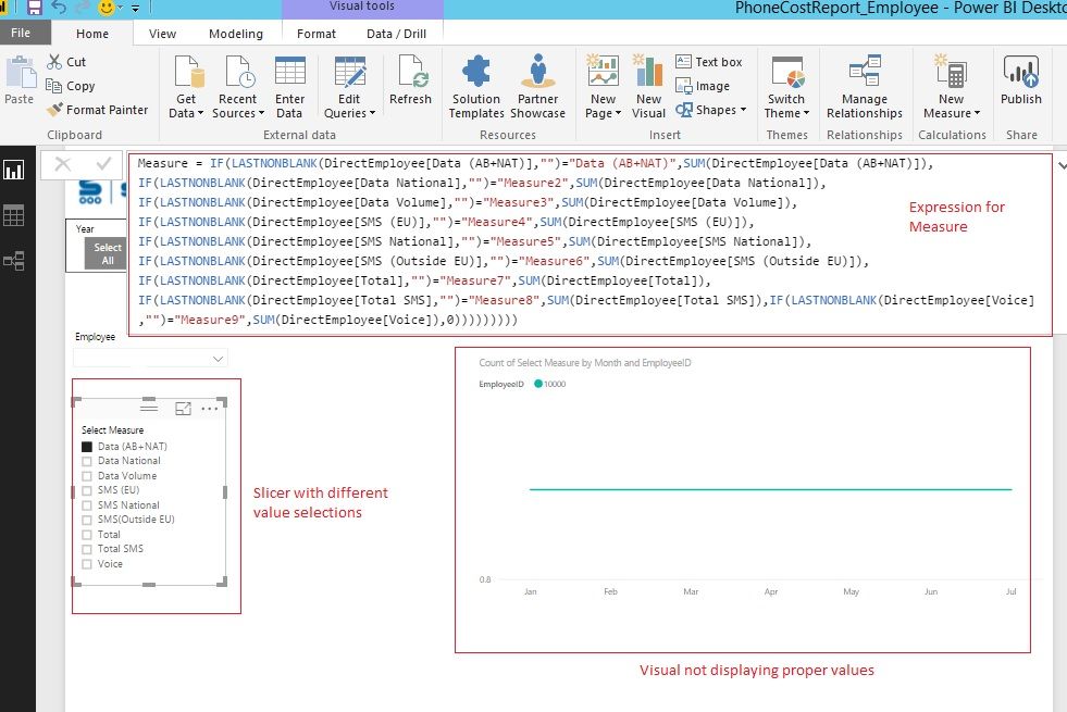
I did something but couldn't receive the desired results. Could you please help me what's wrong from the screenshot below.
Thanks Again.
- Mark as New
- Bookmark
- Subscribe
- Mute
- Subscribe to RSS Feed
- Permalink
- Report Inappropriate Content
Hi @anmsharma,
From the screenshot you shared above, I find that you're using the column "Select Measure"(Count) as Value on the Chart, which is not right. Instead, you should use the measure "Measure" as Value on the Chart to get the proper result in your scenario. ![]()
Regards
- Mark as New
- Bookmark
- Subscribe
- Mute
- Subscribe to RSS Feed
- Permalink
- Report Inappropriate Content
Thanks for the solution.
Implemented and figured out the issue and it's working fine.
Thanks Again
Anmol
- Mark as New
- Bookmark
- Subscribe
- Mute
- Subscribe to RSS Feed
- Permalink
- Report Inappropriate Content
Hi @anmsharma,
Great to hear the problem got resolved! Could you accept corresponding reply as solution to close this thread? ![]()
Regards
- Mark as New
- Bookmark
- Subscribe
- Mute
- Subscribe to RSS Feed
- Permalink
- Report Inappropriate Content
@anmsharma and have you tested the measures that they working outside of this particular method?
If I took the time to answer your question and I came up with a solution, please mark my post as a solution and /or give kudos freely for the effort 🙂 Thank you!
Proud to be a Super User!
Helpful resources

Power BI Monthly Update - April 2026
Check out the April 2026 Power BI update to learn about new features.

Data Days 2026 coming soon!
Sign up to receive a private message when registration opens and key events begin.

New to Fabric Survey
If you have recently started exploring Fabric, we'd love to hear how it's going. Your feedback can help with product improvements.

| User | Count |
|---|---|
| 36 | |
| 28 | |
| 28 | |
| 21 | |
| 18 |
| User | Count |
|---|---|
| 68 | |
| 39 | |
| 33 | |
| 24 | |
| 23 |

