FabCon is coming to Atlanta
Join us at FabCon Atlanta from March 16 - 20, 2026, for the ultimate Fabric, Power BI, AI and SQL community-led event. Save $200 with code FABCOMM.
Register now!- Power BI forums
- Get Help with Power BI
- Desktop
- Service
- Report Server
- Power Query
- Mobile Apps
- Developer
- DAX Commands and Tips
- Custom Visuals Development Discussion
- Health and Life Sciences
- Power BI Spanish forums
- Translated Spanish Desktop
- Training and Consulting
- Instructor Led Training
- Dashboard in a Day for Women, by Women
- Galleries
- Data Stories Gallery
- Themes Gallery
- Contests Gallery
- QuickViz Gallery
- Quick Measures Gallery
- Visual Calculations Gallery
- Notebook Gallery
- Translytical Task Flow Gallery
- TMDL Gallery
- R Script Showcase
- Webinars and Video Gallery
- Ideas
- Custom Visuals Ideas (read-only)
- Issues
- Issues
- Events
- Upcoming Events
The Power BI Data Visualization World Championships is back! Get ahead of the game and start preparing now! Learn more
- Power BI forums
- Forums
- Get Help with Power BI
- Desktop
- Re: Transparency Colour for one value in a stacked...
- Subscribe to RSS Feed
- Mark Topic as New
- Mark Topic as Read
- Float this Topic for Current User
- Bookmark
- Subscribe
- Printer Friendly Page
- Mark as New
- Bookmark
- Subscribe
- Mute
- Subscribe to RSS Feed
- Permalink
- Report Inappropriate Content
Transparency Colour for one value in a stacked column chart
Hello, I've been searching for a solution for this and have not found anything online.
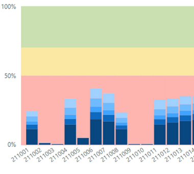
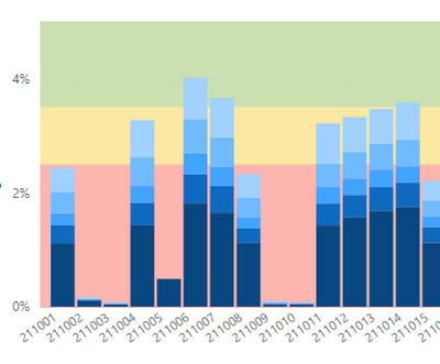
I'm trying to change the colour of one value in a 100% Stacked Column chart. I want to do this so the background colour can be seen and also this last value (grey column) in the stack is not essential. This is what I currently have and the second image is what I would like to be able to do.
Any help would be appreciated.
- Mark as New
- Bookmark
- Subscribe
- Mute
- Subscribe to RSS Feed
- Permalink
- Report Inappropriate Content
Ahh the grey is just a category you visualy would like to hide. So basicly you want to use a 100% stacked column, just because it gives a 100% axis. I would say, use a stacked column chart and create a 100% axis.
- Mark as New
- Bookmark
- Subscribe
- Mute
- Subscribe to RSS Feed
- Permalink
- Report Inappropriate Content
Hi @Anonymous ,
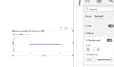
In the visual properties, you will have a background section where you can set the transparency property.
In the below ss, although I have a grey background, since my transparency is 100%, my visual looks white (fully transparent)
- Mark as New
- Bookmark
- Subscribe
- Mute
- Subscribe to RSS Feed
- Permalink
- Report Inappropriate Content
Hi I want to keep the background and make the grey bar in the 100% stacked column transparent.
- Mark as New
- Bookmark
- Subscribe
- Mute
- Subscribe to RSS Feed
- Permalink
- Report Inappropriate Content
Hi @Anonymous ,
If this is an image that you are using for background, you might have to remove the image.
The Earlier suggestion I gave was for if you are using a colour fill as your background. In case you are using both background image and color, making this background color transparent is not going to have any impact on your background image
By the way, is the grey bar the value that you have made up just to fill the visual with an idea of hiding it later?
- Mark as New
- Bookmark
- Subscribe
- Mute
- Subscribe to RSS Feed
- Permalink
- Report Inappropriate Content
Hi @Thejeswar
The backgound is fine and is what I wanted.
The grey bar is the 6th value in the 100% stacked column - I have to keep this value to make the 100% stack column work correctly. By making this value transparent I will end up with the required result. See image two in the original post.
- Mark as New
- Bookmark
- Subscribe
- Mute
- Subscribe to RSS Feed
- Permalink
- Report Inappropriate Content
By using the 100% you're trying to make a workaround. You need a stacked column chart, fix your axis and perhapse value (measure?) to create the desired result.
- Mark as New
- Bookmark
- Subscribe
- Mute
- Subscribe to RSS Feed
- Permalink
- Report Inappropriate Content
By using the stacked column chart I still need to make a workaround. As the axis now does not work as a percent of the total.
- Mark as New
- Bookmark
- Subscribe
- Mute
- Subscribe to RSS Feed
- Permalink
- Report Inappropriate Content
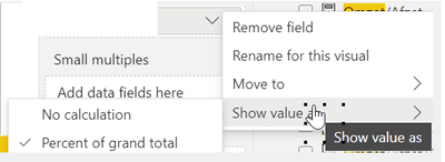
Isn't that easily fixed? Just change how to display the value.
- Mark as New
- Bookmark
- Subscribe
- Mute
- Subscribe to RSS Feed
- Permalink
- Report Inappropriate Content
Hi @PVO3
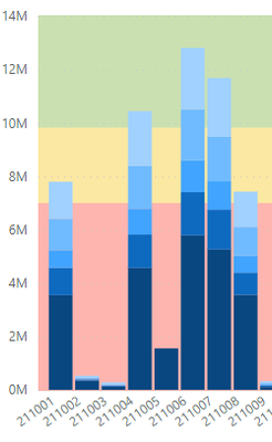
Not that straightforward - putting the value to a percentage of grand total gives you this.
But leave that with me as I might have to create a measure to correct the Y-Axis to solve this. Which is why I was using the 100% stacked column chart.
- Mark as New
- Bookmark
- Subscribe
- Mute
- Subscribe to RSS Feed
- Permalink
- Report Inappropriate Content
To mimic the Y axis accordingly to the 100% stacked, just change the range minimum 0 to maximum 1.
But i think you might want to rethink your values. Not sure what youre currently using, but you might want to change the filter context.
- Mark as New
- Bookmark
- Subscribe
- Mute
- Subscribe to RSS Feed
- Permalink
- Report Inappropriate Content
The conditional formatting of backgrounds for some visuals do not work. Isn't this just simply fixed by removing background of the chart and use a shape or an image in the background? Or you want this to be dynamic?
- Mark as New
- Bookmark
- Subscribe
- Mute
- Subscribe to RSS Feed
- Permalink
- Report Inappropriate Content
Hi, sorry if it isn't clear. I want to keep the background and make the grey bar in the 100% stacked column transparent. As the second image shows.
Helpful resources

Power BI Dataviz World Championships
The Power BI Data Visualization World Championships is back! Get ahead of the game and start preparing now!

| User | Count |
|---|---|
| 40 | |
| 38 | |
| 36 | |
| 29 | |
| 28 |
| User | Count |
|---|---|
| 127 | |
| 88 | |
| 78 | |
| 66 | |
| 65 |

