Join us at FabCon Vienna from September 15-18, 2025
The ultimate Fabric, Power BI, SQL, and AI community-led learning event. Save €200 with code FABCOMM.
Get registered- Power BI forums
- Get Help with Power BI
- Desktop
- Service
- Report Server
- Power Query
- Mobile Apps
- Developer
- DAX Commands and Tips
- Custom Visuals Development Discussion
- Health and Life Sciences
- Power BI Spanish forums
- Translated Spanish Desktop
- Training and Consulting
- Instructor Led Training
- Dashboard in a Day for Women, by Women
- Galleries
- Data Stories Gallery
- Themes Gallery
- Contests Gallery
- Quick Measures Gallery
- Notebook Gallery
- Translytical Task Flow Gallery
- TMDL Gallery
- R Script Showcase
- Webinars and Video Gallery
- Ideas
- Custom Visuals Ideas (read-only)
- Issues
- Issues
- Events
- Upcoming Events
Enhance your career with this limited time 50% discount on Fabric and Power BI exams. Ends August 31st. Request your voucher.
- Power BI forums
- Forums
- Get Help with Power BI
- Desktop
- Transforming sharepoint list survey results
- Subscribe to RSS Feed
- Mark Topic as New
- Mark Topic as Read
- Float this Topic for Current User
- Bookmark
- Subscribe
- Printer Friendly Page
- Mark as New
- Bookmark
- Subscribe
- Mute
- Subscribe to RSS Feed
- Permalink
- Report Inappropriate Content
Transforming sharepoint list survey results
Hi,
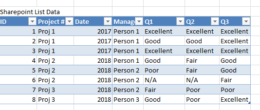
I am anaylzing results from a survey which are pulled into power bi through a sharepoint list. The format of the sharepoint list is as follows:
I would like to graph the results on a stacked bar chart - yaxis being the questions and xaxis being the % answered of each type (Excellent, good, fair, poor, n/a), also being able to filter by project #, date, manager.
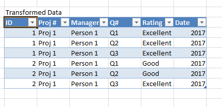
I believe the easiest way to do that would be to get my data in the following format:
How would I use power bi to transform the data this way? (Or is there a better way to format the data to get the resultant graph?)
Thanks so much!
Solved! Go to Solution.
- Mark as New
- Bookmark
- Subscribe
- Mute
- Subscribe to RSS Feed
- Permalink
- Report Inappropriate Content
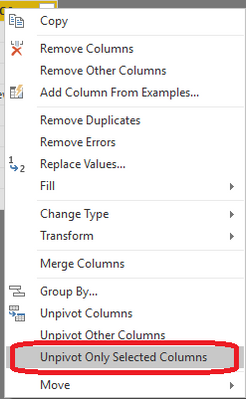
In query editor, select Q1, Q2, Q3 columns, right click, and click 'Unpivot Only Selected Columns':
- Mark as New
- Bookmark
- Subscribe
- Mute
- Subscribe to RSS Feed
- Permalink
- Report Inappropriate Content
In query editor, select Q1, Q2, Q3 columns, right click, and click 'Unpivot Only Selected Columns':
- Mark as New
- Bookmark
- Subscribe
- Mute
- Subscribe to RSS Feed
- Permalink
- Report Inappropriate Content
When selecting unpivot only selected columns, all the columns display "error".
The error message is:
DataSource.Error: We couldn't parse OData response result. Error: A value without a type name was found and no expected type is available. When the model is specified, each value in the payload must have a type which can be either specified in the payload, explicitly by the caller or implicitly inferred from the parent value.
Details:
DataSourceKind=SharePoint
DataSourcePath=https://mytentnat.sharepoint.com/sites/qa/_api/Web/Lists(guid'542c4b4b-f41d-472b-a401-8e0768adc2d8')...
Helpful resources
| User | Count |
|---|---|
| 80 | |
| 74 | |
| 41 | |
| 30 | |
| 28 |
| User | Count |
|---|---|
| 107 | |
| 96 | |
| 53 | |
| 47 | |
| 47 |


