FabCon is coming to Atlanta
Join us at FabCon Atlanta from March 16 - 20, 2026, for the ultimate Fabric, Power BI, AI and SQL community-led event. Save $200 with code FABCOMM.
Register now!- Power BI forums
- Get Help with Power BI
- Desktop
- Service
- Report Server
- Power Query
- Mobile Apps
- Developer
- DAX Commands and Tips
- Custom Visuals Development Discussion
- Health and Life Sciences
- Power BI Spanish forums
- Translated Spanish Desktop
- Training and Consulting
- Instructor Led Training
- Dashboard in a Day for Women, by Women
- Galleries
- Data Stories Gallery
- Themes Gallery
- Contests Gallery
- Quick Measures Gallery
- Notebook Gallery
- Translytical Task Flow Gallery
- TMDL Gallery
- R Script Showcase
- Webinars and Video Gallery
- Ideas
- Custom Visuals Ideas (read-only)
- Issues
- Issues
- Events
- Upcoming Events
To celebrate FabCon Vienna, we are offering 50% off select exams. Ends October 3rd. Request your discount now.
- Power BI forums
- Forums
- Get Help with Power BI
- Desktop
- Trailing 12-Month Visual
- Subscribe to RSS Feed
- Mark Topic as New
- Mark Topic as Read
- Float this Topic for Current User
- Bookmark
- Subscribe
- Printer Friendly Page
- Mark as New
- Bookmark
- Subscribe
- Mute
- Subscribe to RSS Feed
- Permalink
- Report Inappropriate Content
Trailing 12-Month Visual
Hello,
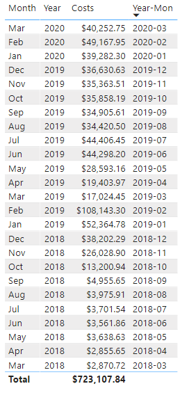
I have the following table showing the sum of costs for yyyy-mm:
I'd like to display this in a basic bar chart, but dynamically show the trainling 12-months from the current month.
Thanks,
Frank
Solved! Go to Solution.
- Mark as New
- Bookmark
- Subscribe
- Mute
- Subscribe to RSS Feed
- Permalink
- Report Inappropriate Content
I'm not sure if there's a way to dynamically alter the start/end points of a visual like that, but you could use some logic to get the same result with a filter - if you use the correct combination of dateadd/eomonth/today, you should be able to define each record as being in the previous twelve months or not, then use it as a visual level filter
edit - I've completely forgotten that there's relative date filtering as an out of the box option, try dropping your date field into that as a visual level filter and seeing if previous 12 calendar months will get you what you want?
- Mark as New
- Bookmark
- Subscribe
- Mute
- Subscribe to RSS Feed
- Permalink
- Report Inappropriate Content
Use a relative date filter or same option is also available visual level filter
https://docs.microsoft.com/en-us/power-bi/visuals/desktop-slicer-filter-date-range
- Mark as New
- Bookmark
- Subscribe
- Mute
- Subscribe to RSS Feed
- Permalink
- Report Inappropriate Content
I'm not sure if there's a way to dynamically alter the start/end points of a visual like that, but you could use some logic to get the same result with a filter - if you use the correct combination of dateadd/eomonth/today, you should be able to define each record as being in the previous twelve months or not, then use it as a visual level filter
edit - I've completely forgotten that there's relative date filtering as an out of the box option, try dropping your date field into that as a visual level filter and seeing if previous 12 calendar months will get you what you want?
- Mark as New
- Bookmark
- Subscribe
- Mute
- Subscribe to RSS Feed
- Permalink
- Report Inappropriate Content
I added the date field to the visual filter and used the relative date filter.
Thanks for you help!


