FabCon is coming to Atlanta
Join us at FabCon Atlanta from March 16 - 20, 2026, for the ultimate Fabric, Power BI, AI and SQL community-led event. Save $200 with code FABCOMM.
Register now!- Power BI forums
- Get Help with Power BI
- Desktop
- Service
- Report Server
- Power Query
- Mobile Apps
- Developer
- DAX Commands and Tips
- Custom Visuals Development Discussion
- Health and Life Sciences
- Power BI Spanish forums
- Translated Spanish Desktop
- Training and Consulting
- Instructor Led Training
- Dashboard in a Day for Women, by Women
- Galleries
- Data Stories Gallery
- Themes Gallery
- Contests Gallery
- QuickViz Gallery
- Quick Measures Gallery
- Visual Calculations Gallery
- Notebook Gallery
- Translytical Task Flow Gallery
- TMDL Gallery
- R Script Showcase
- Webinars and Video Gallery
- Ideas
- Custom Visuals Ideas (read-only)
- Issues
- Issues
- Events
- Upcoming Events
Get Fabric Certified for FREE during Fabric Data Days. Don't miss your chance! Request now
- Power BI forums
- Forums
- Get Help with Power BI
- Desktop
- Re: Tooltip not showing all lines data
- Subscribe to RSS Feed
- Mark Topic as New
- Mark Topic as Read
- Float this Topic for Current User
- Bookmark
- Subscribe
- Printer Friendly Page
- Mark as New
- Bookmark
- Subscribe
- Mute
- Subscribe to RSS Feed
- Permalink
- Report Inappropriate Content
Tooltip not showing all lines data
Hello everyone,
I have a silly problem and I can't figure out how to solve it.
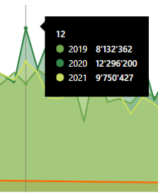
I must recreate a line chart that exist in a Power BI deskop file that an ex colleague did. When overing with the mouse, the tooltip shows all the points like this:
and this is exactly what I need to obtain.
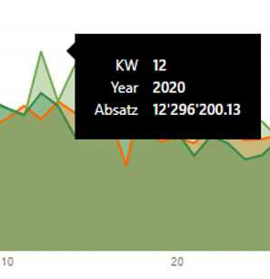
Now when I create exactly the same chart in a new PBI desktop file, the same tooltip showes like this:
I can't figure out what make it appear differently. The configuration of the visual is exactly the same, and it was not a custom tooltip.
Any idea ?
Thanks in advance
Solved! Go to Solution.
- Mark as New
- Bookmark
- Subscribe
- Mute
- Subscribe to RSS Feed
- Permalink
- Report Inappropriate Content
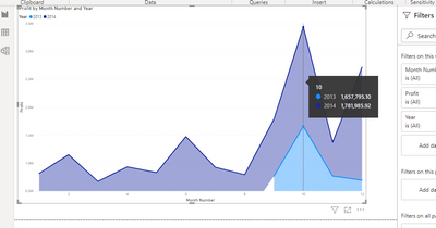
Sorry I couldn't answer before ! I found a solution, even though for me the reason of this behavior is still not clear. It's not a matter of version of Power BI or whatsoever. And I didn't ask for custom tooltips, I just wanted to recreate the standard one, as showed in the picture, and as you can see on your example too...
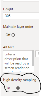
I could eventually do it by toggling off the "High density sampling" option, on the general settings panel:
I read the Microsoft documentation and within the considerations and limitations of this feature, they said: "Because of increased granularity and the binning process, Tooltips may only show a value if the representative data is aligned with your cursor. "
This is exactly why the standard tooltips showed up differently.
Thank you everyone for your help
- Mark as New
- Bookmark
- Subscribe
- Mute
- Subscribe to RSS Feed
- Permalink
- Report Inappropriate Content
Hi @MarcoFogale ,
I can't reproduce your issue. Everything is normal, just like the first picture. What version of pbi desktop are you using? Could you share a pbix (Use virtual data)and create a line chart?
Best Regards,
Liang
If this post helps, then please consider Accept it as the solution to help the other members find it more quickly.
- Mark as New
- Bookmark
- Subscribe
- Mute
- Subscribe to RSS Feed
- Permalink
- Report Inappropriate Content
Sorry I couldn't answer before ! I found a solution, even though for me the reason of this behavior is still not clear. It's not a matter of version of Power BI or whatsoever. And I didn't ask for custom tooltips, I just wanted to recreate the standard one, as showed in the picture, and as you can see on your example too...
I could eventually do it by toggling off the "High density sampling" option, on the general settings panel:

I read the Microsoft documentation and within the considerations and limitations of this feature, they said: "Because of increased granularity and the binning process, Tooltips may only show a value if the representative data is aligned with your cursor. "
This is exactly why the standard tooltips showed up differently.
Thank you everyone for your help
- Mark as New
- Bookmark
- Subscribe
- Mute
- Subscribe to RSS Feed
- Permalink
- Report Inappropriate Content
This is literally a life-saver. I spent so long trying to figure out why my tool-tip was not showing up properly. THANK YOU!
- Mark as New
- Bookmark
- Subscribe
- Mute
- Subscribe to RSS Feed
- Permalink
- Report Inappropriate Content
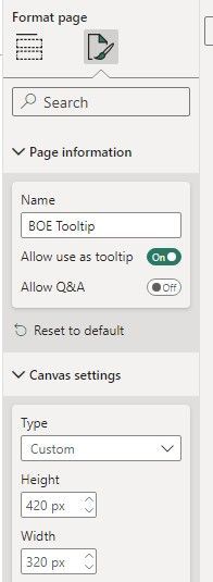
Go to tooltip page > Format Page > Format Icon > Canvas settings > Type: Custom > Increase the height (up to 420 px?)
- Mark as New
- Bookmark
- Subscribe
- Mute
- Subscribe to RSS Feed
- Permalink
- Report Inappropriate Content
Hi @MarcoFogale,
Here is Area chart with custom tooltip which will help you to get custom tooltip for each area value.
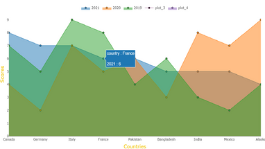
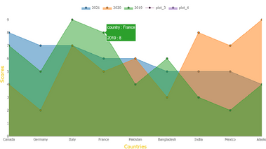
Download link for the custom visual file in this page,
https://pbivizedit.com/gallery/area-chart-with-custom-tooltip
This was made with our Custom Visual creator tool PBIVizEdit.com. With this tool,
- anyone, irrespective of technical skills, can create their own visuals
- 15 minutes to create a visual from scratch
- opens up many additional attributes to edit (for e.g. labels, tooltips, legends position, etc)
Give this a shot and let us know if you face any problem/errors.
You can use the editor to modify your visual further (some modifications cannot be done in Power BI window and have to be in editor).
Thanks,
Team PBIVizEdit
- Mark as New
- Bookmark
- Subscribe
- Mute
- Subscribe to RSS Feed
- Permalink
- Report Inappropriate Content
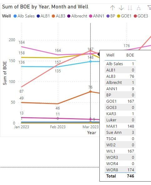
@MarcoFogale , I think the year is a legend, and that is why this kind of tooltip.
You can create a tooltip page , with [Keep all filters - off] , pass only axis value - add that to > add drill/tooltip value here
Helpful resources

Power BI Monthly Update - November 2025
Check out the November 2025 Power BI update to learn about new features.

Fabric Data Days
Advance your Data & AI career with 50 days of live learning, contests, hands-on challenges, study groups & certifications and more!

