FabCon is coming to Atlanta
Join us at FabCon Atlanta from March 16 - 20, 2026, for the ultimate Fabric, Power BI, AI and SQL community-led event. Save $200 with code FABCOMM.
Register now!- Power BI forums
- Get Help with Power BI
- Desktop
- Service
- Report Server
- Power Query
- Mobile Apps
- Developer
- DAX Commands and Tips
- Custom Visuals Development Discussion
- Health and Life Sciences
- Power BI Spanish forums
- Translated Spanish Desktop
- Training and Consulting
- Instructor Led Training
- Dashboard in a Day for Women, by Women
- Galleries
- Data Stories Gallery
- Themes Gallery
- Contests Gallery
- QuickViz Gallery
- Quick Measures Gallery
- Visual Calculations Gallery
- Notebook Gallery
- Translytical Task Flow Gallery
- TMDL Gallery
- R Script Showcase
- Webinars and Video Gallery
- Ideas
- Custom Visuals Ideas (read-only)
- Issues
- Issues
- Events
- Upcoming Events
The Power BI Data Visualization World Championships is back! Get ahead of the game and start preparing now! Learn more
- Power BI forums
- Forums
- Get Help with Power BI
- Desktop
- Re: Timeline Visual to Show Usage During the Day
- Subscribe to RSS Feed
- Mark Topic as New
- Mark Topic as Read
- Float this Topic for Current User
- Bookmark
- Subscribe
- Printer Friendly Page
- Mark as New
- Bookmark
- Subscribe
- Mute
- Subscribe to RSS Feed
- Permalink
- Report Inappropriate Content
Timeline Visual to Show Usage During the Day
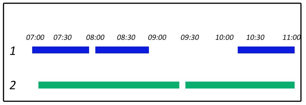
I would really like to find a way to show the usage of a Room during the day.
My table has
Room Start Time End Time Date
1 07:00 07:40 4-6-18
1 08:00 08:45 4-6-18
1 10:25 11:00 4-6-18
2 07:15 09:20 4-6-18
2 09:30 11:00 4-6-18
I would love the visual to end up like this: Please tell me there is something I can do to get this.
Solved! Go to Solution.
- Mark as New
- Bookmark
- Subscribe
- Mute
- Subscribe to RSS Feed
- Permalink
- Report Inappropriate Content
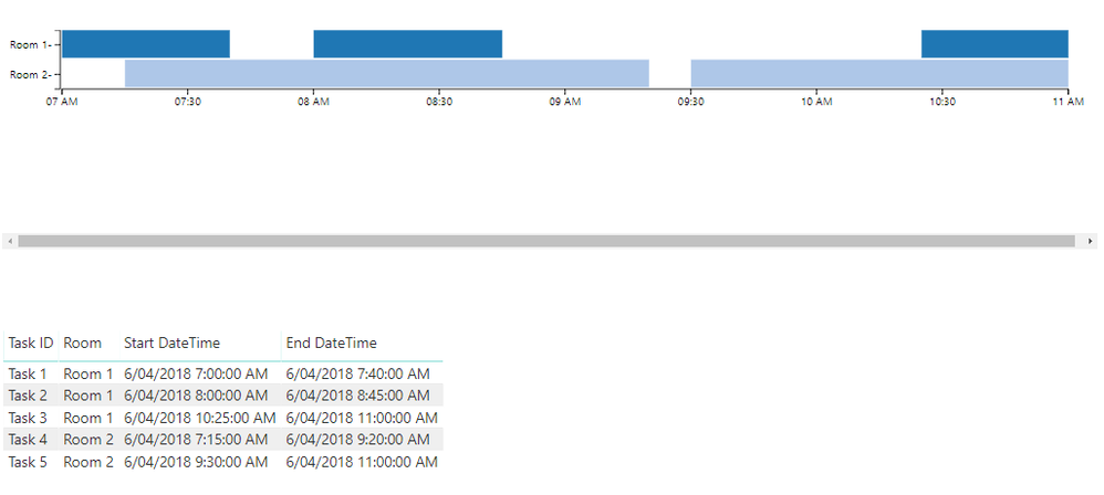
It seems that the "as Timeline" custom visual gets close to what you want.
I created a dummy pbix with your sample data here
I can't say I'm completely happy with the formatting options though - I had to create a dummy column to colour the bars by room.
There are a couple of Gantt custom visuals available as well that you could play around with (Gantt and Gantt Chart By MAQ Software).
Regards,
Owen
- Mark as New
- Bookmark
- Subscribe
- Mute
- Subscribe to RSS Feed
- Permalink
- Report Inappropriate Content
Hi @OwenAuger I could not find "As Timeline" Visual. Can you provide me with the .pbiviz file.
- Mark as New
- Bookmark
- Subscribe
- Mute
- Subscribe to RSS Feed
- Permalink
- Report Inappropriate Content
It looks like it's no longer in AppSource 😞
It looks like a copy of the PBIVIZ is available linked from this post.
Specifically in this SharePoint Online folder:
- Mark as New
- Bookmark
- Subscribe
- Mute
- Subscribe to RSS Feed
- Permalink
- Report Inappropriate Content
Your solution fit very well for what I am pretending to do, thanks!
Some values, in my case, the start time of a activity is in a day and it finish in the next day. In that way the chart does not keep in a 24h interval that I want. Any tips? I would like to transfer the hours from the next day in the chart to the same hours im the current day.
- Mark as New
- Bookmark
- Subscribe
- Mute
- Subscribe to RSS Feed
- Permalink
- Report Inappropriate Content
Hi @LeoM_ I could not find "As Timeline" Visual. Can you provide me with the .pbiviz file.
- Mark as New
- Bookmark
- Subscribe
- Mute
- Subscribe to RSS Feed
- Permalink
- Report Inappropriate Content
@OwenAuger hello Sir, is there any chance to get a copy of your file for this topic?
Thank you in advance,
- Mark as New
- Bookmark
- Subscribe
- Mute
- Subscribe to RSS Feed
- Permalink
- Report Inappropriate Content
- Mark as New
- Bookmark
- Subscribe
- Mute
- Subscribe to RSS Feed
- Permalink
- Report Inappropriate Content
Hi,
I have downloaded the PBIX, I see you have added a dummy column, but I am not able to find the logic you have written to colors the bars based on room number?
Could you please help me?
- Mark as New
- Bookmark
- Subscribe
- Mute
- Subscribe to RSS Feed
- Permalink
- Report Inappropriate Content
Is there a way to set the start time to like 6:30AM instead of the midnight?
Your solution was perfect. I didn't have my time fields as time -they were set to text for some reason.
- Mark as New
- Bookmark
- Subscribe
- Mute
- Subscribe to RSS Feed
- Permalink
- Report Inappropriate Content
That's good news 🙂
For me, the time axis was starting at 7:00 (start time of first event), so not sure why you may have been getting midnight.
I tried creating a dummy event with zero duration starting at 6:30 am, and this forces the time axis to start at 6:30.
See same Dropbox link for updated file.
- Mark as New
- Bookmark
- Subscribe
- Mute
- Subscribe to RSS Feed
- Permalink
- Report Inappropriate Content
I found the timeline issue and it is fixed. Is there any way to get labels in the bar colors?
- Mark as New
- Bookmark
- Subscribe
- Mute
- Subscribe to RSS Feed
- Permalink
- Report Inappropriate Content
Thanks for sharing about this great custom visual. I have a similar problem to solve but I wasn't sure if this visual could achieve the following requirement -
I would like to show by "continuous" timeline on x-axis of a KPI metric, which has StartTime + EndTime attributes in the dataset. The tricky part is how to allocate the count across the timeline. Each record below is 1 count.
ie
StartTime EndTime
2018-01-01 08:15:51 2018-01-01 10:45:31
2018-01-01 09:45:51 2018-01-01 10:15:31
2018-01-01 13:24:51 2018-01-01 17:05:31
2018-01-01 15:17:51 2018-01-01 18:42:31
2018-01-01 07:15:51 2018-01-01 11:58:31
Final Result - a timeline chart that shows at any given time, the count. For example, at 10 am sharp, the count should be 3 (1st, 2nd, and 5th records above).
I'm not sure which visualization provides the best approach for this?
Can any of you help point me in the right direction?
Thank you!
- Mark as New
- Bookmark
- Subscribe
- Mute
- Subscribe to RSS Feed
- Permalink
- Report Inappropriate Content
The visual I used would not work for this but I did something similiar for another project and just used a bar graph. I rounded the times to the nearest 15 minute increment.
I had to create a table with all of the time values it could be, then created a summary table of other data.
- Mark as New
- Bookmark
- Subscribe
- Mute
- Subscribe to RSS Feed
- Permalink
- Report Inappropriate Content
Do you mind sharing your solution how to round when there's a StartTime & EndTime?
- Mark as New
- Bookmark
- Subscribe
- Mute
- Subscribe to RSS Feed
- Permalink
- Report Inappropriate Content
This one rounds down so 3:21 becomes 3:00
TimeIn = IF(MINUTE('Pre Op Times'[Time In])<30,TIME(HOUR('Pre Op Times'[Time In]),0,0),TIME(HOUR('Pre Op Times'[Time In]),30,0))
This one rounds up so 3:21 becomes 3:30
TimeOut = if(MINUTE('Pre Op Times'[Time Out])>30,TIME(HOUR('Pre Op Times'[Time Out]),59,0)+TIME(0,1,0),TIME(HOUR('Pre Op Times'[Time Out]),30,0))
- Mark as New
- Bookmark
- Subscribe
- Mute
- Subscribe to RSS Feed
- Permalink
- Report Inappropriate Content
But the goal is not just bucket StartTime & EndTime, the goal is associate count for all times in between StartTime & EndTime. I mentioned it in my example below -
StartTime EndTime
2018-01-01 08:15:51 2018-01-01 10:45:31
2018-01-01 09:45:51 2018-01-01 10:15:31
2018-01-01 13:24:51 2018-01-01 17:05:31
2018-01-01 15:17:51 2018-01-01 18:42:31
2018-01-01 07:15:51 2018-01-01 11:58:31
Final Result - a timeline chart that shows at any given time, the count. For example, at 10 am sharp, the count should be 3 (1st, 2nd, and 5th records above).
I'm not sure which visualization provides the best approach for this?
Thanks!
- Mark as New
- Bookmark
- Subscribe
- Mute
- Subscribe to RSS Feed
- Permalink
- Report Inappropriate Content
I'm sorry but I am not the one to help. I am so new to Power BI that I ask for help almost daily. I would suggest starting a new thread. There are so many knowledgeable people on here that could help you.
- Mark as New
- Bookmark
- Subscribe
- Mute
- Subscribe to RSS Feed
- Permalink
- Report Inappropriate Content
I just thought this thread had many similar ingredients that could help me find a great visual for my case.
I did start a new thread below on 8/18, but haven't received a response/solution yet.
- Mark as New
- Bookmark
- Subscribe
- Mute
- Subscribe to RSS Feed
- Permalink
- Report Inappropriate Content
I'm wondering if there are other visuals that could in-take StartTime & EndTime and provides a count?
- Mark as New
- Bookmark
- Subscribe
- Mute
- Subscribe to RSS Feed
- Permalink
- Report Inappropriate Content
I am not sure
Helpful resources

Power BI Dataviz World Championships
The Power BI Data Visualization World Championships is back! Get ahead of the game and start preparing now!

| User | Count |
|---|---|
| 40 | |
| 38 | |
| 36 | |
| 29 | |
| 28 |
| User | Count |
|---|---|
| 127 | |
| 88 | |
| 78 | |
| 66 | |
| 65 |


