Get Fabric certified for FREE!
Don't miss your chance to take the Fabric Data Engineer (DP-600) exam for FREE! Find out how by watching the DP-600 session on-demand now through April 28th.
Learn more- Power BI forums
- Get Help with Power BI
- Desktop
- Service
- Report Server
- Power Query
- Mobile Apps
- Developer
- DAX Commands and Tips
- Custom Visuals Development Discussion
- Health and Life Sciences
- Power BI Spanish forums
- Translated Spanish Desktop
- Training and Consulting
- Instructor Led Training
- Dashboard in a Day for Women, by Women
- Galleries
- Data Stories Gallery
- Themes Gallery
- Contests Gallery
- QuickViz Gallery
- Quick Measures Gallery
- Visual Calculations Gallery
- Notebook Gallery
- Translytical Task Flow Gallery
- TMDL Gallery
- R Script Showcase
- Webinars and Video Gallery
- Ideas
- Custom Visuals Ideas (read-only)
- Issues
- Issues
- Events
- Upcoming Events
Join the FabCon + SQLCon recap series. Up next: Power BI, Real-Time Intelligence, IQ and AI, and Data Factory take center stage. All sessions are available on-demand after the live show. Register now
- Power BI forums
- Forums
- Get Help with Power BI
- Desktop
- Time Line Story Visual
- Subscribe to RSS Feed
- Mark Topic as New
- Mark Topic as Read
- Float this Topic for Current User
- Bookmark
- Subscribe
- Printer Friendly Page
- Mark as New
- Bookmark
- Subscribe
- Mute
- Subscribe to RSS Feed
- Permalink
- Report Inappropriate Content
Time Line Story Visual
hi
I tried few visual but am not getting desired time line visuals.
i tried Gantt chart xViz,as Time line,Time line circle all from power bi visual stores.
Closest i got with Time line circle but not many options for formating.
Are they any time line visual,which can show bit neat and easy to understand.
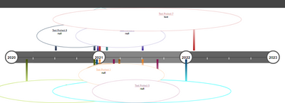
Is there any way to remove or format those circle.below chart is "time line circle".
Sample data in excel.
Thanks
Solved! Go to Solution.
- Mark as New
- Bookmark
- Subscribe
- Mute
- Subscribe to RSS Feed
- Permalink
- Report Inappropriate Content
Hi @bideveloper555 ,
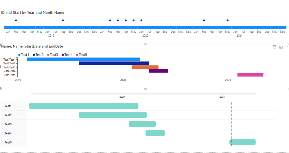
To have this type of information best option is to go for a Gannt chart have you consider it?
There is also the possibility of trying using some dax make a bar and line chart give some information with a tooltip.
Another options is to do a charticulator custom visual.
https://charticulator.com/docs/video-tutorials.html
Chekc the PBIX file with some options:
Regards
Miguel Félix
Did I answer your question? Mark my post as a solution!
Proud to be a Super User!
Check out my blog: Power BI em Português- Mark as New
- Bookmark
- Subscribe
- Mute
- Subscribe to RSS Feed
- Permalink
- Report Inappropriate Content
have you tried the TimeLine by querion:
https://appsource.microsoft.com/en-us/product/power-bi-visuals/WA200001804?tab=Overview
Making use of the start date column and formatting it has a YYYY-MM, also adding a new line for each start of the year and making it different from the other got result on top.
PBIX FIle attach.
Regards
Miguel Félix
Did I answer your question? Mark my post as a solution!
Proud to be a Super User!
Check out my blog: Power BI em Português- Mark as New
- Bookmark
- Subscribe
- Mute
- Subscribe to RSS Feed
- Permalink
- Report Inappropriate Content
Thank you Felix for your time and effort.
its for big boys in company. they need some thing neat and show year in linear and drill side ways,with start and end date or showing some time frame for each project.
- Mark as New
- Bookmark
- Subscribe
- Mute
- Subscribe to RSS Feed
- Permalink
- Report Inappropriate Content
Hi @bideveloper555 ,
To have this type of information best option is to go for a Gannt chart have you consider it?
There is also the possibility of trying using some dax make a bar and line chart give some information with a tooltip.
Another options is to do a charticulator custom visual.
https://charticulator.com/docs/video-tutorials.html
Chekc the PBIX file with some options:
Regards
Miguel Félix
Did I answer your question? Mark my post as a solution!
Proud to be a Super User!
Check out my blog: Power BI em PortuguêsHelpful resources

Power BI Monthly Update - April 2026
Check out the April 2026 Power BI update to learn about new features.

New to Fabric Survey
If you have recently started exploring Fabric, we'd love to hear how it's going. Your feedback can help with product improvements.

Power BI DataViz World Championships - June 2026
A new Power BI DataViz World Championship is coming this June! Don't miss out on submitting your entry.

| User | Count |
|---|---|
| 42 | |
| 37 | |
| 35 | |
| 22 | |
| 15 |
| User | Count |
|---|---|
| 67 | |
| 58 | |
| 29 | |
| 27 | |
| 25 |


