Get certified for free when you join Fabric Data Days 2026 and dive into Fabric, Power BI, SQL, AI, and other essential data skills.
Join nowJuly 7 - July 17 | Round 2 of the Power BI Dataviz World Championships. Don't miss your chance! Learn more
Afternoon all:
I have a line graph that shows montly percentages across a rolling 12 month period for three metrics. Is it possible to put a target line on the graph for each of the three metrics? For example: Metric 1 has a target of 5%, Metric 2 has a target of 22%, Metric 3 has a target of xx %. Thos target line would extend across the line graph. This would allow to see where each metric is relative to target each month.
TIA for any help.
Solved! Go to Solution.
Go to Analytics area under visualizations and Click on Y-Axis Constant Line and you can add multiple target lines here and format accordingly
Hi @PowerBINoob24 ,
Thank you, @NishPatel, for your helpful and quick response.
My additions are as follows.
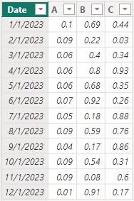
Here is the dummy data I created.
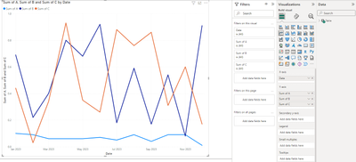
The fields in the line chart are as follows.
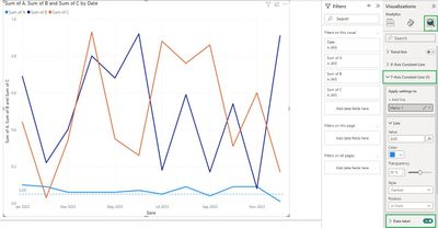
Please select your line chart, and in the Visualizations pane, do the following.
Line colors can be changed on your request.
You can also set the Data label option to "on".
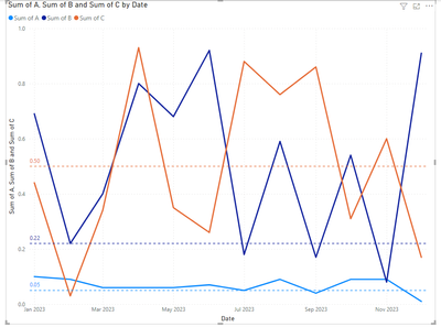
Result is as below.
For more you may refer to:
Use the Analytics pane in Power BI Desktop - Power BI | Microsoft Learn
Best Regards,
Yulia Yan
If this post helps, then please consider Accept it as the solution to help the other members find it more quickly.
Hi @PowerBINoob24 ,
Thank you, @NishPatel, for your helpful and quick response.
My additions are as follows.
Here is the dummy data I created.
The fields in the line chart are as follows.
Please select your line chart, and in the Visualizations pane, do the following.
Line colors can be changed on your request.
You can also set the Data label option to "on".
Result is as below.
For more you may refer to:
Use the Analytics pane in Power BI Desktop - Power BI | Microsoft Learn
Best Regards,
Yulia Yan
If this post helps, then please consider Accept it as the solution to help the other members find it more quickly.
Go to Analytics area under visualizations and Click on Y-Axis Constant Line and you can add multiple target lines here and format accordingly
Join us in Barcelona for FabCon and SQLCon, the Fabric, Power BI, SQL, and AI community event. Save €200 with code FABCMTY200.
Join Data Days 2026: 60 days of free live/on-demand sessions, challenges, study groups, and certification opportunities.
| User | Count |
|---|---|
| 26 | |
| 23 | |
| 19 | |
| 18 | |
| 15 |
| User | Count |
|---|---|
| 46 | |
| 46 | |
| 43 | |
| 36 | |
| 31 |