A new Data Days event is coming soon!
This time we’re going bigger than ever. Fabric, Power BI, SQL, AI and more. We're covering it all. You won't want to miss it.
Learn more- Power BI forums
- Get Help with Power BI
- Desktop
- Service
- Report Server
- Power Query
- Mobile Apps
- Developer
- DAX Commands and Tips
- Custom Visuals Development Discussion
- Health and Life Sciences
- Power BI Spanish forums
- Translated Spanish Desktop
- Training and Consulting
- Instructor Led Training
- Dashboard in a Day for Women, by Women
- Galleries
- Data Stories Gallery
- Themes Gallery
- Contests Gallery
- QuickViz Gallery
- Quick Measures Gallery
- Visual Calculations Gallery
- Notebook Gallery
- Translytical Task Flow Gallery
- TMDL Gallery
- R Script Showcase
- Webinars and Video Gallery
- Ideas
- Custom Visuals Ideas (read-only)
- Issues
- Issues
- Events
- Upcoming Events
Did you hear? There's a new SQL AI Developer certification (DP-800). Start preparing now and be one of the first to get certified. Register now
- Power BI forums
- Forums
- Get Help with Power BI
- Desktop
- Target line
- Subscribe to RSS Feed
- Mark Topic as New
- Mark Topic as Read
- Float this Topic for Current User
- Bookmark
- Subscribe
- Printer Friendly Page
- Mark as New
- Bookmark
- Subscribe
- Mute
- Subscribe to RSS Feed
- Permalink
- Report Inappropriate Content
Target line
Afternoon all:
I have a line graph that shows montly percentages across a rolling 12 month period for three metrics. Is it possible to put a target line on the graph for each of the three metrics? For example: Metric 1 has a target of 5%, Metric 2 has a target of 22%, Metric 3 has a target of xx %. Thos target line would extend across the line graph. This would allow to see where each metric is relative to target each month.
TIA for any help.
Solved! Go to Solution.
- Mark as New
- Bookmark
- Subscribe
- Mute
- Subscribe to RSS Feed
- Permalink
- Report Inappropriate Content
Go to Analytics area under visualizations and Click on Y-Axis Constant Line and you can add multiple target lines here and format accordingly
- Mark as New
- Bookmark
- Subscribe
- Mute
- Subscribe to RSS Feed
- Permalink
- Report Inappropriate Content
Hi @PowerBINoob24 ,
Thank you, @NishPatel, for your helpful and quick response.
My additions are as follows.
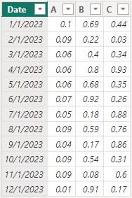
Here is the dummy data I created.
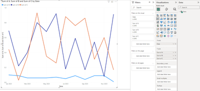
The fields in the line chart are as follows.
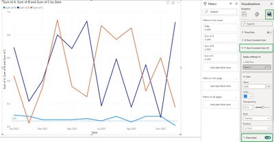
Please select your line chart, and in the Visualizations pane, do the following.
Line colors can be changed on your request.
You can also set the Data label option to "on".
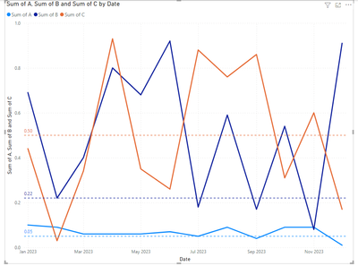
Result is as below.
For more you may refer to:
Use the Analytics pane in Power BI Desktop - Power BI | Microsoft Learn
Best Regards,
Yulia Yan
If this post helps, then please consider Accept it as the solution to help the other members find it more quickly.
- Mark as New
- Bookmark
- Subscribe
- Mute
- Subscribe to RSS Feed
- Permalink
- Report Inappropriate Content
Go to Analytics area under visualizations and Click on Y-Axis Constant Line and you can add multiple target lines here and format accordingly
Helpful resources

Power BI Monthly Update - April 2026
Check out the April 2026 Power BI update to learn about new features.

Data Days 2026 coming soon!
Sign up to receive a private message when registration opens and key events begin.

New to Fabric Survey
If you have recently started exploring Fabric, we'd love to hear how it's going. Your feedback can help with product improvements.

| User | Count |
|---|---|
| 34 | |
| 31 | |
| 25 | |
| 20 | |
| 16 |
| User | Count |
|---|---|
| 60 | |
| 48 | |
| 29 | |
| 23 | |
| 23 |


