FabCon is coming to Atlanta
Join us at FabCon Atlanta from March 16 - 20, 2026, for the ultimate Fabric, Power BI, AI and SQL community-led event. Save $200 with code FABCOMM.
Register now!- Power BI forums
- Get Help with Power BI
- Desktop
- Service
- Report Server
- Power Query
- Mobile Apps
- Developer
- DAX Commands and Tips
- Custom Visuals Development Discussion
- Health and Life Sciences
- Power BI Spanish forums
- Translated Spanish Desktop
- Training and Consulting
- Instructor Led Training
- Dashboard in a Day for Women, by Women
- Galleries
- Data Stories Gallery
- Themes Gallery
- Contests Gallery
- QuickViz Gallery
- Quick Measures Gallery
- Visual Calculations Gallery
- Notebook Gallery
- Translytical Task Flow Gallery
- TMDL Gallery
- R Script Showcase
- Webinars and Video Gallery
- Ideas
- Custom Visuals Ideas (read-only)
- Issues
- Issues
- Events
- Upcoming Events
Get Fabric Certified for FREE during Fabric Data Days. Don't miss your chance! Request now
- Power BI forums
- Forums
- Get Help with Power BI
- Desktop
- Re: Switch column chart axis by day, week, month, ...
- Subscribe to RSS Feed
- Mark Topic as New
- Mark Topic as Read
- Float this Topic for Current User
- Bookmark
- Subscribe
- Printer Friendly Page
- Mark as New
- Bookmark
- Subscribe
- Mute
- Subscribe to RSS Feed
- Permalink
- Report Inappropriate Content
Switch column chart axis by day, week, month, year with buttons
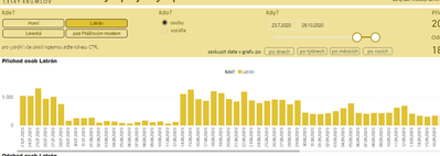
I have a table with a date column and a key figure value.
I create a column chart with date on X axis and the key figure in values.
The request is to switch the X axis from date (represented by day by default) to weeks, months, years granularity with a set of buttons.
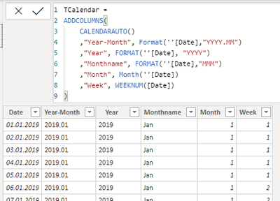
After one hour googling, I have created a calender table with columns date, week, month, year
and 4 charts, each with different column name (from the calender table) in the values field
And finally the trick with 4 charts overlayed and 4 buttons, which toggle each chart with the help of bookmarks and selection pane.
But isn't there a easier way to do this? This looks like overkill.
Thank you
- Mark as New
- Bookmark
- Subscribe
- Mute
- Subscribe to RSS Feed
- Permalink
- Report Inappropriate Content
That's amazing! I love buttons.
My approach would be to use Drill down in 1 visual. So put Year Month in Axis, Month underneath, Day under that, etc all in the same visual in the correct order. You can probably still set up bookmarks to make this work with buttons, or just train users to use the built in drill down functionality.
UPDATED to add: Use the parallel disconnected arrows for drill down to get the same effect as your separate charts.
The Microsoft documentation doesn't use a great example, but here's the info on drill down so you can see what built in buttons I mean: https://docs.microsoft.com/en-us/power-bi/consumer/end-user-drill
Also, I suggest making your date table in Power Query if you can, it will speed up your report: https://excelwithallison.blogspot.com/2020/04/dimdate-what-why-and-how.html
Please @mention me in your reply if you want a response.
Copying DAX from this post? Click here for a hack to quickly replace it with your own table names
Has this post solved your problem? Please Accept as Solution so that others can find it quickly and to let the community know your problem has been solved.
If you found this post helpful, please give Kudos C
I work as a Microsoft trainer and consultant, specialising in Power BI and Power Query.
www.excelwithallison.com
- Mark as New
- Bookmark
- Subscribe
- Mute
- Subscribe to RSS Feed
- Permalink
- Report Inappropriate Content
Hello Allison
The idea with hierarchy is good, I remember, I tried it, but the disadvantage is, that the hierarchy function groups the same month number, week numbers from all years. So I see month 10 in one bar as sum of months 10.2019 and 10.2020. Therefore I created year-month column additionally to month column to see month 10 in two columns - 10.2019 and 10.2020.
Helpful resources

Power BI Monthly Update - November 2025
Check out the November 2025 Power BI update to learn about new features.

Fabric Data Days
Advance your Data & AI career with 50 days of live learning, contests, hands-on challenges, study groups & certifications and more!

| User | Count |
|---|---|
| 103 | |
| 80 | |
| 58 | |
| 51 | |
| 46 |


