Huge last-minute discounts for FabCon Vienna from September 15-18, 2025
Supplies are limited. Contact info@espc.tech right away to save your spot before the conference sells out.
Get your discount- Power BI forums
- Get Help with Power BI
- Desktop
- Service
- Report Server
- Power Query
- Mobile Apps
- Developer
- DAX Commands and Tips
- Custom Visuals Development Discussion
- Health and Life Sciences
- Power BI Spanish forums
- Translated Spanish Desktop
- Training and Consulting
- Instructor Led Training
- Dashboard in a Day for Women, by Women
- Galleries
- Data Stories Gallery
- Themes Gallery
- Contests Gallery
- Quick Measures Gallery
- Notebook Gallery
- Translytical Task Flow Gallery
- TMDL Gallery
- R Script Showcase
- Webinars and Video Gallery
- Ideas
- Custom Visuals Ideas (read-only)
- Issues
- Issues
- Events
- Upcoming Events
Score big with last-minute savings on the final tickets to FabCon Vienna. Secure your discount
- Power BI forums
- Forums
- Get Help with Power BI
- Desktop
- Re: Switch Row/Column Data
- Subscribe to RSS Feed
- Mark Topic as New
- Mark Topic as Read
- Float this Topic for Current User
- Bookmark
- Subscribe
- Printer Friendly Page
- Mark as New
- Bookmark
- Subscribe
- Mute
- Subscribe to RSS Feed
- Permalink
- Report Inappropriate Content
Switch Row/Column Data
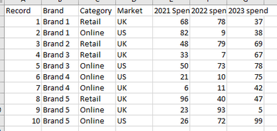
Hi, I have some data which are single record for different combinations with columns for yearly spend. Here's some mock data:
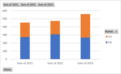
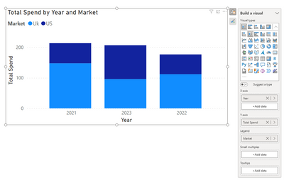
I want to be able to chart the data that each year is the X axis label then I can have the stacks as the Brand/Category/Market such as the below which I can do using a stack column and switch row/column when pivoting the data in excel.
Chart 1:
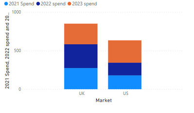
When I try to do this in power BI I can only get the following chart and can't figure out how to switch row/column
Chart 2:
Any way I can turn chart 2 into chart 1 in PowerBI?
Solved! Go to Solution.
- Mark as New
- Bookmark
- Subscribe
- Mute
- Subscribe to RSS Feed
- Permalink
- Report Inappropriate Content
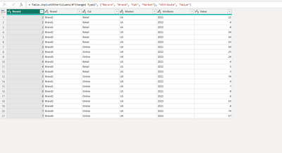
if the data you bringing is in the same format as your table above. Then you will need to pivot the data, by going into transform data and highlight the column years and go to the transform/Unpivot columns. Your data should look something like this now. close and apply Now you should be able to pivot the data in the format you want.
