FabCon is coming to Atlanta
Join us at FabCon Atlanta from March 16 - 20, 2026, for the ultimate Fabric, Power BI, AI and SQL community-led event. Save $200 with code FABCOMM.
Register now!- Power BI forums
- Get Help with Power BI
- Desktop
- Service
- Report Server
- Power Query
- Mobile Apps
- Developer
- DAX Commands and Tips
- Custom Visuals Development Discussion
- Health and Life Sciences
- Power BI Spanish forums
- Translated Spanish Desktop
- Training and Consulting
- Instructor Led Training
- Dashboard in a Day for Women, by Women
- Galleries
- Data Stories Gallery
- Themes Gallery
- Contests Gallery
- QuickViz Gallery
- Quick Measures Gallery
- Visual Calculations Gallery
- Notebook Gallery
- Translytical Task Flow Gallery
- TMDL Gallery
- R Script Showcase
- Webinars and Video Gallery
- Ideas
- Custom Visuals Ideas (read-only)
- Issues
- Issues
- Events
- Upcoming Events
The Power BI Data Visualization World Championships is back! Get ahead of the game and start preparing now! Learn more
- Power BI forums
- Forums
- Get Help with Power BI
- Desktop
- Summary Table, Unique Counts, Graphs and Averages ...
- Subscribe to RSS Feed
- Mark Topic as New
- Mark Topic as Read
- Float this Topic for Current User
- Bookmark
- Subscribe
- Printer Friendly Page
- Mark as New
- Bookmark
- Subscribe
- Mute
- Subscribe to RSS Feed
- Permalink
- Report Inappropriate Content
Summary Table, Unique Counts, Graphs and Averages - How to incorporate them all?
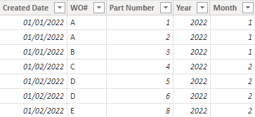
In my PowerBI dataset I have many columns, but I am trying to build a graph using three columns from my dataset (Created Date, WO# and Part Number. I basically want to be able to show a graph that shows for any given year and month how many unique "WO#"s there were and the average "Part Number Count" per "WO#" for that month.
Does anyone have any ideas on how to easily do this in PowerBI? I could easy do this in PivotTable, but I want this to be automated. The goal would be to answer the following questions.
1. How many unique WO#s were there for a given year/month
2. For a given year/month, what was the average Part Number count per WO#?
Ultimately we want to track " Average Part Numbner Count per WO#" and see it go down month over month.
Hopefully this makes sense!
Thanks!
Solved! Go to Solution.
- Mark as New
- Bookmark
- Subscribe
- Mute
- Subscribe to RSS Feed
- Permalink
- Report Inappropriate Content
I appreciate the help. I don't think I explained myself fully, but after looking at what you did in your example, I realized I was over thinking the whole thing, was making it more difficult than it needed to be and was able to solve it using just a couple measures and some math.
Thanks for getting me to think differently!
- Mark as New
- Bookmark
- Subscribe
- Mute
- Subscribe to RSS Feed
- Permalink
- Report Inappropriate Content
Hi @Anonymous ,
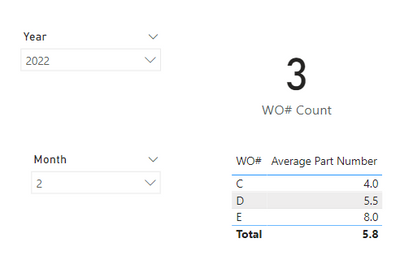
According to your description, I create a sample.
Maybe I didn't fully understand. When we put the year and month in the slicer, the measures created can dynamically change by the slicer.
WO# Count = DISTINCTCOUNT('Table'[WO#])Average Part Number = AVERAGE('Table'[Part Number])
If the problem is not like this, please feel free to let me know.
Best Regards,
Community Support Team _ kalyj
If this post helps, then please considerAccept it as the solution to help the other members find it more quickly.
- Mark as New
- Bookmark
- Subscribe
- Mute
- Subscribe to RSS Feed
- Permalink
- Report Inappropriate Content
I appreciate the help. I don't think I explained myself fully, but after looking at what you did in your example, I realized I was over thinking the whole thing, was making it more difficult than it needed to be and was able to solve it using just a couple measures and some math.
Thanks for getting me to think differently!
Helpful resources

Power BI Dataviz World Championships
The Power BI Data Visualization World Championships is back! Get ahead of the game and start preparing now!

| User | Count |
|---|---|
| 38 | |
| 38 | |
| 37 | |
| 28 | |
| 28 |
| User | Count |
|---|---|
| 124 | |
| 89 | |
| 73 | |
| 66 | |
| 65 |


