Join us at FabCon Vienna from September 15-18, 2025
The ultimate Fabric, Power BI, SQL, and AI community-led learning event. Save €200 with code FABCOMM.
Get registered- Power BI forums
- Get Help with Power BI
- Desktop
- Service
- Report Server
- Power Query
- Mobile Apps
- Developer
- DAX Commands and Tips
- Custom Visuals Development Discussion
- Health and Life Sciences
- Power BI Spanish forums
- Translated Spanish Desktop
- Training and Consulting
- Instructor Led Training
- Dashboard in a Day for Women, by Women
- Galleries
- Data Stories Gallery
- Themes Gallery
- Contests Gallery
- Quick Measures Gallery
- Notebook Gallery
- Translytical Task Flow Gallery
- TMDL Gallery
- R Script Showcase
- Webinars and Video Gallery
- Ideas
- Custom Visuals Ideas (read-only)
- Issues
- Issues
- Events
- Upcoming Events
Compete to become Power BI Data Viz World Champion! First round ends August 18th. Get started.
- Power BI forums
- Forums
- Get Help with Power BI
- Desktop
- Re: Strange behavior in a stacked column chart wit...
- Subscribe to RSS Feed
- Mark Topic as New
- Mark Topic as Read
- Float this Topic for Current User
- Bookmark
- Subscribe
- Printer Friendly Page
- Mark as New
- Bookmark
- Subscribe
- Mute
- Subscribe to RSS Feed
- Permalink
- Report Inappropriate Content
Strange behavior in a stacked column chart with 2 lines
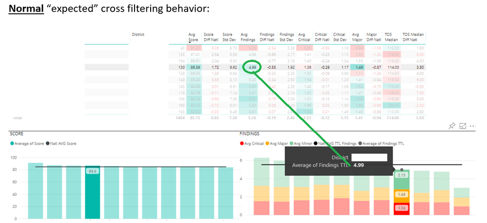
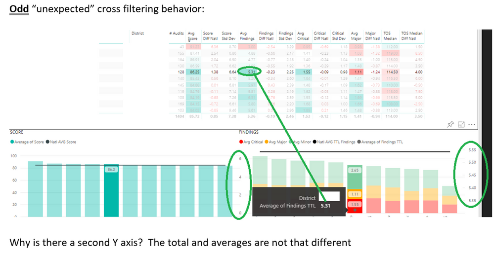
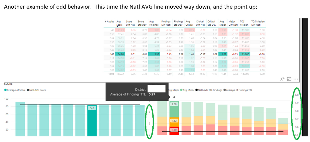
I am currently working on a set of reports that deal with averages and comparing individual and District averages to a national average. I was able to use some DAX average and averageX formulas to build the data set, and in tables the data seems just fine when it comes to the on-page filters as well as the cross filtering. In a stacked column chart with 2 lines however, the cross filtering will sometimes add a second Y axis and move the data points in an odd way.
I am just curious if anyone else has seen this? Maybe there is a quick fix or a setting that I am missing?
Solved! Go to Solution.
- Mark as New
- Bookmark
- Subscribe
- Mute
- Subscribe to RSS Feed
- Permalink
- Report Inappropriate Content
Hi @andymc123,
The secondary axis is based on line field values, I'm not so sure why it display/hide when you interact with other visuals.
Maybe you can manually turn on/off it on format tab.
Regards,
Xiaoxin Sheng
- Mark as New
- Bookmark
- Subscribe
- Mute
- Subscribe to RSS Feed
- Permalink
- Report Inappropriate Content
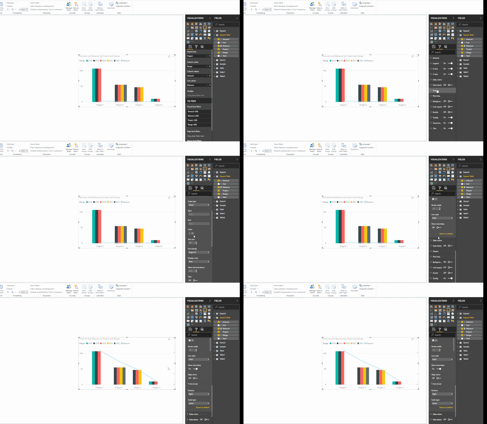
Thanks! there is a sub-setting under the Y-Axis settings called "Show secondary". I needed to apply a cross filter (click on a row in the table that showed both the primary and secondary Y axes) then when I turned off the "Show secondary" the point and line behavior started to work as expected.
This has had me stumped for a while. I am glad that the fix was literally just clicking on the correct setting switch.


