FabCon is coming to Atlanta
Join us at FabCon Atlanta from March 16 - 20, 2026, for the ultimate Fabric, Power BI, AI and SQL community-led event. Save $200 with code FABCOMM.
Register now!- Power BI forums
- Get Help with Power BI
- Desktop
- Service
- Report Server
- Power Query
- Mobile Apps
- Developer
- DAX Commands and Tips
- Custom Visuals Development Discussion
- Health and Life Sciences
- Power BI Spanish forums
- Translated Spanish Desktop
- Training and Consulting
- Instructor Led Training
- Dashboard in a Day for Women, by Women
- Galleries
- Data Stories Gallery
- Themes Gallery
- Contests Gallery
- QuickViz Gallery
- Quick Measures Gallery
- Visual Calculations Gallery
- Notebook Gallery
- Translytical Task Flow Gallery
- TMDL Gallery
- R Script Showcase
- Webinars and Video Gallery
- Ideas
- Custom Visuals Ideas (read-only)
- Issues
- Issues
- Events
- Upcoming Events
The Power BI Data Visualization World Championships is back! Get ahead of the game and start preparing now! Learn more
- Power BI forums
- Forums
- Get Help with Power BI
- Desktop
- Stagged Bar Chart with multiple values
- Subscribe to RSS Feed
- Mark Topic as New
- Mark Topic as Read
- Float this Topic for Current User
- Bookmark
- Subscribe
- Printer Friendly Page
- Mark as New
- Bookmark
- Subscribe
- Mute
- Subscribe to RSS Feed
- Permalink
- Report Inappropriate Content
Stagged Bar Chart with multiple values
Hello,
again, I am struggling at transforming an EXCEL Report into Power BI:
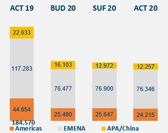
I would like to create this kind of bar charts, and I have following problem:
As Legend of the Bar Chart, I choose my Territory, so I get the "Americas, Emena, APA/China"... everything fine but:
the volumes, based on the different Scenarios (ACT 19, BUD 20, SUF 20, ACT 20) are all calculated measures. Therefore, I can only put one of these 4 into the Value of the Bar Chart Visual.
And I can not put the Scenario into the Axis of the Bar Chart, because then, I do not have the ACT 19, because in my Dataset, I only have the BUD, SUF and ACT as Element of the Scenario Column.
Is there any workaround, how I can visualize my 4 calculated Measures as a stagged bar chart, based on territory?
Solved! Go to Solution.
- Mark as New
- Bookmark
- Subscribe
- Mute
- Subscribe to RSS Feed
- Permalink
- Report Inappropriate Content
Hi @Pfoerster ,
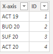
Create a disconnected table with the following data:
Now create the following measure:
VALUE = SWITCH(
                SELECTEDVALUE('AXIS'[ID]);
                1 ; [ACT 19];
                2; [BUD 20];
                3 ; [SUF 20];
                4; [ACT 20]
            )
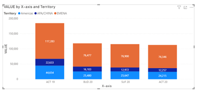
Build you chart with the following setup:
Axis: X-Axis Column
Legend: Territory
Values: Measure Value
Result below and in attach PBIX file.
Regards
Miguel Félix
Did I answer your question? Mark my post as a solution!
Proud to be a Super User!
Check out my blog: Power BI em Português- Mark as New
- Bookmark
- Subscribe
- Mute
- Subscribe to RSS Feed
- Permalink
- Report Inappropriate Content
Perfect! It is working as I like 🙂 Thank you very much.
Helpful resources

Power BI Monthly Update - November 2025
Check out the November 2025 Power BI update to learn about new features.

Fabric Data Days
Advance your Data & AI career with 50 days of live learning, contests, hands-on challenges, study groups & certifications and more!


