Join the #PBI10 DataViz contest
Power BI is turning 10, and we’re marking the occasion with a special community challenge. Use your creativity to tell a story, uncover trends, or highlight something unexpected.
Get started- Power BI forums
- Get Help with Power BI
- Desktop
- Service
- Report Server
- Power Query
- Mobile Apps
- Developer
- DAX Commands and Tips
- Custom Visuals Development Discussion
- Health and Life Sciences
- Power BI Spanish forums
- Translated Spanish Desktop
- Training and Consulting
- Instructor Led Training
- Dashboard in a Day for Women, by Women
- Galleries
- Webinars and Video Gallery
- Data Stories Gallery
- Themes Gallery
- Contests Gallery
- Quick Measures Gallery
- Notebook Gallery
- Translytical Task Flow Gallery
- R Script Showcase
- Ideas
- Custom Visuals Ideas (read-only)
- Issues
- Issues
- Events
- Upcoming Events
Join us for an expert-led overview of the tools and concepts you'll need to become a Certified Power BI Data Analyst and pass exam PL-300. Register now.
- Power BI forums
- Forums
- Get Help with Power BI
- Desktop
- Re: Stacked bar chart with concurrent events betwe...
- Subscribe to RSS Feed
- Mark Topic as New
- Mark Topic as Read
- Float this Topic for Current User
- Bookmark
- Subscribe
- Printer Friendly Page
- Mark as New
- Bookmark
- Subscribe
- Mute
- Subscribe to RSS Feed
- Permalink
- Report Inappropriate Content
Stacked bar chart with concurrent events between datetimes
My working sessions dataset includes rows with start datetime and end datetime and the column "worker name".
The goal is to return a stacked bar chart with a timeline axis and "number concurrent workers" value, where the legenda is the "worker name" itself. So when I'm analyzing e.g. a period of 3 months and I see a peak which is too high I can zoom my timeline (filtering the dates or drilling down) and see the details.
The problem are the high granularity of data (seconds), and the fact that it's not a punctual time but a duration. It's like I need a combination of a stacked bar chart and a Gantt chart.
I don't even know where to start, please help.
Solved! Go to Solution.
- Mark as New
- Bookmark
- Subscribe
- Mute
- Subscribe to RSS Feed
- Permalink
- Report Inappropriate Content
Thanks for reply, but I need both timeline and duration to be displayed on the x-axis because the Y-axis is needed to be available for "number of concurrent sessions". I think the answer is that power BI (without R) can't manage the concept of time duration as part of a timeline on the x-axis. Something similar is the Gantt chart in the custom visuals section, but not usable in this case.
- Mark as New
- Bookmark
- Subscribe
- Mute
- Subscribe to RSS Feed
- Permalink
- Report Inappropriate Content
Hi @AGo
Could you post some simplified data and expected output like this post?It seems you may create a second column with DATEDIFF Function.
Regards,
Cherie
If this post helps, then please consider Accept it as the solution to help the other members find it more quickly.
- Mark as New
- Bookmark
- Subscribe
- Mute
- Subscribe to RSS Feed
- Permalink
- Report Inappropriate Content
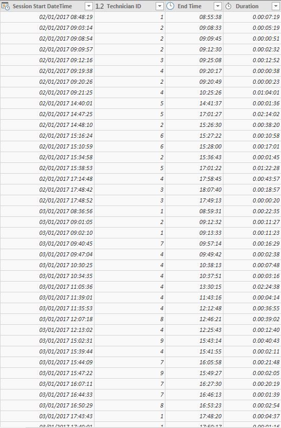
Sure, here's the dataset.

I calculated also a "Session End DateTime" based on the duration field.
The concept is that every record represent a session which value is equal to one when active from start to end.
The graph should display the time line on the X-axis an the number of concurrent active sessions on the Y-axis, having the working session technician names when consulting would be welcome. So a stacked bar chart with legenda or a line chart with command description should work. The problem with the bar chart is that you can't script how wide the bar should be (eg. from 01/01/01 20pm to 01/01/01 22pm) but its representation is based on a punctual datetime. Someone has a smart way to solve this way of represent duration/interval data?
- Mark as New
- Bookmark
- Subscribe
- Mute
- Subscribe to RSS Feed
- Permalink
- Report Inappropriate Content
Hi @AGo
Below are workarounds for you to create the visual.
1. Use integer to represent the Time and display integer in Y-Axis, there is a similar thread for your reference.
2. Use R visual, please see this similar thread.
Regards,
Cherie
If this post helps, then please consider Accept it as the solution to help the other members find it more quickly.
- Mark as New
- Bookmark
- Subscribe
- Mute
- Subscribe to RSS Feed
- Permalink
- Report Inappropriate Content
Thanks for reply, but I need both timeline and duration to be displayed on the x-axis because the Y-axis is needed to be available for "number of concurrent sessions". I think the answer is that power BI (without R) can't manage the concept of time duration as part of a timeline on the x-axis. Something similar is the Gantt chart in the custom visuals section, but not usable in this case.
Helpful resources

Join our Fabric User Panel
This is your chance to engage directly with the engineering team behind Fabric and Power BI. Share your experiences and shape the future.

Power BI Monthly Update - June 2025
Check out the June 2025 Power BI update to learn about new features.

| User | Count |
|---|---|
| 80 | |
| 79 | |
| 60 | |
| 36 | |
| 33 |
| User | Count |
|---|---|
| 91 | |
| 60 | |
| 59 | |
| 49 | |
| 45 |
